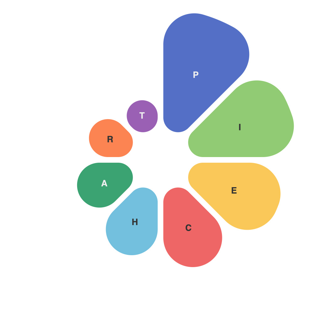
In the ever-evolving landscape of data analytics, the art of data visualization is an indispensable skill. It enables us to transform raw data into actionable insights, revealing patterns, trends, and relationships that the naked eye might easily miss. One of the foundational tools in this data visualization arsenal is the pie chart. At first glance, pie charts might seem simple and straightforward; however, they are a testament to how even the simplest visual can carry a deeper complexity of storytelling if curated with care.
Understanding the Pie Chart’s Essence
The pie chart is, as the name suggests, a graphical representation of data in a circular format divided into segments that correspond to different categories within a whole. This depiction, much like a real pie, provides a clear visual cue of proportion, showing at a quick glance the relative size of each part compared to the whole. However, to truly master the pie chart craft, it’s essential to understand its key principles and the pitfalls to avoid.
Segmenting the Sweet Spot
The main goal of pie chart design is to effectively communicate the proportions within the dataset. To achieve this, the choice of categories and segmentation is crucial. Begin by identifying the most important information and limiting the number of slices to prevent the chart from becoming cluttered. A common rule of thumb is to avoid more than seven segments as the human eye might have difficulty discerning the difference between them when too many are presented.
Coloring the Canvas
Color is a powerful tool in data visualization. It not only enhances the aesthetic appeal of the pie chart but also aids in differentiating between the segments. While you want to ensure high contrast between the colors to stand out on the visual canvas, be cautious not to overdo it. Bright, contrasting colors are more likely to attract attention; however, they should convey clarity instead of chaos.
Shades of Gray: When Pie Charts Don’t Cut It
Even when designed to perfection, pie charts are not for every situation. Sometimes, they can misrepresent the data or confuse the audience, especially if there’s a large number of segments, or when the reader needs to compare pie charts against other data. In these cases, alternative chart types—like the bar or donut chart—can be far more effective.
Pie Chart Dynamics: Static or Animated?
The dynamic nature of data means that pie charts can be static or interactive. Static pie charts are suitable for one-off presentations or reports where the data doesn’t change frequently. On the other hand, interactive pie charts offer engaging and informative visual storytelling. They allow the viewer to select specific segments to drill down into more detailed data, making the pie chart much more than just a static visual component.
Crafting Pie Charts with Purpose
Every aspect of pie chart design should be purposeful. This includes:
– **Labels:** Clearly label each segment with a description for context and clarity.
– **Titles:** Use a descriptive title that explains what the pie chart represents right away.
– **Legend:** Consider using a legend if there’s a need for further explanation, but keep it small and not too overwhelming.
– **Orientation:** For readability, choose an orientation that suits the content and the context in which the pie chart will be used. Horizontal pie charts are generally more readable.
Mastering the pie chart craft, therefore, is more than just following a formula. It is about knowing the audience, understanding the context, and knowing when to break the rules. With a thoughtful approach, pie charts can serve as powerful storytelling tools in the hands of a skilled data visualizer.
In conclusion, whether you are a seasoned data分析师 or a beginner trying your hand at data visualization, the pie chart is a fundamental element worth honing. Remember, it’s the story within the numbers, and the artful presentation of that narrative through the pie chart that can bring your data to life.

