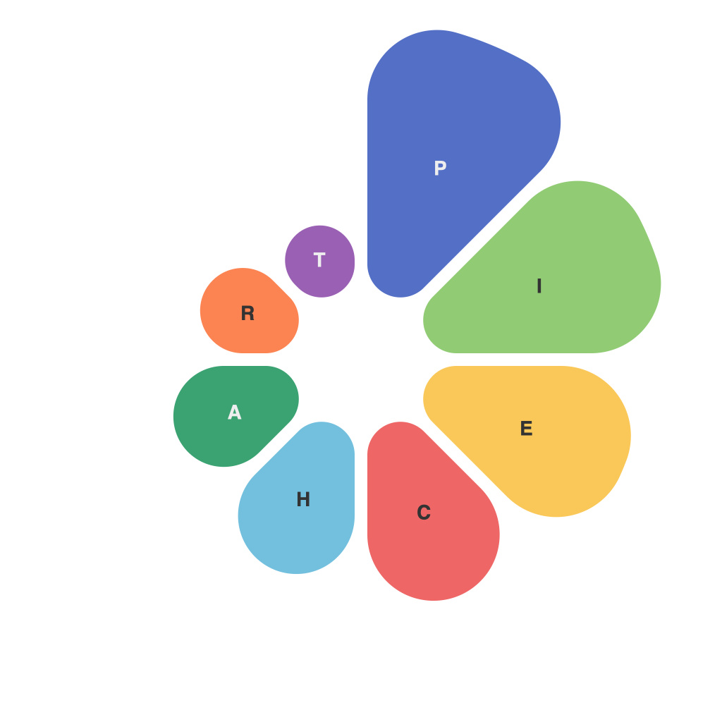
In today’s data-driven world, the art of effective data visualization stands as a crucial bridge between raw data and actionable insights. Pie charts, with their elegant use of color and division, are a staple in this visual storytelling practice. Mastering the craft of pie charts not only enhances data comprehension but also allows for the conveying of complex information in a straightforward, engaging manner. Below, we delve into the intricacies of pie charts, offering tips and insights on how to unlock their full potential.
**Understanding the Foundation: The Basic Structure**
A pie chart presents data as slices of a circle that collectively add up to 100%. On the surface, this seems straightforward— slices larger than others represent greater values. However, the simplicity of design belies the depth required to create a pie chart that effectively communicates the data’s essence.
**Choosing the Right Data: Pie or Not Pie?**
Not all data is suited for a pie chart presentation. It’s vital to ask whether pie charts are the best tool for the job. Ideal candidates are categories that naturally lend themselves to proportional representation, such as market share or survey responses. Avoid pie charts when dealing with numerous categories or small differences, as these can be challenging to interpret.
**Labeling: Clarity is Key**
To ensure pie chart comprehension, label each slice clearly—no ambiguity about what each represents. Using both the category name and its corresponding value can be helpful in providing context. Numbers can strain the eyes and clutter the chart, so consider representing values on a key or an extended legend if space allows.
**Color as a Communicating Tool: The Palette**
Color not only highlights segments but can also help to tell a story or emphasize trends. When choosing colors, avoid using too many hues or clashing color schemes that could be confusing. Use a consistent color scheme if you’re creating a series of pie charts, to maintain the viewer’s sense of continuity.
**Consider the Viewer: Visual Rhythm and Proportions**
How the slices are positioned in relation to one another matters as much as how they represent the data. A pie chart can visually indicate magnitude, so arranging slices in descending size order can draw attention to the largest segments first. If there is a pattern to how slices should be ordered, maintain that pattern to aid in viewing, especially when comparing multiple pie charts.
**Pie Chart Labels: Avoiding the Text Trap**
Pie chart labels can easily become a minefield due to readability concerns. Make sure that text is proportionate to the slice’s size and not cluttered. Horizontal alignment of text can improve legibility. If a slice is too thin to accommodate text, it might be better to omit the label altogether or refer to it via the legend instead.
**Pie Charts vs. Other Visualization Tools: The Comparative Edge**
While pie charts have their place in the data visualization landscape, alternative tools like donut charts and radar charts can offer more effective ways of presenting certain types of data. Donut charts remove the edge where slices meet the pie chart, which can help reduce crowding and improve readability. Radar charts, on the other hand, are excellent for 3D modeling data in multiple dimensions.
**Conclusion: Mastering the Pie Chart through Practice and Practice**
The mastery of pie charts as a data visualization tool is a skill achieved through practice and an understanding of the subtleties they encapsulate. When pie charts are constructed with intention, guided by a clear goal of informing rather than overwhelming, they can be powerful tools for conveying data insights. Remember that while pie charts have their limitations, when used correctly, they can be an effective means to engage viewers and draw them into a deeper narrative about the data at hand.

