Unlocking the Power of Data Visualization: A Comprehensive Guide to Mastering Pie Charts
In the era of big data, the ability to understand and interpret complex information is more crucial than ever before. One effective tool for making sense of numerical data is data visualization. Among numerous techniques available, the often-underlooked pie chart stands as a powerful yet straightforward method to represent parts of a whole visually. This article aims to guide you through the essential aspects of leveraging pie charts effectively, including the principles, components, and techniques for creating insightful visual representations.
### Understanding Pie Charts
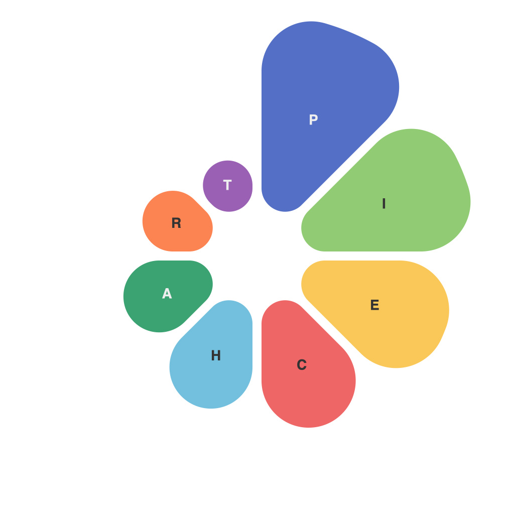
Pie charts are circular graphs divided into sectors, each representing a portion of the total amount. They’re particularly useful when one wants to visualize how each component contributes to the grand total, making it easier to grasp proportions and relative sizes at a glance. Before delving into their mastery, it’s important to grasp several key attributes:
– **Sectors**: Each sector corresponds to a specific category within the data, with its size proportional to the category’s contribution to the whole.
– **Labels**: Descriptive labels for each sector enhance understanding by making the represented data immediately identifiable.
– **Colors**: Used to differentiate categories aesthetically and can aid in distinguishing smaller segments visually.
### Choosing When to Use a Pie Chart
Pie charts are most effective when dealing with a small number of categories (typically three to five) that you aim to compare in their entirety. They are particularly advantageous when emphasizing the proportion of the whole each part represents. For instance, in marketing, a pie chart can illustrate sales distribution across different product lines in a year. In finance, they can depict budget allocation across various departments.
### Tips for Effective Pie Charts
– **Limit Sectors**: Pie charts work best with a small number of categories. Consider consolidating categories if you have many or if they share similar values.
– **Sort Data**: Arrange the sectors from the largest to the smallest to facilitate easier comparison and understanding. This visual cue naturally guides the viewer’s eye through the chart.
– **Highlight Important Data**: Emphasize key segments that deserve special attention, such as a sector representing a substantial portion of the total or a unique category.
– **Consistent Sizing**: Ensure that the size of each sector is immediately intuitive—larger sectors should correspond to a larger percentage of the whole.
### Customization for Enhanced Visual Impact
Pie charts can be dramatically improved with customization. Consider the following strategies:
– **Colors**: Use a consistent and visually appealing color scheme. Contrasting colors within sectors can make differentiation easier and enhance readability. Tools such as color contrast checkers can ensure accessibility.
– **Labels and Legends**: Keep labels concise yet descriptive. Legends, if used, should be minimal and clear, taking into account the size of the chart to maintain readability.
– **3D Effects and Explodents**: Although visually appealing, 3D effects and explodents (expanding sectors) should be used sparingly to avoid misleading viewers or over-complicating the chart unnecessarily.
### Best Practices in Creating Pie Charts
– **Use Simple Axes**: Since pie charts are circular, avoid the use of x and y axes. Instead, focus on the intuitive visual representation of categories.
– **Consider Audience**: The decision to use a pie chart should be based on what is most appropriate for your audience’s expectations and the information you wish to convey.
– **Keep it Interactive**: Utilize digital platforms for interactive pie charts. Tools like tooltips, clickable segments, and animations can enhance user engagement and data comprehension.
### Conclusion
Pie charts, when used appropriately, can significantly enhance the conveyance of information by visually illustrating relative proportions and making complex data easily digestible. They are not merely visual aids but powerful tools in a data analyst’s arsenal. With a keen eye on design principles, customization techniques, and an understanding of when to use them, you can unlock the full potential of this simple yet impactful charting method, ensuring clear, engaging, and effective data communication.

