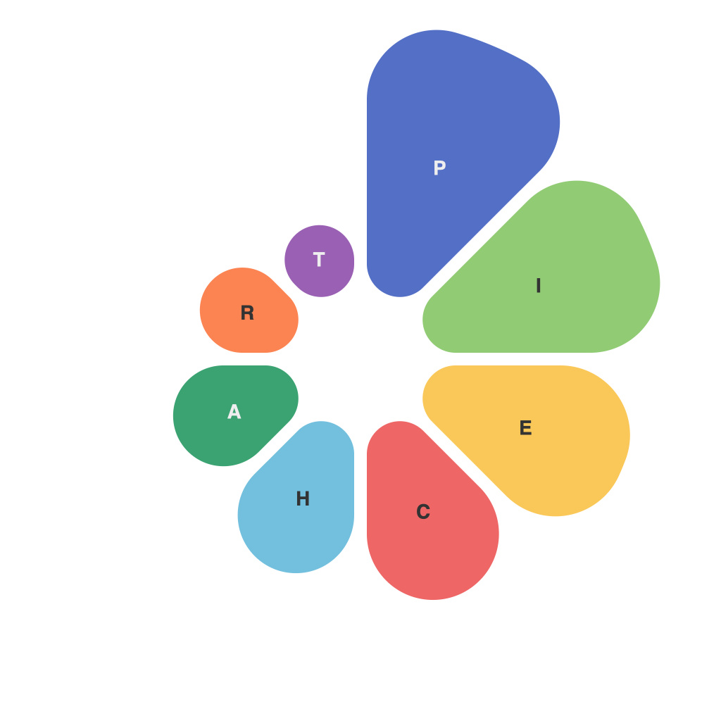
Unlocking the Power of Data Visualization: Mastering Pie Charts for Effective Communication
Data visualization is an essential tool that helps us understand and digest complex information more easily and quickly. Among the various types of charts and graphs available, pie charts are particularly compelling for showing how a whole is divided into various parts. They are widely adopted in various fields due to their simplicity and intuitiveness, making it easy for viewers to grasp the relative sizes of components at a glance.
Unlocking the Potential of Pie Charts
Pie charts excel when representing parts of a whole, especially when the data categories are descriptive and the number of categories can be limited. They are particularly effective for showing proportions, such as market share, budget allocation, or demographic breakdowns, where the viewer needs a clear perception of each component’s percentage of the total.
Mastering the Art of Pie Chart Design
For pies charts to effectively communicate data, consider several crucial aspects:
1. **Limit the Number of Slices**: Typically, pie charts work best with 3 to 5 slices. More than this, the chart can become cluttered, and viewers may struggle to interpret the data accurately. Complex data patterns requiring more categories may be better suited for other types of charts like stacked bar charts.
2. **Labeling**: Each sector should be clearly labeled with the corresponding category and percentage (or number, if there are few slices). Label placement is crucial to avoid overlapping and ensure readability. Using tooltips can help for smaller sectors that might have long labels or for more detailed analysis.
3. **Sorting Order**: Arrange sectors in a logical order, such as by size, either clockwise or counterclockwise. This visualization can help emphasize the importance of the largest components.
4. **Using Consistent Colors**: Use distinct, but consistent colors to represent different categories. This allows for easier differentiation between categories and can aid in memorability.
5. **Avoid 3D Effects**: While 3D effects may add a modern, aesthetically pleasing touch to pie charts, they can also distort perception and make it harder to compare the sizes of the slices accurately. Opt for a flat design to ensure clarity and precision in data representation.
Common Pitfalls to Avoid
Despite the benefits of pie charts, several common pitfalls can undermine their effectiveness:
1. **Data Sparsity**: A pie chart with too few categories loses its charm. In such cases, consider alternative visualizations that better depict complex data relationships.
2. **Comparisons Beyond One Pie**: If pie charts are used to compare multiple sets of data, it’s better to use separate charts or a different type of chart (like parallel axis charts) to avoid confusion.
3. **Pie Chart Misuse for Time Series Data**: For visualizing changes over time, pie charts are not the most suitable option. Instead, consider using line charts, which convey trends more accurately and effectively.
4. **Overuse of Similar Slices**: If multiple charts have slices representing a similar portion size, such as 25%, this can create confusion. This effect can dilute the message rather than reinforcing it.
In conclusion, pie charts are an indispensable tool in data visualization, particularly when the need arises to communicate proportions and compositions clearly. By understanding the best practices and pitfalls associated with their creation, you can unlock their full potential for creating effective, communicative, and impactful designs. Always remember that the goal should be to facilitate understanding and not to merely present data.

