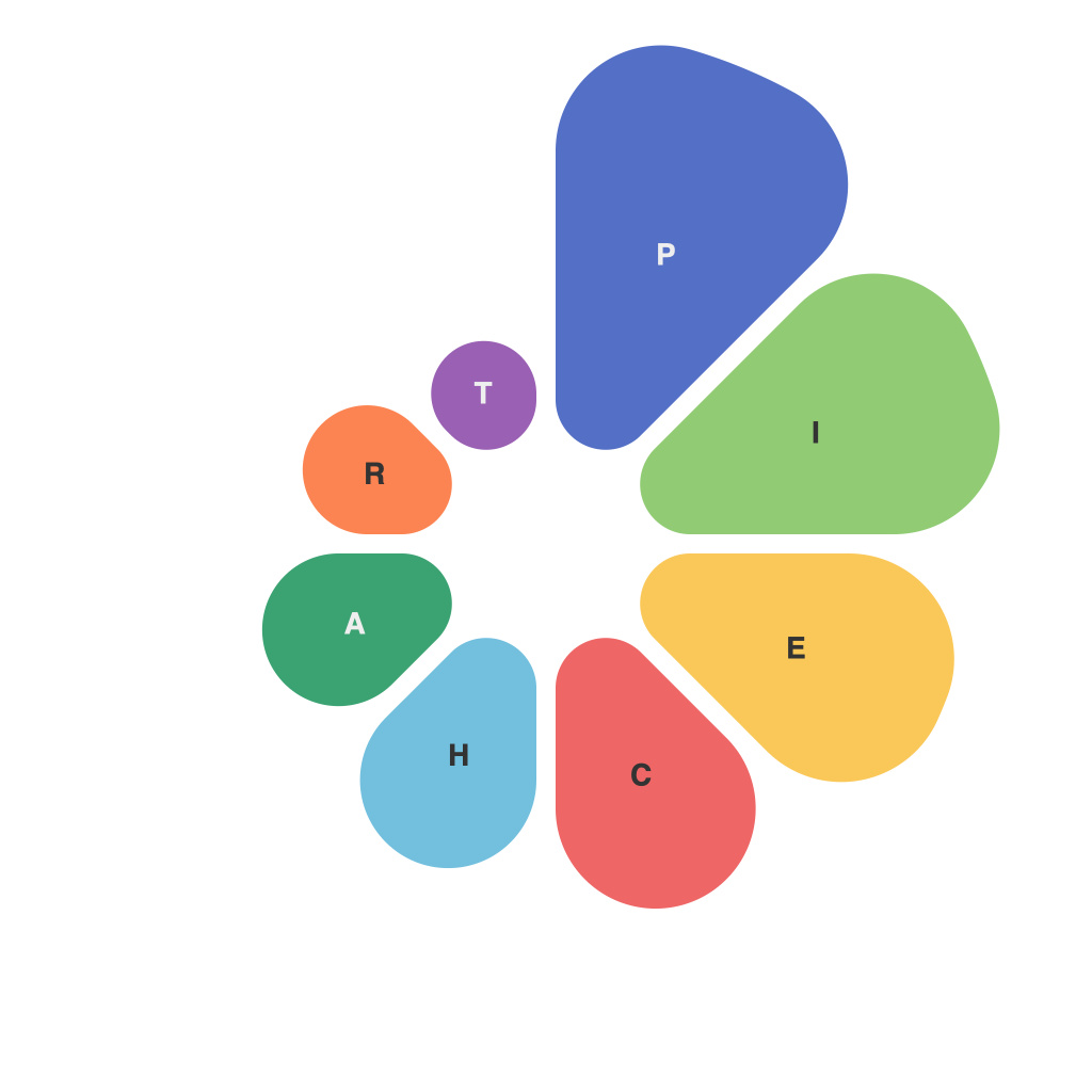
Title: Breaking Down Data Complexity: The Art of Mastering Pie Charts for Empowering Visual Communication
Data visualization has the incredible ability to simplify complex information, making it accessible and understandable within seconds. It turns raw data into insights, facilitating better decision making, and helping us communicate information more effectively. Among the myriad of graphical tools at our disposal, pie charts stand out as an engaging and intuitive way to represent proportions and distributions of categorical data. Mastering pie charts, therefore, is an essential skill in the realm of data visualization.
### Understanding Pie Charts: A Foundation
As the name suggests, pie charts are visually captivating, using sector sizes to compare values against a total sum. Each slice of the pie represents a category, with the size of the sector directly proportional to the value it represents. For instance, a pie chart might depict the spending distribution of a business across its various departments, where each sector represents the share of the total budget allocated to that department.
### Why Pie Charts Are Powerful
Pie charts have staying power for several compelling reasons:
#### 1. **Ease of Understanding**: Their visual nature allows people to quickly grasp proportions. A glance at a pie chart provides an immediate understanding of which categories are larger or smaller in relation to the whole.
#### 2. **Comparison of Parts to Whole**: They excel at showing how different parts contribute to a whole, which is particularly useful for demonstrating the percentage of a total. This makes it easy to compare the relative sizes of categories.
#### 3. **Aesthetic Appeal**: When designed well, pie charts can be visually appealing, making them popular in reports and presentations designed for general audiences.
### Mastering Pie Charts: Key Considerations
However, like any tool, pie charts have their limitations and require care to be used effectively:
#### 1. **Limit 4-5 Slices**: To maintain clarity, it is often recommended that pie charts should not have more than 4-5 slices. More slices can make the chart confusing and harder to read.
#### 2. **Color Contrast**: Use contrasting colors for different slices to enhance visibility and differentiation. While eye-catching colors are sometimes used for style, readability and visual impact should be prioritized.
#### 3. **Arrange Slices Logically**: Arrange the slices in a logical order, typically from the largest to the smallest, starting with the highest value at the top (12 o’clock) and moving clockwise. This intuitive arrangement helps in quicker comparison and understanding.
#### 4. **Consider Alternative Charts**: For data sets where comparisons between the exact values are more important than proportions, consider alternative charts like bar charts or line graphs. In many cases, these charts may be more effective for highlighting precise data values and trends.
### Enhancing Your Pie Chart: Tips for Effective Design
To truly harness the power of pie charts, focus on these additional tips for design:
#### 1. **Label Wisely**: Include labels for each slice, specifying what the slice represents and, ideally, the exact percentage. Ensure labels are large enough to be read easily, especially for smaller slices.
#### 2. **Utilize Legends**: If labels take up too much space or cannot be included, use a legend to explain slice categories. This maintains clarity without overcrowding the pie chart.
#### 3. **Focus on Relevance**: Don’t include unnecessary categories that could be grouped to simplify the chart, unless the distribution across all categories is what you want to emphasize.
#### 4. **Interactive Pie Charts**: In digital formats, leverage interactive elements like hover-over labels for more detailed information on each slice. This enhances user experience by providing information beyond what is visible at first glance.
Mastering pie charts involves balancing clarity with visual impact, creating charts that communicate the intended information effectively and appeal to a wide audience. By focusing on these principles of design, you can unlock the full potential of pie charts in your data visualization toolkit, ensuring that your data is not only communicated visually but remembered and understood by your audience.

