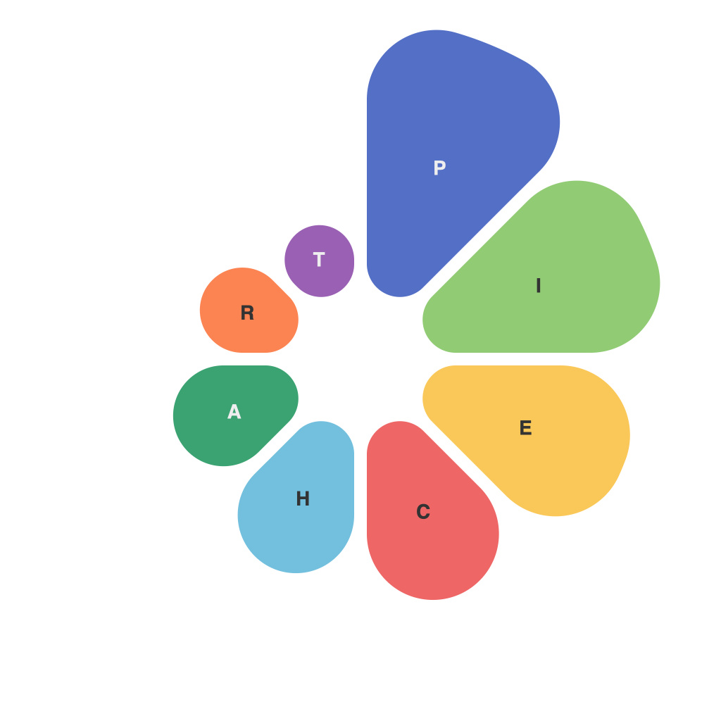
In today’s data-driven world, the ability to effectively interpret and present information is crucial in various sectors, ranging from business analysis, scientific research, to everyday personal decision making. One of the most powerful tools in the visual communication arsenal is pie charts. They are widely favored for their simplicity, ease of understanding, and their ability to highlight proportions succinctly. However, not every pie chart is equally effective. The secret lies in mastering the art of designing a pie chart that not only communicates the intended message clearly but also engages the audience effectively.
### Purpose of Pie Charts
Pie charts are used to represent data in a way that shows the relationship of different parts to the whole. They are particularly effective when you have a limited number of categories, you’re dealing with percentages, and you need to provide an at-a-glance comparison.
### Key Principles in Designing Effective Pie Charts
**1. **Simplicity is Key:** A good pie chart should ideally have no more than 5-7 slices to avoid overcrowding and ensure readability. More slices can often be confusing and are better presented in a bar chart or line graph.
**2. **Use of Color:** Color is a powerful tool in data visualization. However, it should be used wisely. High contrast colors can make slices easy to distinguish, while complementary colors can enhance visual appeal. Ensure that the colors also align with your brand or the context of the data.
**3. **Labeling:** Each slice should be clearly labeled to avoid the chart becoming overly crowded and to ensure that the meaning is understood. Opt for simple, readable fonts and position labels close to their corresponding sectors.
**4. **Focus on Understanding:** The primary goal of a pie chart is to convey a comparison in parts of a whole. Make sure that the comparison is immediately clear and that each slice has a distinctive angle that visually relates to its proportion.
**5. **Data Transparency:** Always accompany the chart with a table, graph labels, or legends to provide a solid grounding for the visual presented. This transparency helps in validating the numbers and clarifies any potential ambiguities.
### Advanced Techniques for Enhanced Presentation
**1. **3D Effects and Exploded Slices:** These can be used to make certain slices stand out or to add depth. However, they should be used minimally, as overuse can give the chart an unnecessary, unprofessional look.
**2. **Interactive Pie Charts:** In digital formats, interactive pie charts can be incredibly effective. They allow users to hover over slices or touch them to see detailed information, making complex information easier to understand and engage with.
### Case Study: The Power in Practical Application
Consider the example of a nonprofit organization aiming to highlight the distribution of their annual fund’s budget across various programs. A well-designed pie chart can instantly communicate which programs are the most funded, which areas are underserved, and which might require additional resources. The clarity and simplicity of the pie chart can lead to informed discussions, potential funding adjustments, or inspire renewed focus on specific areas.
### Conclusion
Pie charts, when wielded skillfully, are a potent tool in data visualization. They make complex data sets more accessible, engaging, and comprehensible, providing a clear picture of the relationship between different elements of a whole. Whether in classrooms, boardrooms, or daily meetings, the ability to create and interpret pie charts becomes a valuable skill. With a focus on simplicity, color usage, labeling, understanding, and engagement, one can unleash the true power of data visualization in their personal and professional endeavors.

