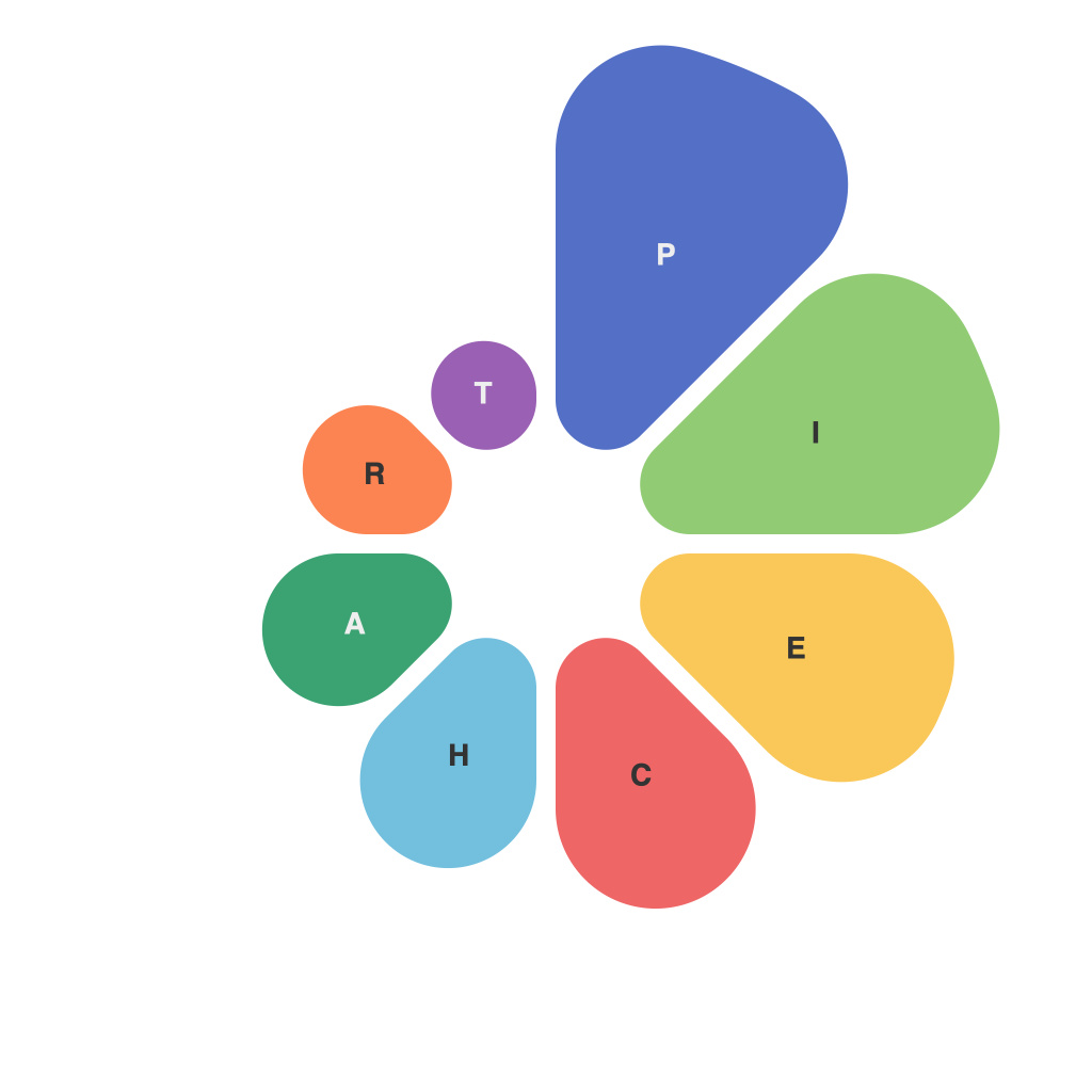
**Unlocking the Power of Pie Chart Mastery: Techniques and Tips for Effective Data Visualization**
Pie charts, once a cornerstone of visual communication, often find themselves in the shadow of more modern and flexible data visualization tools. Yet, when used appropriately, pie charts maintain a unique charm in effectively conveying the relative sizes of categories in a dataset. This article aims to explore the lesser-known facets of pie chart mastery, providing insights into why, when, and how they should be employed to achieve impactful and readable data visualization.
### **Understanding the Power Dynamics of Pie Charts**
Pie charts are graphical representations of data where each slice (or sector) corresponds to a category, illustrating how the whole dataset is distributed among these categories. Despite their simplicity, pie charts can excel in highlighting the proportionality, making it straightforward to compare parts of the data against the whole at a glance.
### **When to Use a Pie Chart**
– **Single Dataset Analysis**: Pie charts work best when you’re dealing with a single dataset that needs to be compared to a whole. When analyzing a dataset where the focus is on the relationship of individual categories to the overall total, a pie chart can reveal insights quickly and effectively.
– **Comparing Proportions**: If your aim is to compare the relative sizes of categories (e.g., market shares or demographic distribution), pie charts provide a clear visual comparison.
– **Categorically Consistent Data**: Ensure the categories are mutually exclusive and collectively exhaustive. Pie charts are not suitable for sequential data or those that require ordered comparison.
### **Navigating the Challenges of Pie Charts**
– **Legibility and Readability**: Pie charts can become difficult to read when there are too many categories, making it hard to accurately interpret the sizes of the smaller slices. Use no more than five or six slices in a single chart.
– **Equal Arcs and Visual Perception Bias**: Human eyes are better at perceiving linear measurements than angles and areas. This can lead to misinterpretation, especially with slices close to the center. Ensure that labels for less significant categories are clear and positioned well to guide the viewer’s attention.
### **Enhancing Pie Chart Design for Clarity and Impact**
– **Use of Color**: Effective use of color can enhance the visual appeal and make the chart more engaging. However, use color judiciously to emphasize key categories and maintain clarity. Tools like the color wheel can guide in choosing colors that are not only visually appealing but also perceivable to a wide audience.
– **Adding Value with Legends and Labels**: While pie charts lack the linear scale and reference points of bar charts or line graphs, labels and legends play a crucial role in ensuring the chart is easily understandable. Avoid overcrowding by placing labels directly on the chart or using a legend if necessary.
– **Experiment with Animation and Interactivity**: For presentations and reports where dynamic content is appreciated, consider animations that reveal slices or interactivity that allows users to hover over slices for more detailed information. This can be especially effective in digital formats.
### **Conclusion**
Pie charts, though sometimes overshadowed by more versatile visualization tools, possess a unique power in simplifying complex data into easily digestible proportions. Mastering their use involves understanding their strengths—emphasizing proportions in a visually appealing format—and addressing their limitations, such as ensuring clarity and readability. By applying the techniques and tips discussed, pie charts can become a valuable asset in your arsenal of data visualization tools, effectively communicating insights in various datasets and presentations.

