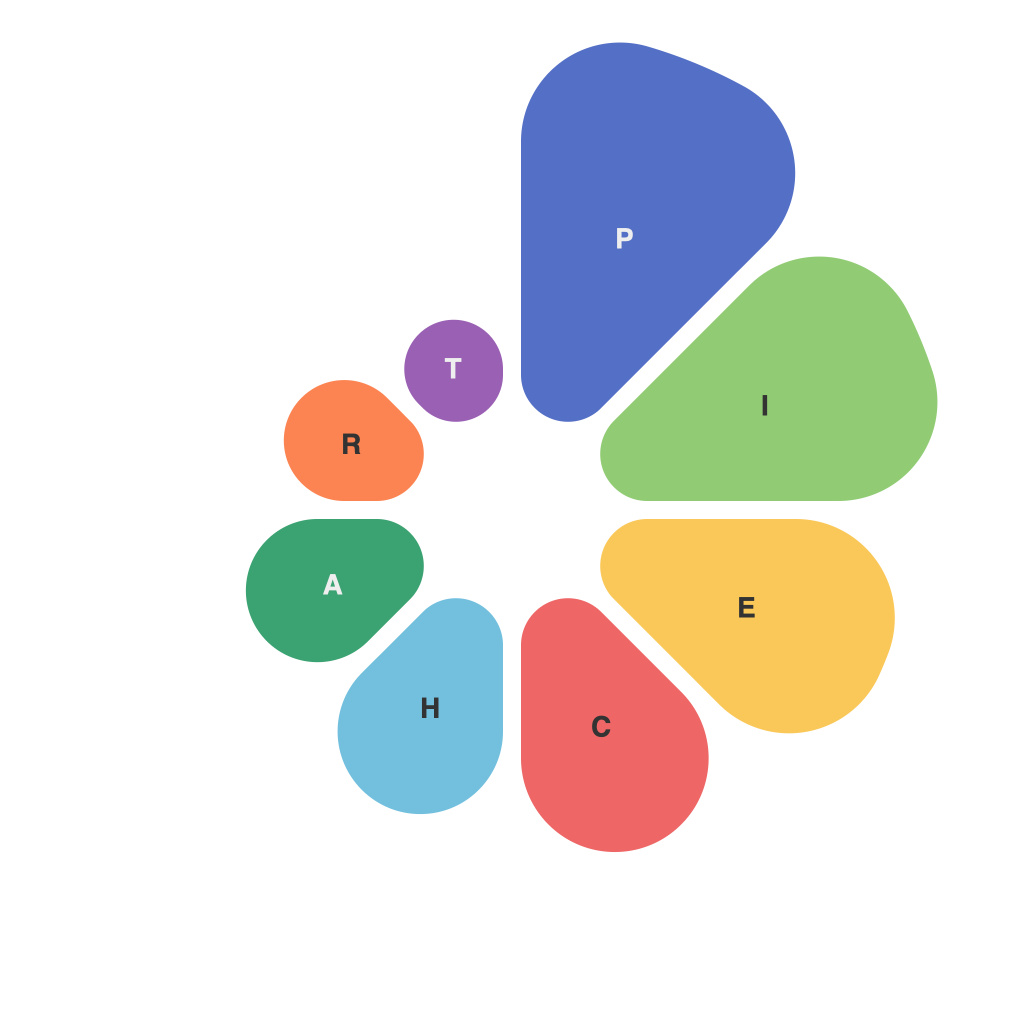
Unlocking the Power of Pie Charts: A Comprehensive Guide to Mastering Data Visualization
In the vast landscape of data visualization, pie charts are akin to a lighthouse guiding analysts, researchers, and audiences alike towards the essence of the information contained within. Often underappreciated yet incredibly effective, pie charts provide a visual summary of parts to a whole. This article delves into the profound potential of utilizing pie charts to craft effective data visualization, offering a comprehensive guide to mastering their application through strategic tips and best practices.
**Understanding the Basics**
Before leaping into the complexities, it’s crucial to grasp the fundamental aspects of pie charts. A pie chart is essentially a ‘circle graph’ divided into sectors, each representing a portion of the overall data set. The size of each sector correlates directly with the percentage it represents of the total data. For example, if visualizing the market share of various smartphone brands, each brand would occupy a sector in the pie chart, the size of which reflects its share of the market.
**When and Why Use Pie Charts**
As versatile as they may seem, pie charts aren’t a one-size-fits-all solution in the world of data visualization. They should be considered as an effective tool when you want to:
– **Present Simple Comparisons**: If your aim is to compare the proportions of categories within a whole (e.g., sales by territory, budget allocation across departments), a pie chart might be the right choice.
– **Emphasize Percentage Distribution**: When the emphasis is on showcasing how different parts contribute to the whole, and the differences in segment sizes are critical (e.g., distribution of energy sources for a country).
**Best Practices for Effective Pie Charts**
To ensure that your pie charts are not only visually appealing but also actionable for your audience, consider the following tips:
1. **Limit Sectors**: Avoid cluttering the chart with too many categories. A pie chart should ideally not have more than 5-7 categories. When you have more data points, consider using a stacked bar chart instead.
2. **Ensure Readability**: Always label your sectors with their corresponding values in percentages or, if appropriate, actual quantities. Using clear font styles and sizes ensures that the information is easily readable.
3. **Avoid 3D Effects**: While 3D effects might seem appealing, they can distort the viewer’s perception of the relative sizes of the sectors, making it difficult to accurately compare the data.
4. **Sort by Value**: Arrange the sectors in the order of their magnitude. Typically, place the largest sector first, followed by the next largest, and so on. This sorting not only makes the chart more intuitive but also aids in identifying the largest contributors at a glance.
5. **Ensure Different Colors for Distinction**: Assign distinct colors to each sector to differentiate them easily. This color distinction helps in rapid identification and differentiation among smaller segments. However, it is equally crucial not to use too many colors, which can overwhelm the viewer and compromise readability.
**Advanced Tips for Mastery**
Moving beyond the basics can unlock the full potential of pie charts:
1. **Use of Legends**: For charts with multiple datasets, incorporate a legend that links pie sectors to their respective categories. This enhances clarity and avoids the need for sector labels, especially when the number or size exceeds what is readable.
2. **Interactive Pie Charts**: In digital media, especially in web applications, leverage interactive pie charts. They can be designed to explode certain sectors and reveal more detailed data upon hover or click, providing a more engaging and enlightening experience for the viewer.
3. **Color Psychology**: Carefully choose colors that not only differentiate your segments but also evoke the right emotional response in your audience. For instance, blue might convey trustworthiness, green might inspire a sense of freshness or growth, and so on, depending on your message and audience.
**Conclusion**
The power of pie charts lies in their ability to provide quick, intuitive insights into the composition of data. By following the best practices and advanced tips outlined herein, one can harness the full potential of pie charts to enhance the effectiveness of data visualization efforts. However, it is also essential to be aware of the limitations and appropriate times to use pie charts, ensuring that the visual representation not only adds clarity but also does so with the minimal amount of distortion and misinterpretation.
So, the next time you look at a pie chart, remember it’s more than just a simple graphic; it’s a tool that unlocks deeper understanding and communicates insights effectively—when used wisely.

