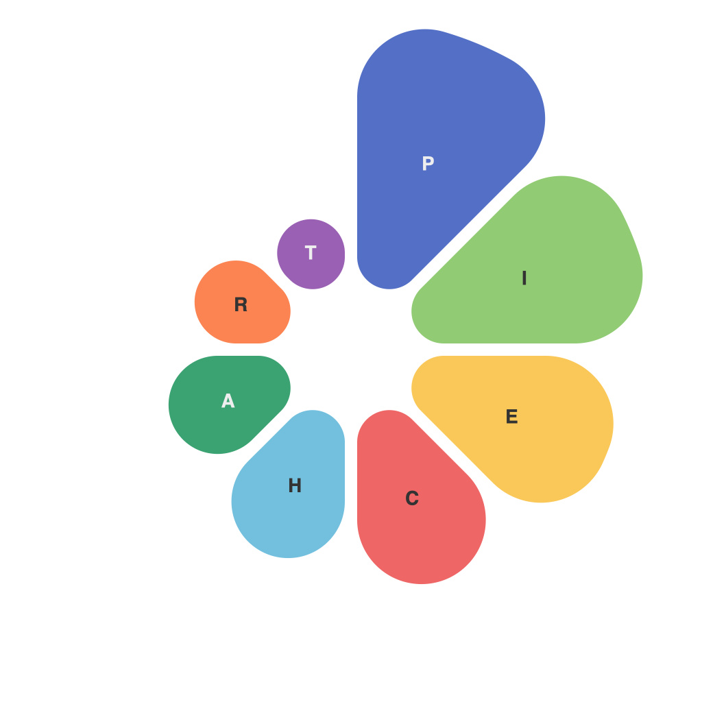
Unlocking the Power of Visual Representation: A Comprehensive Guide to Mastering Pie Charts
In the vast sea of data, visual representation often acts like a lighthouse, guiding us through the fog of raw numbers and leading us to insights hidden within the data’s depths. One such tool, often underutilized, is the pie chart. A simple yet potent graphic, pie charts provide a visually intuitive way to understand proportions and relationships within data sets. In this article, we will take you on a journey to mastering pie charts, unlocking their full potential in effectively communicating your data story.
### Understanding Pie Charts
**Basic Definition**: A pie chart is a circular statistical graphic that is divided into slices to illustrate numerical proportions. Each slice represents a category, with its size corresponding to the value of the category.
**Why Use Pie Charts**: They are particularly valuable when you need to display how different categories contribute to a whole. If your data can be easily divided into distinct parts and you want to show the relative sizes of each part, a pie chart can be very effective.
**Limitations**: However, pie charts can be less effective for showing detailed amounts if there are too many slices, or when exact values are more important than the general proportions. They are also not ideal for comparing data across multiple pie charts due to issues with human pattern perception and the difficulty in accurately judging angle differences.
### Mastering Pie Charts: Key Elements
#### 1. **Data Suitability**: As mentioned, use pie charts for categorical data where you want to compare values against the total. They are most effective when you have a small number of categories. For more than 5-7 categories, consider a different chart type, such as a bar chart.
#### 2. **Segment Labeling**: Ensure each segment is clearly labeled with values or percentages. This allows viewers to understand the exact proportion each slice represents. Consider implementing data labels to provide precise values, or percentage labels if the exact values are less critical.
#### 3. **Color Usage**: Color choice can significantly impact the readability and emotional impact of a pie chart. Use colors judiciously, ensuring that segments with similar values aren’t confused or colored in a way that might be distracting. Differentiating colors should facilitate a clear distinction between segments.
#### 4. **Simplicity Over Complexity**: Aim for simplicity. Focus on clarity and directness to enhance comprehension. Avoid too many labels, and use legends sparingly. When necessary, a legend should be used, and it should be placed in a way that doesn’t obstruct any slices of data.
#### 5. **Consistency**: Use consistent sizing in your chart to ensure that the relationships between different segments are accurately perceived. Uneven sizing can lead to misinterpretations, making the chart less effective in conveying information.
### Advanced Tips
#### 1. **Use of 3D and Exploded Slices**: These features can make pie charts more visually engaging but should be used sparingly. Excessive use of 3D effects can make it harder for the viewer to perceive differences in size or proportions. Exploded slices can highlight specific data points, but their effective use requires careful planning to avoid misleading the audience.
#### 2. **Comparative Analysis**: When pie charts need to be used in comparative analysis, consider adjacent charts or a single chart with stacked or split segments to help viewers see trends and comparisons more clearly.
### Conclusion: Unlocking the Power with Practice
Pie charts, when used thoughtfully and strategically, can transform your data into engaging, insightful visual stories. Mastering the finer nuances of pie charts involves understanding when and how to apply them, along with best practices for visual simplicity and clarity. This comprehensive guide aims to provide a solid foundation for integrating pie charts into your data visualization toolkit, ensuring they serve as effective tools for communication. With practice, you’ll be able to unlock the true potential of these visual representations, making complex data accessible to a wide audience.

