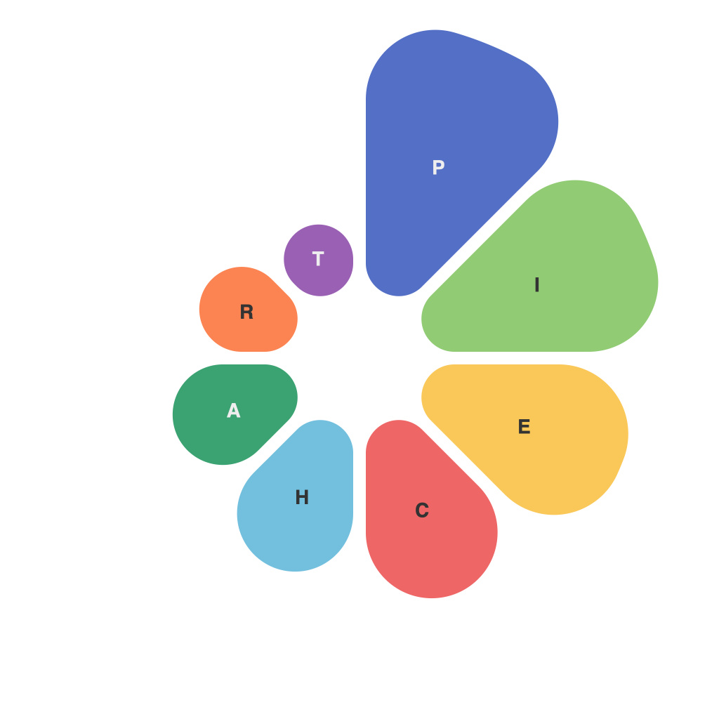
Unlocking the Secrets of Data Visualization: Mastering Pie Charts for Effective Communication
In the world of data analysis and information sharing, effective communication plays a critical role in conveying insights and understanding to various audiences. One popular and powerful tool for simplifying complex data is the pie chart, a graphical representation that provides a clear, accessible view of parts of a whole.
Pie charts, a circular graph that divides data into portions, each representing a different category, often used to illustrate proportions. They’re intuitive to most people’s visual sense, and their straightforward design makes them perfect for showing percentages and relative proportions. Here’s how to master pie charts for effective communication.
### 1. **Choosing the Right Data for Pie Charts**
Pie charts excel when visualizing data in proportions or as percentages. Use them to show distributions where the whole data set represents something tangible or total, like market share, budget allocations, or demographic breakdowns. Avoid using them for detailed comparison or when there are more than a few categories, as this can make the chart cluttered and hard to read.
### 2. **Effective Data Presentation**
– **Clarity of Data:** Ensure that the data represents meaningful segments and that these segments are not too numerous. Three to seven categories are generally manageable for a clear and effective pie chart.
– **Sorting Data:** Arrange the slices from the largest to the smallest in a descending pattern starting from the top. This visual ordering helps the viewer quickly grasp the major contributors to the whole.
### 3. **Segment Style and Color Selection**
– **Colors:** Contrasting colors, especially contrasting dark and light colors, help differentiate among segments easily. Consider using color schemes that appeal to your audience but also ensure that the chart doesn’t look too busy. Stick to a maximum of 7 colors for consistency and readability.
– **Typography:** Ensure that the labels are clear and readable, even from a distance. Use simple fonts and appropriate sizes. Optionally, use the percentage values alongside the labels if space and clarity permit.
### 4. **Enhancing Readability and Aesthetics**
– **Data Labels:** Consider avoiding data labels for minor segments if space is an issue, as they can clutter the chart. Instead, rely on the legend for such segments.
– **Exploding Slices:** Use exploded slices to highlight a particular segment, perhaps the one with the highest value, to emphasize its importance. However, use this sparingly as it draws excessive attention from other segments.
### 5. **Accessibility and Universality**
Pie charts are universally understood, making them an excellent tool for global audiences. Ensure all data used in the chart is accessible and clear to viewers with potential visual impairments, by providing alternative text descriptions for each segment.
### 6. **Integration with Other Visuals**
– **Context Creation:** Consider combining pie charts with other visual representations like bar charts or trend lines in a dashboard format to give a complete picture. This integration aids in telling a more comprehensive and nuanced story about the data without overwhelming the viewer.
### 7. **Software and Tools for Creation**
– **Utilize Design Software:** Tools like Microsoft Excel, Google Sheets, or specialized data visualization software such as Tableau or Power BI, offer easy-to-use features to create, customize, and optimize pie charts.
### Conclusion:
Pie charts remain an indispensable tool in the data visualization arsenal, providing a clear and accessible means to illustrate proportions and percentages. Their simplicity and intuitiveness make them effective in a wide range of communication scenarios. By following the guidelines discussed, anyone can master the use of pie charts to enhance the presentation and understanding of data in professional and personal settings alike.

