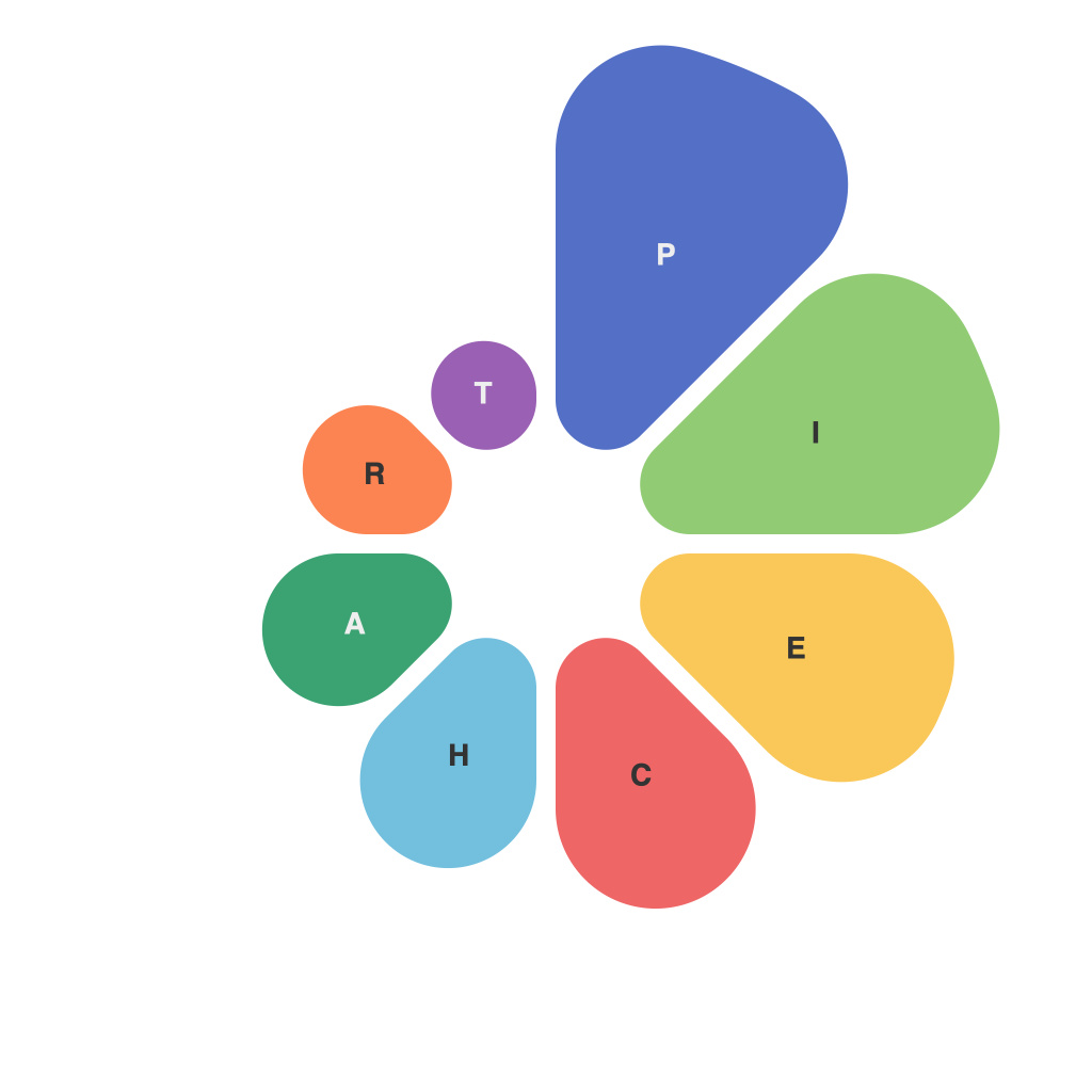
**Unlocking Visual Insights: A Comprehensive Guide to Mastering Pie Charts**
Pie charts, a fundamental tool of the data visualization arsenal, serve as a powerful means to represent data in a manner that emphasizes proportions. They are circular statistical graphics that divide the full circle into sectors, each sector illustrating a constituent value within a dataset. The visual clarity of these charts makes them particularly useful for depicting relative sizes of categories when comparing parts to a whole. Mastering pie charts involves understanding their construction, interpreting their nuances, and applying best practices for their effective use. This article delves into these aspects to equip you with the skills necessary to harness the full insight potential of pie charts.
### **Understanding the Basics**
**Definition and Components**: A pie chart displays data as slices (or “pie wedges”) of a circle, where the size of each slice represents the magnitude of its corresponding data category. Each slice is proportional to the entire dataset; thus, the area of a slice equals the fraction of the total size represented by that category. Essential components include the pie itself, the categories (labels), and the slice sizes, which convey the relative magnitude of each data point.
### **Effective Use**
**Comparing Parts to a Whole**: Pie charts excel in illustrating how different parts contribute to the total. This makes them especially useful for datasets that have a clear ‘whole’ that needs to be broken down into more understandable segments.
**Simplicity and Clarity**: Use fewer than seven categories to maintain clarity. More slices can complicate the chart, making it harder to interpret. Ensure that each element is distinct enough to differentiate easily.
### **Best Practices for Design**
**Labeling**: Clearly label each segment with its corresponding category and percentage or number value. If space is limited, consider an adjacent table listing all data categories. Using a legend can be an alternative where direct space on the chart is scarce.
**Color Usage**: Use distinct yet harmonious color schemes to differentiate segments. Ensure there is enough contrast so all colors can be distinguished at a glance. Stick to a maximum of five distinct colors to reduce visual clutter.
**Data Size and Clarity**: Prioritize using larger, more distinguishable data slices near the top of the chart. This facilitates immediate understanding of the most significant contributors to the total.
### **Avoiding Common Pitfalls**
– **Overloading with Data**: Keep the number of categories minimal to avoid confusion. If a dataset includes numerous categories, consider using a different type of chart.
– **Misleading Visuals**: Do not assume that the human eye perceives angles with the same proportional error. A small angular difference can lead to a significant misreading of proportions.
– **Overcomplexity**: Do not overlay detailed texts or colors on segments that are too small, typically below 10%. This can make them nearly impossible to read or compare accurately.
### **Interpreting Insights**
To effectively interpret a pie chart, start by understanding the total sum it represents. Compare the sizes of the slices to identify major contributors or trends. This can help in making quick judgments about the relative significance of different categories.
### **Conclusion**
Pie charts, with their inherent ability to visually organize and compare parts of a whole, are an indispensable tool in the data visualization toolkit. Mastering their use is crucial for effectively communicating complex data. By following best practices in design and application, one can ensure that pie charts deliver their full potential in providing insights that are readily understandable at a glance. Whether for business reports, academic presentations, or general information sharing, pie charts provide a powerful and elegant way to make data meaningful and memorable.

