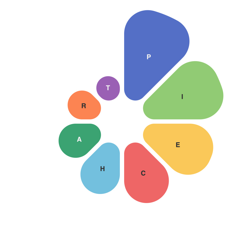
Unlocking Visual Insights: A Comprehensive Guide to Mastering Pie Charts for Data Presentation
Pie charts are an essential tool in the data visualization arsenal. They allow visually depicting the composition of a whole into the various categories or parts which constitute it. Due to their straightforward and intuitive nature, pie charts have been widely adopted in various fields, from market analysis to academic research. However, mastery over this tool requires understanding its nuances, knowing under what circumstances to use it effectively, and being capable of presenting data that is not only visually appealing but also effectively communicates insights.
**Basics of Pie Charts**
A pie chart is a circular statistical graphic that divides the whole into slices to illustrate numerical proportions. Each sector represents a category or an item, and the proportion of the slice relative to the entire pie reflects the proportion of the category within the whole.
**When to Use a Pie Chart:**
Pie charts are particularly useful when you need to compare parts of a whole, especially when the number of categories is limited. They are ideal for demonstrating data where showing the part-to-whole relationship is more critical than the absolute values themselves.
**Choosing the Right Data**
For effective data presentation, ensure your data meets the following criteria:
– The data should be categorical and not continuous.
– There should be a limited number of categories, typically no more than 7 to maintain readability.
– The total value of the data set should be meaningful, often a count or a sum reflecting the whole.
**Designing Your Pie Chart**
1. **Sorting by Magnitude**:
Sort the categories in descending order of their percentage share to make the most significant components easily visible from glance.
2. **Color Usage**:
Use distinct colors for each sector to enhance readability. Avoid using too many colors, which can be overwhelming. Consider using color blindness friendly palettes.
3. **Labels and Legends**:
Always include labels for each sector. Legends are secondary for straightforward charts but become necessary when space constraints or overlapping labels are an issue.
4. **3D Effects**:
While 3D pie charts can look impressive, they can distort the perception of the size of each slice, making the chart less readable. Opt for the 2D version for better clarity and accuracy.
**Analyzing the Data**
Upon visualizing the pie chart, it’s crucial to analyze it not just based on the proportions of each slice but also consider the context and story it tells. This might involve comparing different periods, segments, or categories to identify trends, outliers, or anomalies.
**Tips for Effective Communication**
– **Simplicity**: Avoid overly complex charts with too many slices and ensure the chart isn’t cluttered with unnecessary information.
– **Accuracy**: Double-check your calculations and ensure the total percentages of the pie chart equate to 100%.
– **Consistency**: If presenting in a series, maintain consistent design elements, such as colors and labels, across all charts for a cohesive look.
– **Interactive Options**: Where feasible, provide interactive options, such as tooltips or dynamic slicing, to allow the audience to explore the data in more detail.
In conclusion, pie charts, while simple, when used effectively, can powerfully illustrate the relative sizes of different parts of a whole. By understanding when and how to use them correctly, and being mindful of design principles and insights they aim to convey, mastering pie charts enables the creation of compelling data narratives that resonate with the audience. Through this comprehensive guide, we’ve navigated the ins and outs of pie chart creation and use, equipping you with the tools necessary to unlock deeper, more insightful data presentations.

