Unlocking Visual Insights: Mastering the Art of Creating Effective Pie Charts in Data Visualization
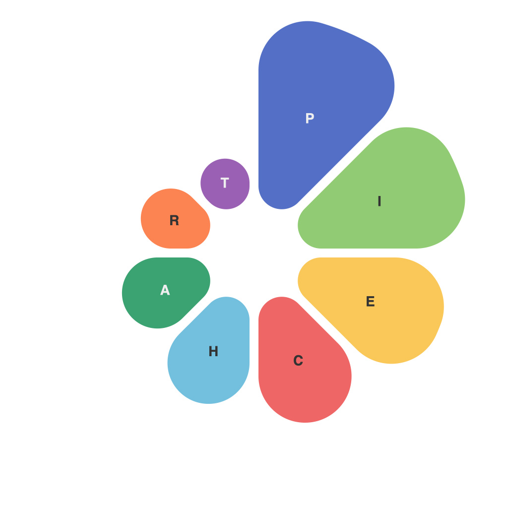
In the realm of data visualization, pie charts play a crucial role in representing data in an easily consumable format. They provide a clear and visual summary of proportions within a whole, making it ideal for conveying relative comparisons at a glance. However, like any tool, leveraging the full potential of pie charts requires a deliberate and thoughtful design approach. This article aims to guide you through the essential steps and best practices for creating effective pie charts that not only communicate data clearly but also engage your audience.
### Understanding Your Audience and Data
The first step in creating an effective pie chart is understanding who you’re presenting the data to and what they need from it. Tailoring your chart to your audience’s level of expertise and the specific questions they might be asking is crucial. For instance, using more sophisticated labels and highlighting techniques for an audience accustomed to dealing with complex data structures can be more effective than a chart intended for general consumption.
### Data Selection and Categorization
Select the right data to include in your pie chart, focusing on data segments that accurately represent the story you want to tell. Large segments should be easily distinguishable from smaller ones to ensure clarity. Consider grouping minor categories under an ‘Others’ category if several segments are too small or numerous to effectively visualize. This maintains the chart’s simplicity and readability without losing important information.
### Effective Use of Colors
Colors can dramatically influence how your audience perceives the data in a pie chart. Use distinct yet harmonious colors to enhance readability and distinguish between categories, especially in visually rich environments where multiple charts are present on a single page or screen. Avoid using colors that blend easily or cause confusion in color perception issues. Tools like Color Theory guidelines or accessibility testing can be helpful in making the right color choices.
### Labeling and Annotations
Label each slice of the pie chart with the category name and its corresponding percentage (ideally, both to aid in understanding and accessibility). Ensure labels are clear and not overlapping. Use contrasting colors for labels against the chart background to make them stand out. Annotations such as a title that clearly describes what the pie chart represents and additional labels for key categories can enhance user comprehension.
### Choosing and Adjusting Pie Chart Types
Decide whether a simple pie chart or a 3D pie chart would best serve your purpose. While 3D might add an engaging visual dimension, it can also introduce unnecessary complexity that obscures data clarity. Consider using donut charts for more complex structures that still maintain readability and allow for the addition of a central label or category. Adjust the size and angles of pie slices to better show distinctions, especially in charts displaying very different proportions.
### Data Ordering
Arrange your pie slices from largest to smallest to facilitate ease of comparison. This natural progression helps users perceive the relationship between categories at a glance. However, for particularly intricate data relationships where the story is in comparing adjacent slices, consider arranging categories in a logical or thematic order that enhances storytelling.
### Implementing Chart Annotations (Pineapple Charts)
Pineapple charts or pie with donut center, offer additional space for annotations such as trend arrows or comparative data, enhancing the depth of the visualization. These can be particularly effective in business reports or research presentations where a more detailed look at underlying trends is required.
### Testing and Feedback
Before finalizing your pie chart, test it with a small group representative of your audience to gather feedback on its clarity, visual impact, and effectiveness in communication. Adjustments might be necessary to improve user engagement or to ensure the data is accessible to all types of viewers, including those with visual impairments. Tools like screen readers and color contrast checkers can aid in accessibility testing.
### Conclusion
Creating effective pie charts is an art that combines technical skills with strategic design thinking. By considering your audience, selecting the right data, employing best practices in color and label usage, and testing your design, you can create pie charts that not only communicate information clearly but also engage and enhance the user experience. Remember, the goal of visualization is to make complex data simple and accessible to everyone, ensuring that the insights are easily understood and appreciated by your audience.

