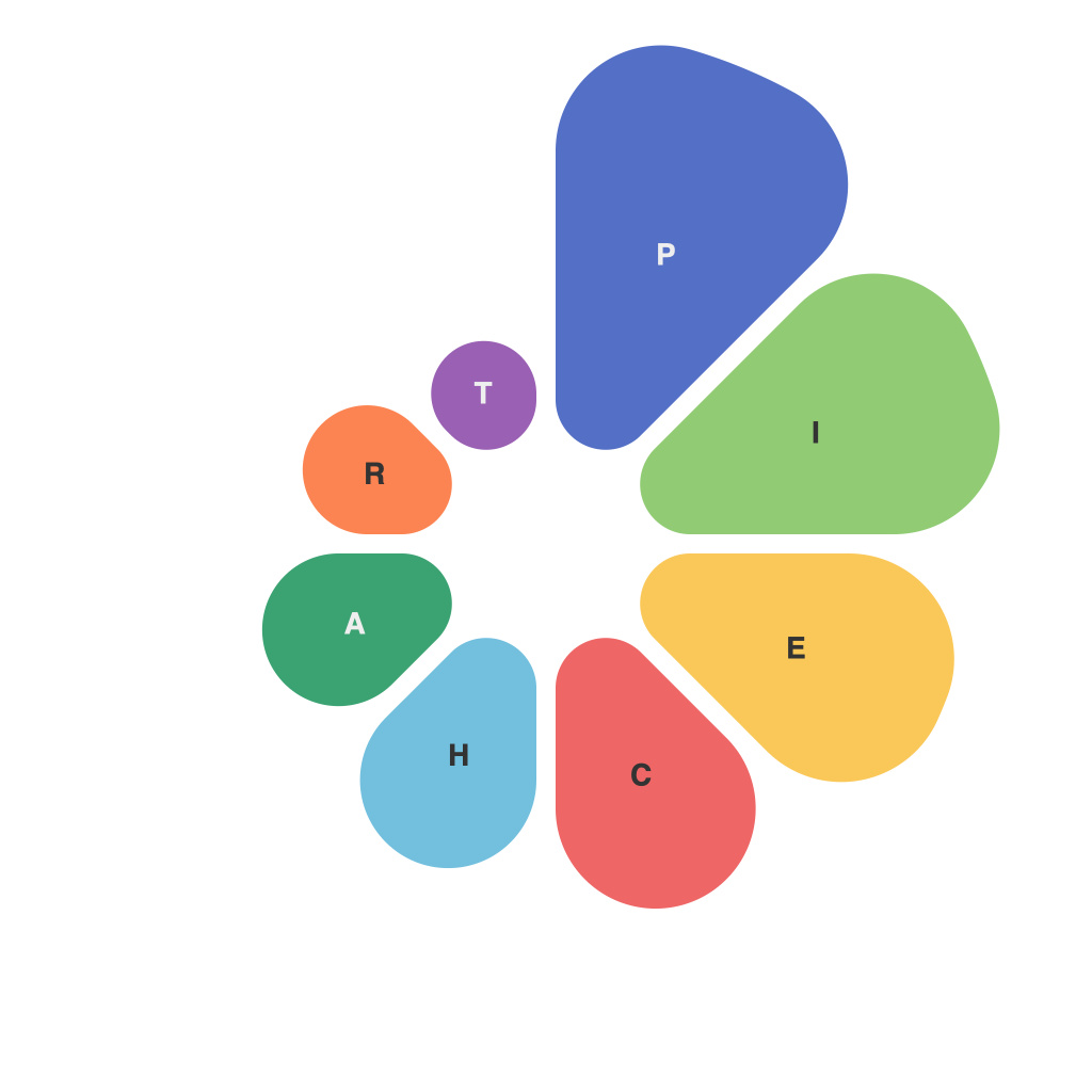
Unlocking Visual Insights: Mastering the Art of Data Representation with Pie Charts
Pie charts have played a pivotal role in visual analytics since their inception, offering a simple yet profound way to analyze and dissect various datasets. This chart type employs a circular graph to illustrate proportions, making them invaluable for both qualitative and quantitative data visualization. Pie charts provide clarity, insight, and a visual representation that is readily accessible and highly comprehensible to a broad audience. Nevertheless, the effectiveness of this chart type hinges on several crucial factors. This article delves into the nuances of pie charts—when to use them, how to interpret them, and best practices to facilitate clearer, more insightful visualization.
### Understanding When to Use a Pie Chart
Pie charts are most effective under specific circumstances:
1. **Limited Categories:** When the dataset is comprised of a few discrete categories or segments. Pie charts lose their simplicity and effectiveness with large datasets, making it difficult to distinguish between similar slice sizes.
2. **Comparing Parts to Whole:** They are particularly useful for highlighting how a total (100%) is divided among different categories. This is particularly evident in market share analysis, budget allocation, and demographic studies.
3. **Ease of Explanation:** Their visual nature makes it straightforward to explain the distribution and proportions to stakeholders with little analytics background.
### How to Interpret a Pie Chart
Interpreting pie charts involves examining the spatial relationship between slices. Here are a few key points to keep in mind:
1. **Size Matters:** The visual size of a slice corresponds directly to the value it represents. Larger slices signify more significant proportions of the total.
2. **Labeling:** Clear labels for each slice can significantly improve readability and understanding, especially for smaller charts or when slices are closely sized.
3. **Color Coding:** Consistent use of color codes helps in distinguishing between different categories easily, adding an extra layer of visual impact.
### Best Practices for Effective Data Representation with Pie Charts
1. **Limit Categories:** Keep the number of categories to a minimum—ideally no more than six slices—to maintain clarity and a clear distinction between each part.
2. **Sort Slices:** Arrange the slices from largest to smallest, starting from the 12 o’clock position, to enhance visual hierarchy and clarity. Include a total value near the chart to show context.
3. **Use Differing Sizes and Colors:** Utilize distinct colors for each slice and vary font sizes or opacity for better readability. The use of contrasting colors aids in quickly identifying critical data points.
4. **Avoid 3D Effects:** While 3D effects can make a pie chart look more appealing, they can distort the perception of size, leading to misinterpretation. Stick to a 2D approach for simplicity and precision.
5. **Interactive Elements:** For digital presentations, incorporating interactive pie charts can enrich user experience. This typically allows viewers to hover over slices for additional data details or drill down for more comprehensive analysis.
6. **Data Accuracy:** Ensure the data being visualized is accurate and up-to-date. Misleading or erroneous data can lead to incorrect conclusions and interpretations.
### Conclusion
Pie charts remain a staple in the data visualization realm due to their simplicity and effectiveness in highlighting proportions within a dataset. By considering the use case, employing best practices, and ensuring accuracy, you can harness the power of pie charts to unlock deeper insights and facilitate more informed decision-making. Whether analyzing market trends, budget distributions, or demographic profiles, pie charts provide an accessible means of communicating complex data concisely, offering a visual aid to understanding proportions and parts of a whole.

