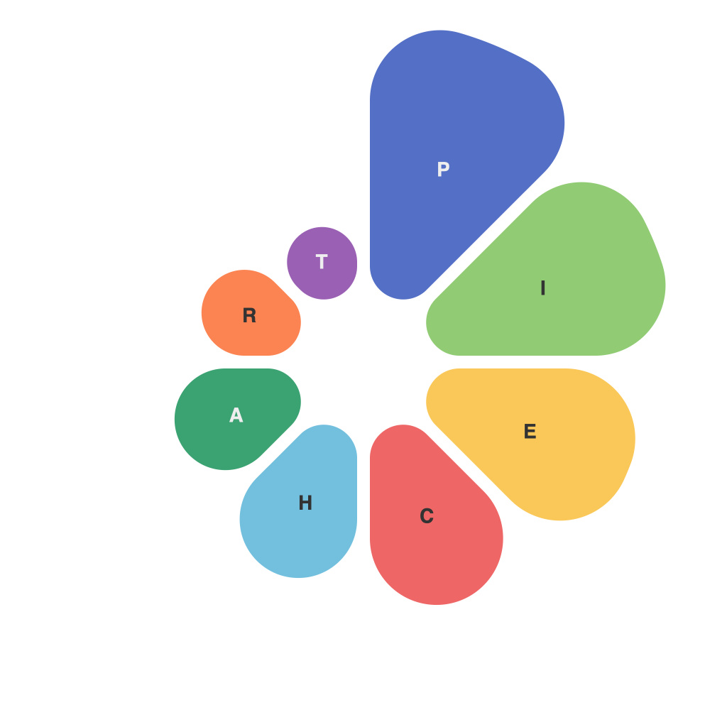
Unlocking Visual Insights: Mastering the Art of Effective Pie Charts in Data Presentation
Pie charts are graphical representations that illustrate proportions and distributions of data through circular sections. Although simple in design, pie charts play a crucial role in data storytelling by providing an immediate visual understanding of comparative data sizes. In this article, we will delve into the intricacies of pie charts, exploring how to effectively use them to communicate complex information, and also uncovering common pitfalls to avoid.
### Why Pie Charts Are Crucial in Data Presentation
Pie charts are ideal when the dataset includes categories that have comparable sizes and the relationship between their portions is crucial for understanding the data. They are particularly effective for showing proportions of a whole, making it easy for audiences to grasp the composition of variables at a glance.
### Best Practices for Creating Effective Pie Charts
1. **Limit the Number of Slices**: Too many categories can drown out the visual message, leading to a cluttered appearance. For best results, focus on a maximum of 5-7 categories. This ensures each segment is clearly visible and easy to understand.
2. **Use Color Wisely**: Color not only catches the eye but also influences perception and memory. Apply a consistent color scheme that aligns with your brand while ensuring high contrast between categories so they’re easy to distinguish. For instance, use contrasting colors for top and bottom sections to highlight disparities.
3. **Display Data Labels and Percentages**: Clearly labeling each segment with both percentage values and category names is essential for complete information. However, bear in mind that if labels are too cluttered, it might affect readability. Consider using an interactive solution, where clicking on a slice reveals the details, especially for digital presentations.
4. **Sort by Size**: Arrange the slices in order of size, either ascending or descending, from outer to inner rings if you are using a donut chart. This helps in emphasizing the significance of larger categories at a glance.
5. **Use 3D or exploded slices with caution**: While these can visually enhance a chart, they also introduce complexity and can distort perception of slice sizes. They should be used strategically and sparingly, particularly to highlight specific categories rather than to enhance visual effects.
### Avoiding Common Mistakes
– **Overuse of 3D effects or gradients** can make charts difficult to interpret, especially on printed materials or small screens. Stick to simple, flat colors for more clarity.
– **Lack of context** can leave viewers uncertain about what the pie chart represents. Always provide a brief caption or annotations to clarify the categories and the whole they represent.
– **Misleading the audience** with pie charts can occur if the sizes of categories are not well proportioned or if the dataset has too many categories to effectively communicate meaningful comparisons. Choose the right chart type for your data and avoid using pie charts when a bar chart, line graph, or another type of chart might more effectively convey your data.
### Conclusion
Pie charts, when used correctly, serve as powerful tools for visual storytelling, enabling audiences to quickly comprehend the distribution of data across various categories. By adhering to best practices such as limiting the number of slices, using color effectively, ensuring clarity with data labels, and avoiding common pitfalls, pie charts can enhance the clarity and impact of your data presentations. Remember, the key to mastering pie charts lies in balancing simplicity and effectiveness, making the information easily digestible for your audience.

