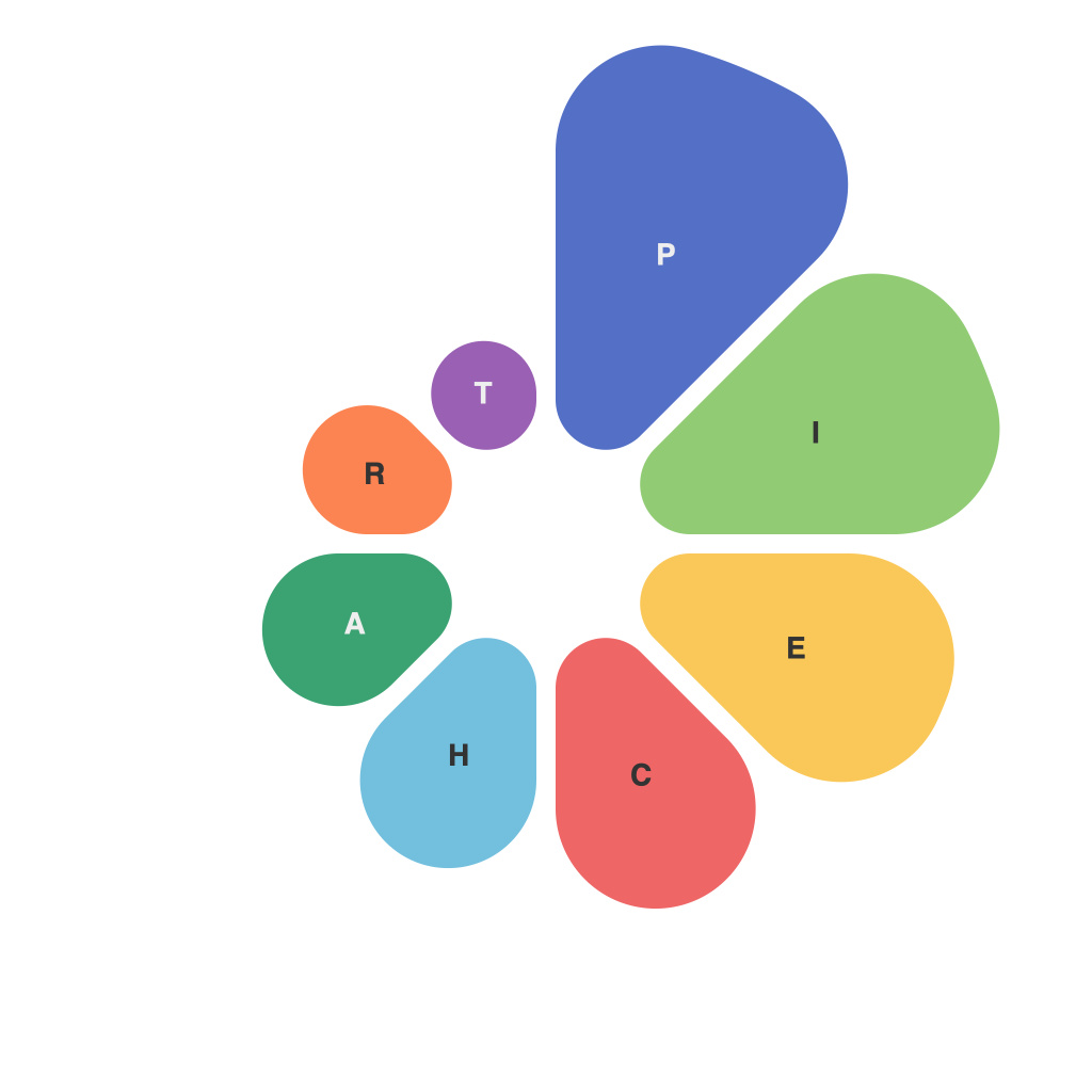
Unlocking Visual Insights: Mastering the Art of Pie Chart Creation and Interpretation
Pie charts occupy an important space in data visualization, especially for presenting information that highlights parts of a whole in a visually appealing way. As such, creating and interpreting pie charts effectively can unlock meaningful insights often unseen within raw data. This guide aims to demystify the process of pie chart creation, detailing best practices and common pitfalls to avoid.
The foundational step in creating an effective pie chart lies in proper data selection and preparation. First and foremost, the data must represent a whole that should be meaningful and comprehensible. Ensure the categories are mutually exclusive and collectively exhaustive, making the pie chart an accurate representation of the whole. Incorrect classification of data can lead to misleading interpretations, jeopardizing the chart’s utility.
Choosing a simple and intuitive color scheme also plays a crucial role. Colors should be distinguishable and meaningful, aiding in the differentiation of data segments. The color scheme should enhance clarity, rather than overpower the data, ensuring that viewers can grasp the relationships between the parts and the whole at a glance.
Another crucial aspect of effective pie chart design is the avoidance of 3D effects and exploding slices. While visual flair may seem appealing, both can actually detract from the chart’s readability and interpretative power. 3D effects can cause distortions, skewing the perception of sizes and angles. Explode or ‘explode’ a slice can make sense when it represents an exceptional or important category, though this should be done judiciously. The focus should always remain on maximizing clarity and ease of understanding.
Data labels and, if necessary, percentages, are essential components to enhancing the legibility of a pie chart. Labels inform the viewer about the specific values of the slices, while percentages provide context by indicating the relative sizes of segments. The principle of simplicity should guide the implementation of these labels, however. Excessive or overlapping labels can clutter the chart, obscuring the data rather than elucidating it. Smart design typically favors clear labels positioned outside the chart, where possible, to ensure they don’t interfere with the overall presentation.
From the artist’s perspective, a well-designed pie chart is not just informative but also aesthetically pleasing. This entails choosing typography, chart orientation, and the overall layout that not only presents the data accurately but also adheres to universal design principles. Consistent color themes, balanced proportions, and harmonious spacing across the chart all contribute to a cohesive visual experience, enhancing viewer engagement and comprehension.
Interpreting pie charts correctly is equally vital. Always scrutinize the label or percentage provided for each slice to understand its specific contribution to the whole dataset. Beware of common misinterpretations, such as equating the slice size with the absolute importance of the category. While a larger slice might visually dominate, its actual significance could be minimal depending on the dataset’s scale. A critical eye paired with an understanding of the data’s context is necessary for extracting meaningful insights.
In conclusion, pie charts, as tools for data visualization, offer a unique way to convey complex information in an easily digestible form. By carefully selecting, preparing, creating, and interpreting pie charts, users can unlock valuable insights from data, making informed decisions based on visual representations of information. As with any data visualization tool, the key lies in leveraging pie charts’ inherent strengths while mitigating their limitations to maximize their effectiveness in any given scenario.

