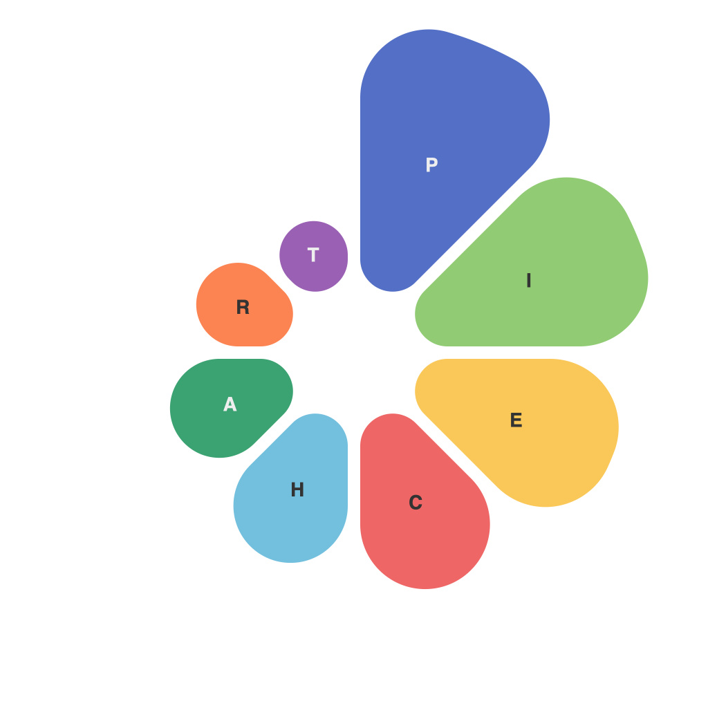
Unlocking Visual Insights: Mastering the Art of Pie Chart Design and Interpretation
In the realm of data visualization, one often encounters complex information that needs to be communicated succinctly and efficiently. Among the various graphical representations present, including bar graphs, line charts, and scatter plots, the pie chart has emerged as an effective tool for quick comprehension and analysis. This article endeavors to delve deeply into the art of pie chart design and interpretation, highlighting the advantages, challenges, and best practices for crafting compelling pie charts that resonate effectively with audiences.
## The Essence of Pie Charts
Pie charts are primarily utilized to illustrate the proportion of individual components to the whole. By sectorizing the entire area or a circle into smaller portions, each sector’s size precisely represents the magnitude of the element it embodies compared to the total. They are especially advantageous when you need to showcase the relative importance or composition of categories within a specific area.
### Key Components of Effective Pie Charts
To harness the full potential of pie charts and ensure that they communicate their intended message with precision and clarity, understanding and optimizing certain key components is paramount:
#### Sectors
Creating sectors that are visually appealing yet proportionally accurate is fundamental. To achieve this, maintain a wide range of radii difference for various sections and limit the number of categories to no more than seven to nine. This ensures that the viewer does not get overwhelmed by too many slices, as too many categories can make the chart cluttered and difficult to interpret. A pie chart with fewer elements not only looks more aesthetically pleasing but also facilitates a more straightforward comprehension.
#### Color Scheme
Effective use of color is a cornerstone of pie charts. Select colors that are striking yet comprehensible, ensuring that each color corresponds directly to a specific category. A vibrant color palette and effective color contrast can help distinguish between segments, enhancing readability and engagement. Ensure that color choices comply with accessibility standards for viewers with color vision deficiencies.
#### Labeling
Labeling is an often-overlooked but essential feature in pie chart design. Clearly labeling each slice provides context and facilitates direct reference. The labels should be concise and descriptive, mentioning the category name and the percentage it represents. Incorporating hover text to display label information upon mouseover can be particularly helpful for smaller charts or when space is limited, as it reduces clutter without sacrificing information content.
#### Legends
In cases where too many sectors make direct labeling impractical, a legend can serve as an indispensable tool. A well-designed legend allows readers to identify the representation of each category efficiently. Make sure that the legend is simple to read, including both color and label, and is positioned in a location that is not obstructive.
## Navigating the Challenges
Despite their utility, pie charts come with limitations and challenges that can impede their effectiveness.
### Confusion Among Similar Sectors
When many small sectors are present, their similarities in appearance can confuse viewers, making it difficult to discern relative values. This issue is exacerbated in crowded charts, where distinctions become challenging.
### Incomparability Over Time
Pie charts are not ideal for comparisons across time periods or when demonstrating changes in proportions. The visual representation can lead to misinterpretations, making it hard to identify trends or shifts in data dynamics.
### Limited Information Capacity
Pie charts can only convey information about percentages and are cumbersome for sharing detailed data or complex sets of information. They lack the versatility of other types of charts and graphs in displaying intricate data relationships.
## Best Practices for Effective Pie Chart Design
### 1. **Simplicity Over Complexity**
Strive for simplicity in pie chart designs. Limit the number of sectors to ensure that each has adequate visual clarity and importance.
### 2. **Colorful and Diverse Palette**
Use a consistent and vibrant color palette to differentiate segments easily. Avoid overly bright colors that might be distracting. Additionally, ensure visibility for colorblind users.
### 3. **Contextual Clarity**
Provide necessary context for each category with labels and percentages. Highlighting the total or comparing pie charts to other related charts can enhance the viewer’s understanding.
### 4. **Legend for Clarity**
Always include a legend to facilitate quicker interpretation, especially in charts with numerous colors or labels.
### 5. **User-Friendly Hover Text**
Implementing hover text or tooltips can be particularly beneficial for smaller or mobile devices, ensuring that all audience segments can access full information at their convenience.
### 6. **Avoid Pie Charts When Other Graphs are Appropriate**
Consider alternatives like bar charts, line charts, or tables when dealing with sequential data, comparing entities over time, or presenting large datasets.
## Conclusion
Pie charts, as a visual representation tool, offer a unique advantage in illustrating proportions and comparisons at a glance. Through a focused implementation of design principles and an awareness of potential pitfalls, users can harness the full potential of pie charts to make complex information easily accessible and comprehensible. As with any aspect of data visualization, the aim is to foster clear and thoughtful communication, enabling audiences to extract meaningful insights with minimal effort.

