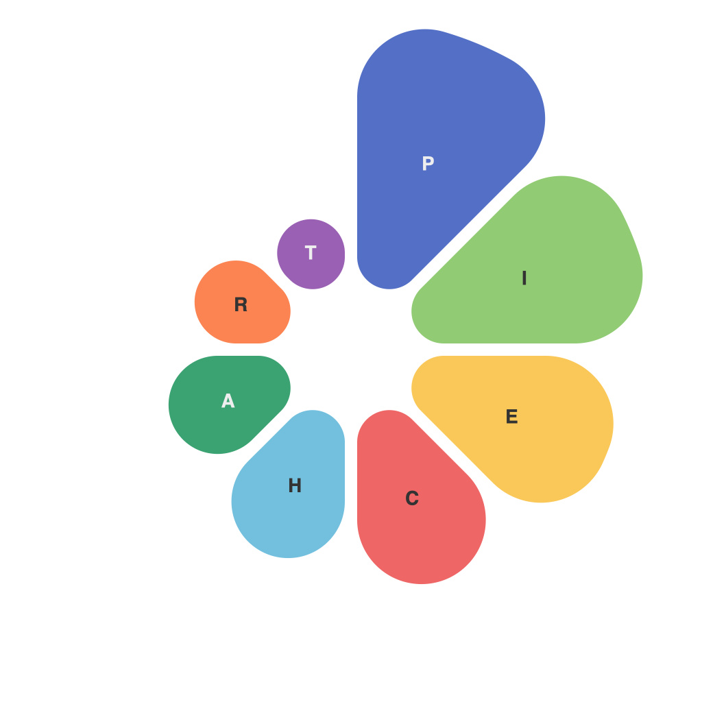
In the realm of data visualization, the humble pie chart has long been both a favorite and a notorious choice of representation for quantitative information. Its familiar, circular form has become so ingrained in our consciousness that it’s hard to imagine a world without its sectors and percentages. However, as with any tool, its true value lies in how effectively it serves its purpose—both in terms of aesthetics and practicality.
Aesthetically, pie charts have a certain timelessness. Their simple, circular format is reminiscent of the pie itself, appealing to our sense of nostalgia and familiarity. It is perhaps this aesthetic draw that makes them an enduring part of the visual analytics landscape. Yet, despite their widespread appeal, pie charts are not universally loved.
Critics often point out the pie chart’s limitations in conveying a variety of information types, particularly when it comes to complex data. They argue that trying to represent numerous categories within a single pie chart can lead to overwhelming visual clutter and a lack of clear insights. Indeed, when faced with several competing slices of information, those slices can become so small that they are virtually indistinguishable from one another, rendering the pie chart ineffective in conveying the relative sizes of the categories.
At the heart of the debate lies an essential consideration of utility. Data visualization, at its core, should serve the human ability to understand and interpret information with ease. When it comes to the pie chart, its utility struggles to keep pace with the sophisticated and often multifaceted demands placed on it by modern audiences. The problem is not with the chart itself, but with the ways in which it is often employed.
When used correctly and judiciously, pie charts can be powerful and enlightening. For instance, they can serve as an excellent tool for illustrating simple proportions or the impact of a single categorical variable. Their clear delineation between each category makes it easy to identify dominant sectors and compare their sizes at a glance.
Moreover, pie charts offer an intuitive way to present data in a clear and concise manner, which is highly beneficial for non-technical audiences or when rapid communication of key information is required. The ease with which viewers can identify which part of the pie a segment represents makes it a memorable tool for reinforcing a message or making a persuasive argument.
However, to maximize the aesthetic and practical impact of pie charts, there are several principles worth following:
1. **Simplicity**: Use pie charts to represent a single categorical variable at a time, keeping complexity to a minimum.
2. **Cohesion**: Choose a color palette that promotes contrast and clearly differentiates each slice.
3. **Labeling**: Use intuitive and consistent labels that aid in segmentation and identification.
4. **Threshold Rule**: If more than five or six categories are being presented, consider an alternative visualization method.
5. **Annotated Labels**: To help viewers grasp the significance, add values or percentages next to each slice.
At the intersection of art and utility, the pie chart can be a delicate balance; however, its proper implementation can yield a rewarding data representation. While contemporary data visualization advocates have promoted a plethora of more complex charts, the pie chart remains an indispensable tool when deployed appropriately. It is through the careful curation of aesthetic details and strategic execution of layout and design that pie charts can truly realize their full potential in contributing to a visually stimulating and insightful presentation of data.

