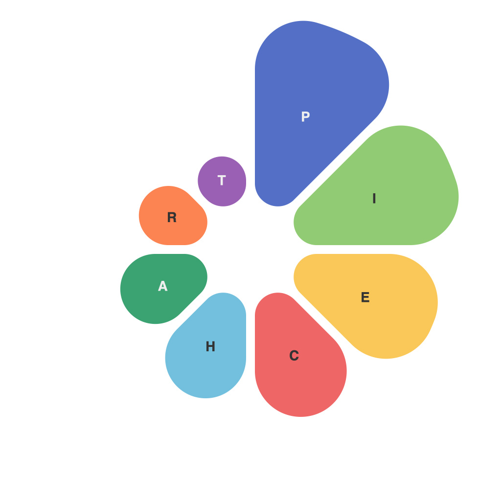
The power of data visualization is undeniable in today’s data-driven world. Among the various tools at a data analyst’s disposal, pie charts have remained a popular choice for conveying part-to-whole relationships and highlighting proportions in a visually appealing manner. Pie charts, however, are often misunderstood or misused, leading to ineffective data visualization. This article delves into the artistry of pie chart mastery, exploring strategies for creating effective data visualizations.
Understanding the Pie Chart
Let’s start with the basics. A pie chart represents data in a circular format, where each slice of the pie represents a category and its size reflects the proportion of that category to the whole. The aim is to display a straightforward comparison of different categories without overwhelming the audience with intricate details.
When to Use a Pie Chart
Though pie charts have several strengths, it’s essential to know when to use them. They work best when:
1. You need to convey the overall composition of a set of categories.
2. The audience is familiar with the category labels and their proportions.
3. You want to emphasize the relationship between categories.
4. You have a limited number of categories (typically five or fewer).
The Pitfalls of Pie Chart Misuse
Despite their benefits, pie charts are often misused in several ways:
1. Overloading: Cluttering the chart with too many categories can make it difficult for the audience to interpret the data.
2. Clashes: Using colors that conflict with each other can make it hard to distinguish between different slices.
3. Slicing: Starting slices at arbitrary points without specifying the base angle can result in misleading interpretations.
4. Lack of context: Pie charts by themselves don’t provide context and should be complemented with additional information or labels.
Pie Chart Mastery Strategies
To master the artistry of pie charts and create effective data visualizations, consider the following strategies:
1. Limit the number of categories: Stick to three to six categories to ensure that the audience can easily interpret the proportions.
2. Use contrasting colors: Choose bright, contrasting colors that make it easy to distinguish between slices but avoid color schemes that could be offensive or culturally insensitive.
3. Specify the base angle: If multiple charts are being displayed, use the same base angle to ensure accuracy when comparing them.
4. Add annotations: Include data labels or secondary annotations to provide additional context or highlight significant data points.
5. Avoid using pie charts if alternatives are better: If your data requires detailed comparisons or specific quantitativ information, consider using bar charts, line graphs, or scatter plots instead.
6. Consider the audience: Tailor your pie chart design and content to the preferences and knowledge level of your audience.
7. Emphasize the whole: Ensure that the center of the pie chart is clearly visible, and consider using a different color for the base to help the audience focus on the overall composition.
In conclusion, pie charts can be a powerful tool for data visualization when used correctly. By understanding their strengths, avoiding common pitfalls, and following these strategies, you can create effective pie charts that illuminate your data in a visually engaging way. Mastering the artistry of pie charts is not only about creating appealing visuals; it’s about accurately communicating your data’s story to your audience.

