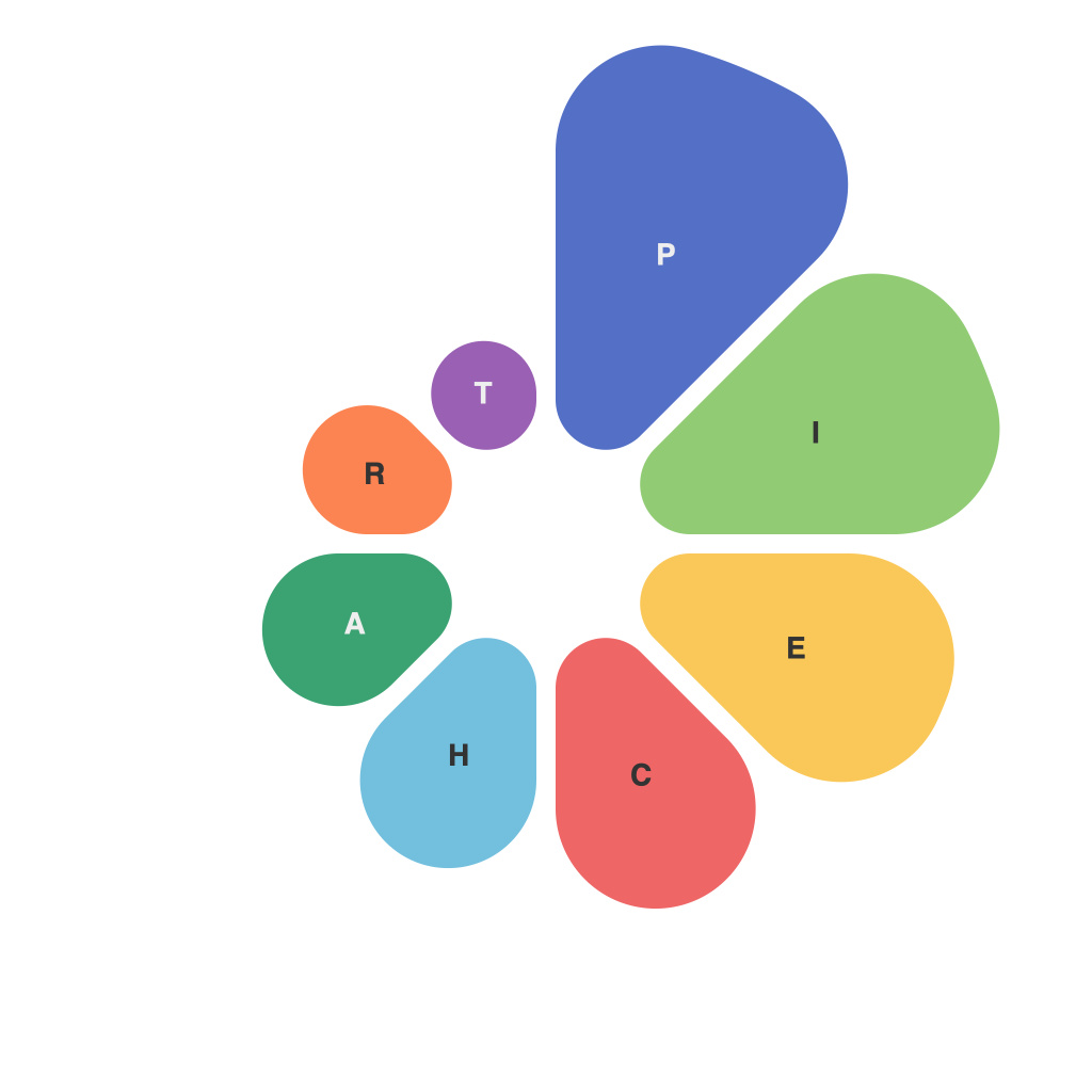
In the realm of data visualization, pie charts stand as a cornerstone, a staple of statistical communication conveying the division of categories into percentage segments. Perfect for illustrating proportional parts of the whole, pie charts are straightforward and impactful. However, crafting the perfect pie chart is an art, an endeavor that requires a blend of design sensibility, technical knowledge, and an understanding of the purpose of the visualization. This comprehensive guide is dedicated to aspiring pie chart masters, aiming to demystify the process and arm you with the knowledge to create informative and engaging visualizations.
**Understanding the Pie Chart’s Purpose**
The first step toward mastering the pie chart is to understand what it should communicate. Pie charts are best used for showing the relative sizes of whole units when the sum of the parts is relatively small and few categories are involved. Overloading a pie chart with too many segments can dilute its effectiveness and overwhelm the audience.
**Choosing the Right Format**
Selecting the correct format for your pie chart is key. You can go for a classic slice pie chart, which is an open circle with labels and percentages; a 3D pie chart, which can make the chart more visually appealing but may lead to misinterpretation of the sizes due to depth perception; or a donut chart, which is like a pie chart but with a hole in the center, making it easier to compare multiple slices with relative size.
**Avoiding Clutter and Complexity**
Pie charts are simple, and they should stay that way. Cluttering the chart with too much information can dilute its message. Too many slices can lead to a “salami sandwich” effect—segments that are overly thin and difficult to distinguish. Aim for a pie chart with five to seven slices to keep it comprehensible.
**Selecting Your Colors Wisely**
Colors make your pie chart pop. A color palette that is too vibrant or busy can be distracting and difficult to interpret. Start with a neutral background and then choose a palette that contrasts well but isn’t too contrasting to prevent eye strain. Use colors that are different enough for viewers to differentiate them easily, but avoid colors that have different shades or too similar hues.
**Understanding Angle to Avoid Misinterpretation**
The standard convention is to place the largest slice at 12 o’clock, which can help with recognizing the size of the largest section by eye. Yet, remember that the human brain isn’t particularly adept with pie charts; the perceived size of the slices can be distorted if there are too many or if the slices are shaped disproportionately.
**Adding Labels and Annotations**
Labels are essential to tell your story. Position them either outside, inside in a radius, or in a cluster on one side depending on which approach provides maximum clarity while avoiding overlapping. Annotations can help communicate important details like a significant difference between slices, especially if only one or two categories stand out strongly from the rest.
**The Psychological Angle of Reading Pie Charts**
There is a psychological element to the way people interpret pie charts. Studies indicate that readers often interpret pie charts by eye as a single circle rather than the sectors of a pie. This means it is especially important to follow the angles discussed earlier for the largest pieces to be placed accordingly.
**Incorporating Interaction for Better Engagement**
Static pie charts have their place, but for added interactivity, consider options like clickable segments that allow users to dive into the data. Modern tools can create pies that have interactive features, allowing users to hover over slices to view additional information or click through to expand on the sections they find most interesting.
**Optimizing for Legibility**
Whether on a printed brochure or a digital report, the pie chart needs to be easily legible. Ensure your text, whether it’s labels, annotations, or even percentages, is of readable size against the background of the pie chart. Consider the accessibility of your chart; including a description or providing text labels outside the chart for screen readers and individuals with visual impairments.
**Testing and Revisiting Your Design**
Lastly, after you’ve created your first pie chart, take the time to test it. Present it to an audience and ask for feedback. Consider revisiting your design decisions and applying the insights you gather. Data visualization is an iterative process, and you can always refine your charts over time.
In the journey to become a master of pie chart creation, remember that the key is not just about the technical skills; it’s about clarity, simplicity, and ensuring the viewer understands the message quickly and effectively. With practice and a deep understanding of the principles outlined here, you’ll be well on your way to creating pie charts that inform and dazzle.

