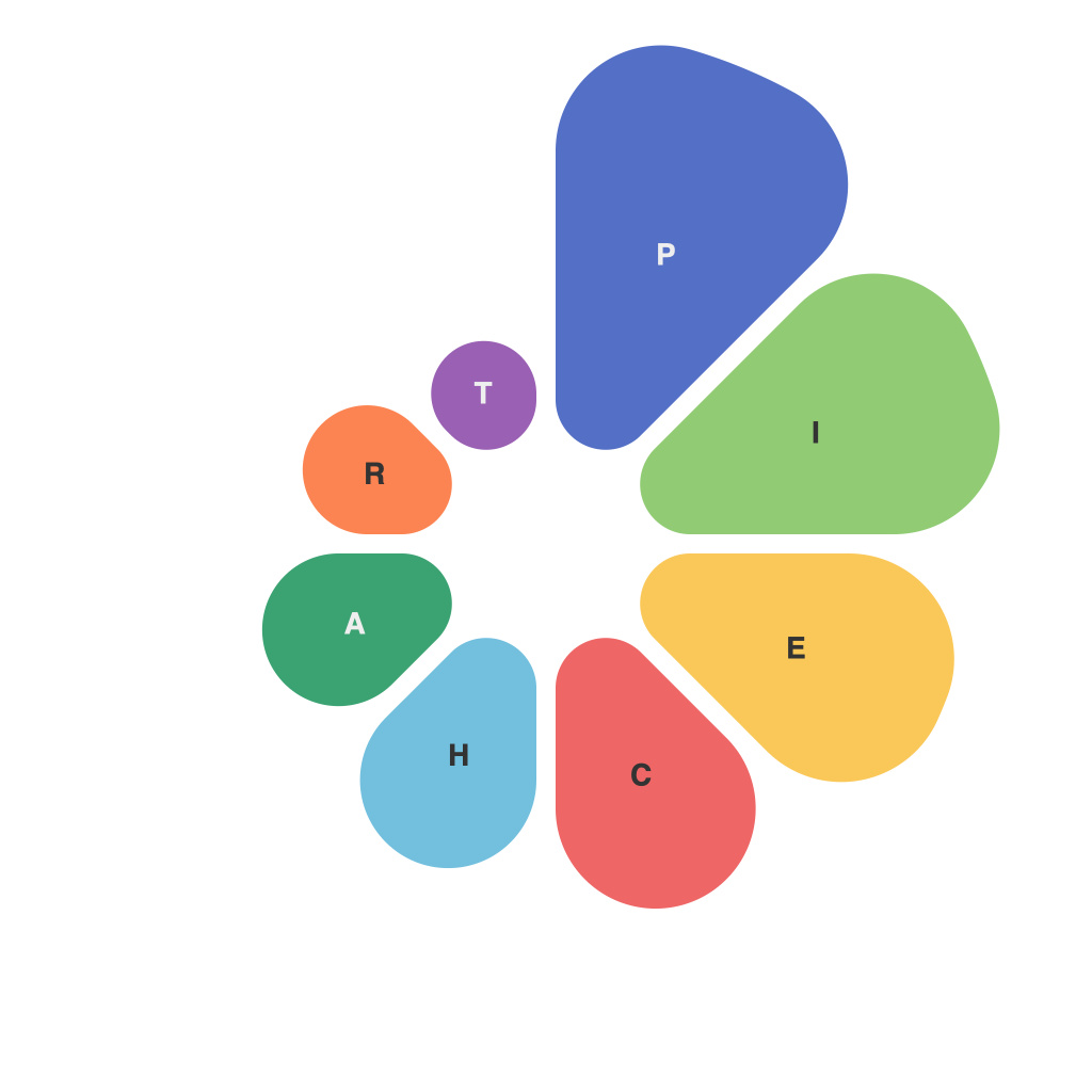
The power of data visualization is undeniable—it’s the key to turning complex information into a format that’s easily digestible and actionable. However, just as the saying goes, “A picture is worth a thousand words,” not all images are created equal. Among the vast array of tools available, the pie chart has long been a staple for presenting data. But what makes a pie chart truly masterful? This guide embarks on an exploration of the nuances and craft of the pie chart, equipping you with the knowledge to navigate the intricate landscape of data visualization.
**Understanding the Basics of Pie Charts**
At their core, pie charts break down a data set into proportions, with each slice representing a segment of overall information. While pie charts can display multiple pieces of information, the key is to avoid clutter by focusing on a single data point or a limited number of data points.
**Selecting the Right Data for Pie Charts**
A pie chart is not a catch-all for all types of data; it’s only as effective as the message it delivers. It shines brightest when presenting data that can be normalized, such as percentages or proportions. As a general rule of thumb, avoid pie charts for large or continuous variables.
**Mastering the Color Palette**
Color choice plays a crucial role in pie charts. The right colors can enhance understanding by emphasizing certain slices or providing a pleasing aesthetic. However, a common misstep is using too many colors, which can overload the viewer and dilute the intended message. The secret? Simplicity. Choose a palette with high contrast and ensure that the colors are accessible to color blind users.
**Labeling with Precision**
Reading a pie chart requires precise labeling to understand each segment clearly. Start with labeling the title clearly, specifying what the pie chart represents. Additionally, use legend entries for each segment, with percentages or absolute numbers for context.
**Balancing the Slices for Visual Clarity**
No matter how well-designed the color scheme and labels, an off-balance pie chart can confuse the viewer. Slices should be proportionately sized for clarity; small slices may go unnoticed, and overly large slices might dominate the visual, leading to misinterpretation.
**Choosing between 2D and 3D Pie Charts**
While 3D pie charts can be visually appealing, they come with a host of pitfalls. The third dimension can distort the actual sizes of slices, leading to misinterpretation of the data. A 2D pie chart, with its simple design, offers a truer reading of data proportions. Opt for 3D charts only when there’s an absolute necessity, such as emphasizing depth or texture for certain data points.
**Incorporating Interaction and Animation**
Interactive pie charts, often combined with hover effects, can help viewers delve deeper into the data. When designed properly, animation can aid in storytelling and help highlight key trends. But be cautious; overuse of animation can detract from the chart’s focus and make it more difficult to read at a glance.
**The Pie Chart Master’s Checklist**
– Ensure that the data set is appropriate for pie charts.
– Use a limited color palette with high contrast.
– Label each slice clearly, ideally with percentages and absolute values.
– Keep the slices balanced and avoid using 3D charts unless necessary.
– Consider interactive elements and animation sparingly.
– Always review the pie chart with different audiences to gauge their understanding.
In summary, the masterful use of pie charts involves a careful balance between design, content, and functionality. By adhering to these guiding principles, you will be able to craft compelling and informative pie charts that convey the essence of your data effectively. As you embark on your journey to data visualization mastery, remember that the key to greatness lies not just in the chart itself, but in the story it tells.

