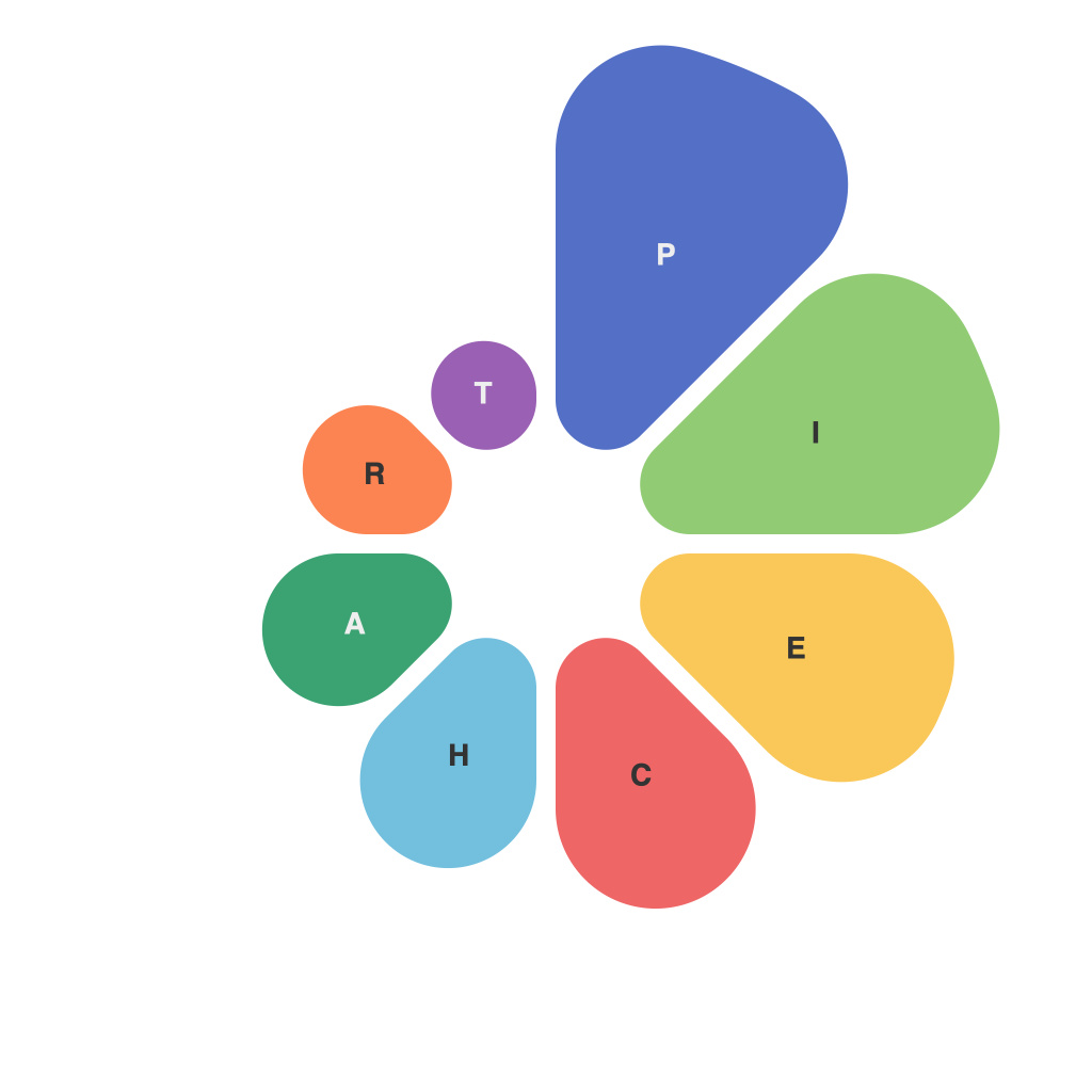
In today’s data-driven culture, the humble pie chart has emerged as an ubiquitous staple in the visual communication of statistics and data analysis. A pie chart, essentially a circle divided into sectors, each representing a portion of a whole, is an intuitive tool that makes it easier to gauge the comparative magnitudes of parts relative to the whole. Yet, its design and composition can be a matter of great debate among statisticians and designers, each striving to craft pie charts that convey meaning with both clarity and aesthetic appeal. This piece delves into the art of creating pie charts that are not just informative, but also insightful.
From Simplicity to Complexity
The foundation of a compelling pie chart lies in its simplicity. When crafted with an emphasis on clarity, a pie chart can offer immediate understanding of a dataset at a glance. Simple pies with a few segments are easy to interpret, making them suitable for illustrating the breakdown of a small set of categories, such as sales figures by product line or voting results by demographic.
However, simplicity can be a double-edged sword. As the number of sectors increases, the pie chart tends toward visual cacophony, as each segment becomes increasingly difficult to differentiate. This quandary challenges pie chart creators to balance detail and digestibility – a task often requires finesse and experience.
The Language of Segmenting
Crafting a meaningful pie chart starts with the way its segments are delineated. In the language of pie charts, segments are much like literary characters, each with a role to play. Here are some pivotal aspects to consider in this respect:
1. **Order of Segments**: The sequence in which segments are presented is crucial. Starting from the largest segment and working to the smallest can enhance the visual emphasis on magnitude. However, when ordering matters (e.g., representing chronological data), logical sequencing or categorization can be more impactful.
2. **Segment Size Differences**: The difference in size should be easily distinguishable. While it is generally advisable to ensure that no segment is smaller than 5% to remain interpretable, the larger the range of segment size differences, the more difficult it becomes to discern smaller segments.
3. **Segment Labels**: Accurate and clear labeling of each segment is essential. Labels should be concise and, ideally, should avoid technical jargon or rely on acronyms that may not be widely understood.
Color: The Visual Syntax
Color is one of the many instruments in a pie chart artist’s toolkit. It speaks the language of immediate visual shorthand, offering an encoded interpretation of data at a glance. The following color considerations are integral to constructing a semantic and effective pie chart:
1. **Limited Color Palette**: Overuse or mismatched colors can be distracting. Stick to a limited color palette to ensure that segments are distinguishable and do not create a visual muddle.
2. **Color Contrast**: High color contrast between segments enhances differentiability. Additionally, contrast can be used to highlight key segments or groups of segments of particular interest to the viewer.
3. **Colorblind Accessibility**: It is essential to consider viewers who may be colorblind. Alternatives such as different shading, patterns, or subtle differences in hue, when combined with color labels, can communicate the same information effectively.
The Craft of Composition
The layout and presentation of the pie chart can further enhance its message or detract from it. Here are some composition tips:
1. **Direction and Orientation**: While horizontal pies are often recommended to prevent distortions (a side effect of perspective), the direction of rotation can also affect readability and comprehension, so this should be tested against the target audience.
2. **Legends vs. Labels**: Depending on the context, using or avoiding legends can improve clarity. Labels are typically more space-efficient and can help maintain a concise presentation.
3. **Titles and Context**: A well-chosen title places the data within context and paves the way for the reader’s insight. It sets the stage for what’s to be learned from the pie chart’s visual narrative.
Pie charts are an age-old tool that, by following the language of visuals, can be crafted into a meaningful experience for any data consumer. The key is to prioritize clarity over complexity, to communicate data effectively through the artful composition of segments and colors, and to consider the whole audience in the design and presentation of visual insights. Through these visual tools and techniques, pie charts can serve as more than just an informative tool—they can be a source of insight and understanding.

