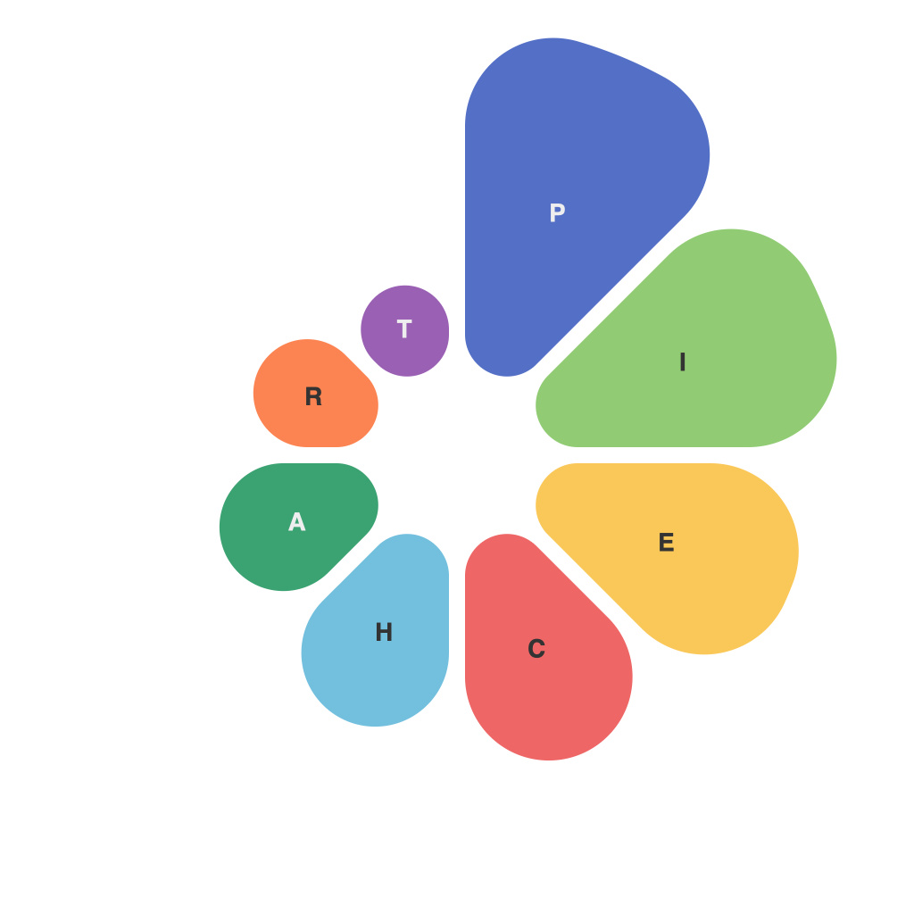
In an era where information overflows and data is king, effective visualization has become an essential tool in conveying information clearly and engagingly. Pie charts, a fundamental data representation method, stand out for their circular symmetry and straightforward distribution of data into segments. This article will delve into the world of pie charts, exploring how clever design and color choices can transform these visual insights from mundane into enlightening.
**The Power of Pie Charts**
Pie charts are not just a relic of office presentations from the past; they are powerful data communication tools. By breaking down data into slices, they allow the audience to quickly grasp proportions, making pie charts invaluable for illustrating percentages and representing parts of a whole.
**Clever Design: Enhancing Clarity and Perception**
The layout of a pie chart can heavily influence how effectively it conveys data. Here are some design considerations to strengthen its impact:
– **Proper Segment Placement**: Segmenting data into smaller slices can make it easier for viewers to digest. Ensure segment placement does not create a jam of large and small slices, which can overwhelm the eye and obscure understanding.
– **Multiple Levels of Detail**: For pie charts that depict more complex datasets, layering in a hierarchical design where the whole is divided into primary and secondary sections can be beneficial.
– **Label Placement**: Position labels for each slice strategically. Placing labels outside the pie or rotating text to avoid overlapping can vastly improve readability.
– **Consistent Slicing**: When all slices are drawn with equal thickness, they tend to look more balanced and professional, which helps viewers focus on the data rather than the chart itself.
**Color Choices: Making Data Pop**
Colors have a significant role in how we perceive pie charts. Here’s how color can be used effectively to enhance the visual insights:
– **Color Coordination**: Use a color palette that is harmonious and balanced. Consistent tones can communicate related data more effectively.
– **Visual Hierarchy**: Apply different shades, patterns, or textures to highlight the most substantial parts. This draws the viewer’s attention to the most critical insights.
– **Avoid Clashes**: Ensure that color choices do not clash or strain the eyes. Strive for a palette that maintains high contrast between the background color of the pie chart and the colors used for the slices.
– **Color Sensitivity Across Cultures**: Be aware that color meanings vary across cultures. Red might symbolize positive connotations in Western cultures, but it could represent negative feelings in other societies.
**In Summary**
Pie charts, when designed with both the user and their information consumption habits in mind, are a compelling way to illuminate data. Clever design and thoughtful color choices are tools in a visual analyst’s arsenal that can go a long way in communicating information succinctly and memorably. By ensuring that your pie charts are not just visually engaging but also functional and accurate, you contribute to a more informed and empowered audience—able to quickly understand and draw conclusions from the information presented. After all, in visual insights, it’s not just about how much we say, but also how we say it.

