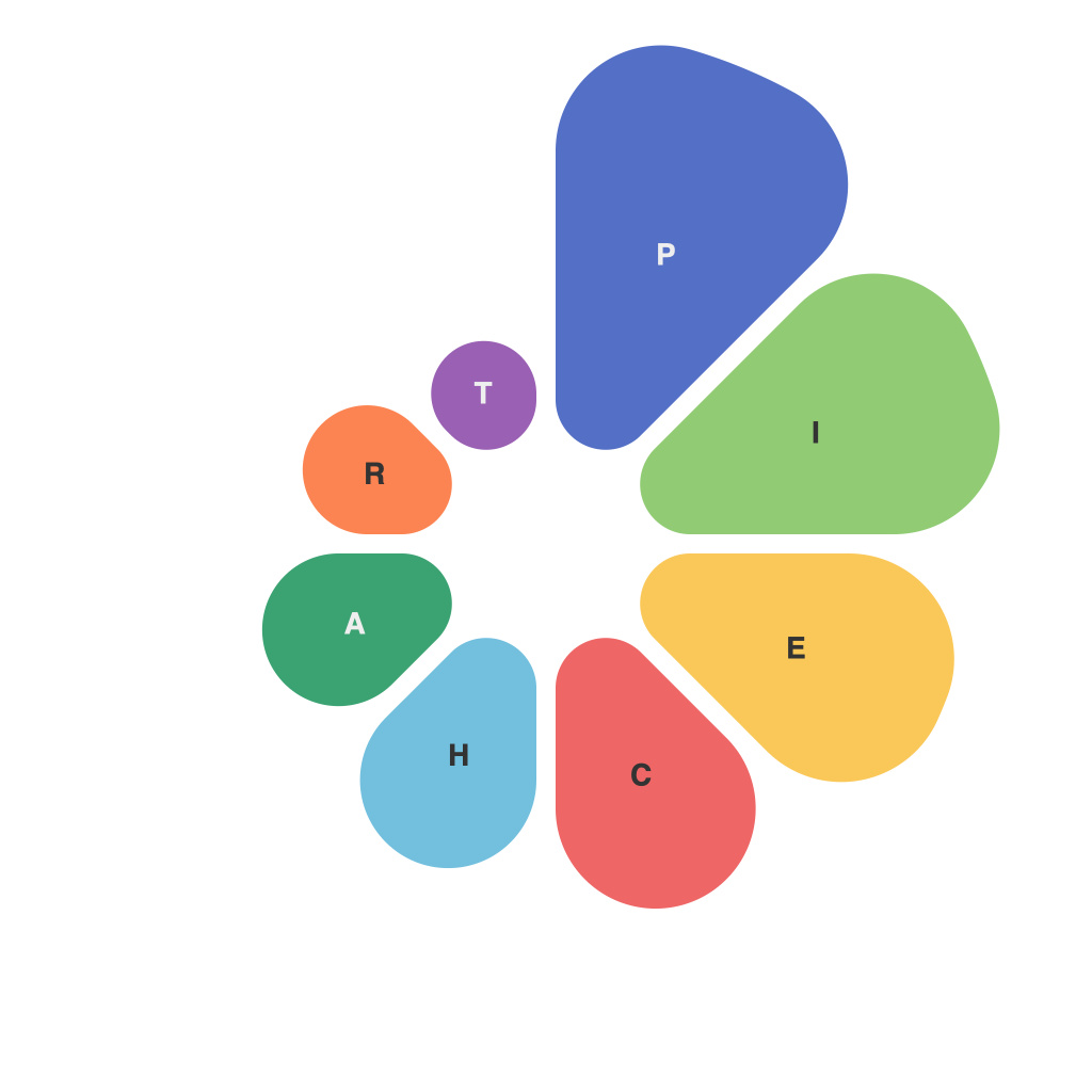
Visualizing data is an artform that transcends mere data presentation. It offers the power to communicate complex information quickly, engagingly, and persuasively, turning numbers into narratives that resonate with a wide audience. Among the various tools of data visualization, pie charts have stood the test of time, remaining a popular choice due to their simplicity and ease of understanding. Yet, crafting a compelling pie chart involves more than a casual assembly of data slices. This article delves into the art of creating persuasive pie charts, unraveling the intricate details that separate a well-designed pie chart from a forgettable one.
**The Pie Chart’s Basic Structure**
In its most rudiments form, a pie chart is a circular graphic divided into sections, each representing a proportion of the whole. The size of the sectors, known as slices, directly correlates with the magnitude of the data it represents. Whether in business, research, or communications, pie charts are ideal for displaying the relationships between individual categories and the entire dataset.
**Design Principles for Persuasive Pie Charts**
1. **Clarity of Data Presentation**
– **Purposeful Categories**: Identify the most critical data categories to include. Avoid overcrowding by excluding non-essential data points.
– **Readable Size**: Ensure pie chart slices are large enough to identify at a glance, and avoid slices smaller than 5% of the total, as they can be challenging to interpret.
2. **Accuracy**
– **Proportional Slicing**: Use the correct angles for slicing the pie to ensure accurate representation. Even a subtle misrepresentation can distort interpretation.
– **Transparent Labeling**: Label the slices and total correctly. Mislabeling data can lead to misinterpretation.
3. **Cognizance of Human Perception**
– **Equal Slice Widths**: Ensure that slices are cut with equal widths to prevent the human eye from misjudging proportional differences due to gaps in the pie chart’s wedges.
– **Minimize Visual Clutter**: Overcomplicating the chart with excessive annotations or colors can detract from its clarity.
4. **Aesthetic Appeal**
– **Color Choice**: Use contrasting colors that stand out against each other, but stay neutral or use muted shades for the background. Avoid using too many colors that can be visually jarring.
– **Font and Size**: Use a clear, readable font and ensure that text sizes are appropriate to the chart size without overwhelming the data.
5. **Responsive Design**
– **Adaptability**: Consider how the pie chart will appear on different devices and platforms. It should be easily readable on smartphones, tablets, laptops, and desktops.
**Engaging with Your Audience**
1. **Storytelling**: Craft narratives with your pie chart. Highlight interesting or important data slices with emphasis and explain why they are significant.
2. **Comparative Analysis**: If comparing data over time or across different groups, use different shades or patterns to illustrate these variations effectively.
3. **Contextual Relevance**: Position the pie chart in context with the overall presentation, reinforcing its significance within the broader data analysis and decision-making process.
**Conclusion**
Mastering the art of creating persuasive pie charts requires a keen awareness of the underlying data, the principles of design, and the audience’s expectations. By focusing on clarity, accuracy, and aesthetic appeal, data visualizers can harness the full potential of pie charts. Whether conveying a story in a business meeting or sharing insights with a broad public audience, a carefully crafted pie chart can serve as a compelling and memorable tool for disseminating data-driven knowledge.

