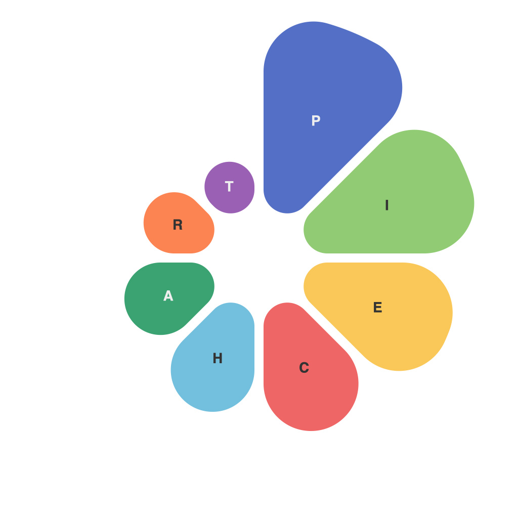
In the realm of data representation, colors are the sparks that ignite the understanding hidden within numbers. Among the diverse array of visual tools at a data analyst’s disposal, pie charts stand as a classic and enduring choice. These circular representations have served as a beacon for presenting data in colors, allowing viewers to derive insights and make sense of information at a glance. In this article, we delve into the art of visualizing data in color within the world of pie charts.
At their core, pie charts embody simplicity and clarity. By dividing a circle into wedge-shaped segments proportional to the size of the corresponding data categories, they convey a sense of unity among diverse metrics. The color palette assigned to each segment plays a pivotal role in highlighting the distinct characteristics of the data at hand.
The Power of Color in Pie Charts
Color is not merely a cosmetic element added to pie charts; it is a critical component that enhances the user experience and the overall messaging. Here’s how color exerts its influence:
1. **Comprehension**: A judicious use of colors aids in immediate recognition and categorization of data sets. It allows viewers to discern different segments without any additional cognitive effort.
2. **Contrast**: High-contrast colors help draw attention to critical data points. When one segment is a stark contrast against the rest, it becomes instantly noticeable, often conveying a sense of importance or urgency.
3. **Cohesion**: Consistent color schemes reinforce the narrative of the pie chart, making the data more internally consistent and easier to digest.
4. **Clarity**: Bright and clear colors make dense pie charts more approachable and less intimidating to the viewer, allowing them to consume complex data without overwhelming complexity.
5. **Color Blindness Consideration**: In the diverse world of human perceptibility, color vision varies. Choosing a color palette that differentiates segments based on their hue, rather than only saturation or brightness, can make the pie chart more inclusive.
The Science Behind Color Selection
Selecting the right colors for pie charts is an art that involves both creativity and science. Some guidelines to consider:
– **Harmony and Contrasting Colors**: Utilize color triangles or wheels to choose hues that complement each other. Contrasting colors can bring out the key figures without overwhelming the chart itself.
– **Neutral Color Palette**: Simple pie charts that are not laden with too much information often benefit from using a neutral palette with subtle variations, which leaves more emphasis on the numbers conveyed.
– **Data Significance**: Assign brighter and more vivid colors for segments that represent significant numerical values. Avoiding color prominence for less influential data prevents distraction.
Interpreting Pie Charts with Color
To leverage the power of color in pie charts, it’s essential to consider how the viewer will interpret the presented information. Here are some strategies:
– **Logical Order**: Arrange colors in a logical order that corresponds to their respective size or significance, either clockwise or counterclockwise.
– **Gradual Shading**: For pie charts with many segments, gradient shading from light to dark can help guide the eye from the smallest to the largest data set.
– **Consistency with Branding**: Especially in corporate or marketing reports, using colors that are consistent with the company’s branding or campaign colors can create a more cohesive presentation.
PieCharts as a Gateway to Bigger Pictures
Visualizing data in color through pie charts can be the start of a journey toward deeper insights. By utilizing the right color palette, analysts and business stakeholders can navigate through the pie chart’s structure and uncover hidden trends, patterns, and outliers. Pie charts, with their simple yet powerful colors, become more than just a static snapshot of the data; they become a bridge to conversations about strategy, forecasting, and decision-making.
In a world where data is ubiquitous and understanding it is key to making sense of the complex, pie charts continue to be a versatile tool. By harnessing the power of color, we can unravel the secrets of information, piece by colorful piece, and transform it into actionable knowledge.

