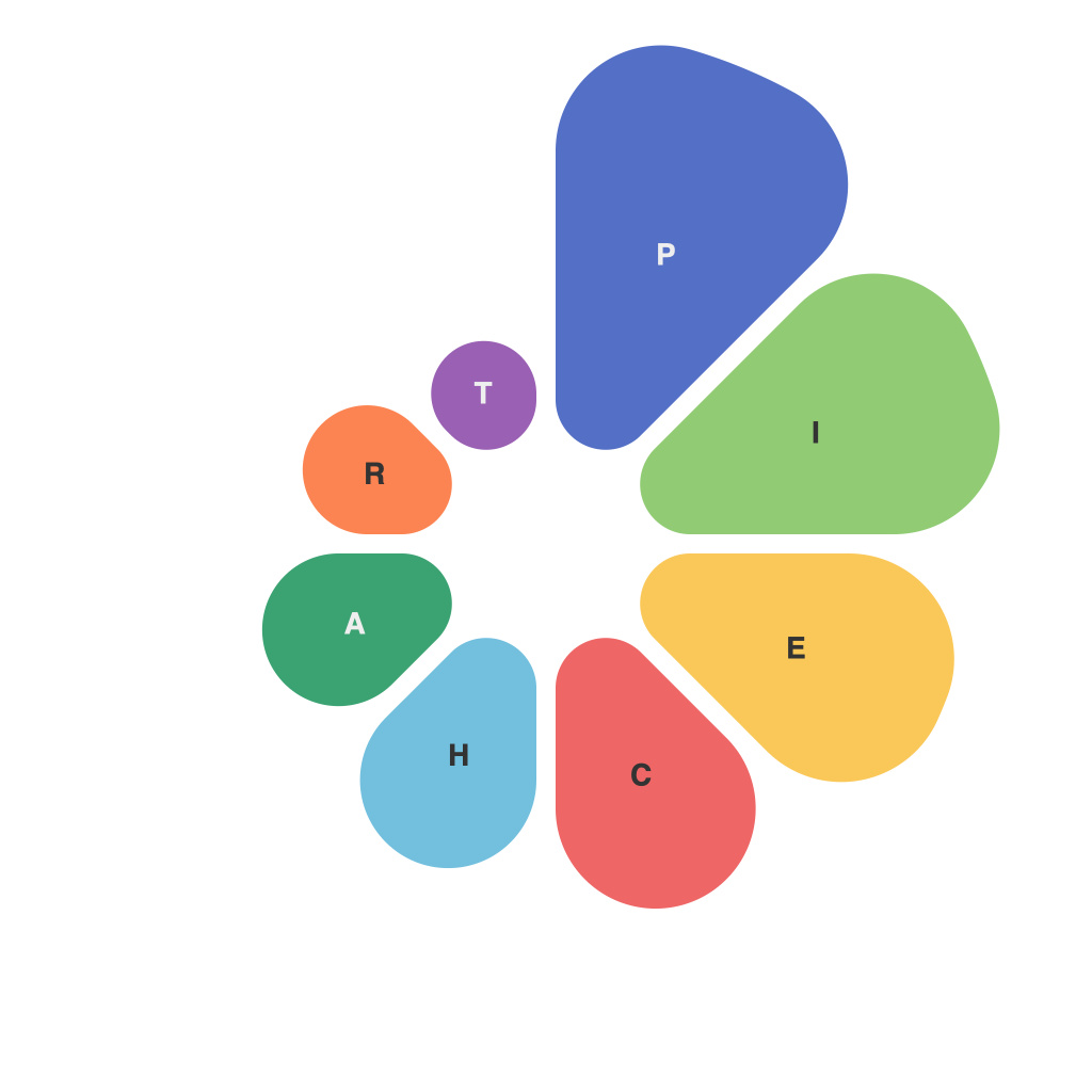
In the ever-evolving landscape of data visualization, the pie chart stands as a timeless tool for conveying complex information with simplicity. This comprehensive guide delves into the world of pie chart design and analysis, exploring not just the creation of these charts, but also their proper application in the broader context of data communication.
Pie charts, with their circular format and wedges representing segments of a whole, have long been a staple in the data visualization arsenal. They’re especially useful when comparing parts to a whole, but it’s essential to understand their nuances to maximize their effectiveness.
**Understanding the Pie Chart Concept**
To grasp the essence of a pie chart, we must first comprehend the components it comprises. A classic pie chart segments a single data point into various sections—each representing a proportion of the whole. Visualizing data in this manner allows for quick comparisons between parts and the total, making it an intuitive choice for certain uses.
**When to Use Pie Charts**
The appropriate application of pie charts is pivotal to their success. Opt for a pie chart when:
– You want to compare data that adds up to a whole.
– You want to demonstrate the proportion of each segment within the whole.
– The overall magnitude of the sections is more important than the number of items in each section.
However, avoid using pie charts in cases where:
– Comparing discrete numbers is critical, since pie charts make it difficult to discern small or closely-spaced numerical values.
– There are many categories, as the complexity of the chart can diminish its efficacy.
– There is the perception of depth added by shadows or 3D effects, as these can distort the true proportions of each section.
**Design Fundamentals**
The design of a pie chart plays a vital role in its readability and clarity. Here are the fundamentals to consider:
**Layout and Layout Guidelines**
– **Slices Arrangement**: When possible, arrange slices in descending order by size to avoid overlap and ensure the largest elements are the first thing the viewer sees.
– **Rotation**: The initial slice can be set to face 12 o’clock to establish a common anchor for comparison. Avoid rotating slices by too much, as this can disrupt orientation and make it difficult to interpret.
**Color Use**
– **Color Schemes**: Utilize a consistent and compatible color palette.
– **Contrast**: Ensure that the colors chosen for each segment have sufficient contrast against each other to be easily distinguishable.
**Lables and Callouts**
– **Label Clarity**: Use clear and concise labels for the different segments. If there are more than six segments, it may be helpful to use callouts outside the pie chart.
– **Legends**: Include a legend if different colors represent different values or categories, making it evident how to interpret the chart.
**Analysis Techniques**
Understanding how to analyze a pie chart is as crucial as designing it well. Here’s how to dissect the data:
– **Segment Size**: A small segment can indicate a small percentage of the whole but might be significant if context is considered (e.g., in a comparison of market segments by revenue).
– **Patterns and Trends**: Look for patterns in the sections. For instance, pie charts with fewer colors and fewer data points will generally be more easily interpreted.
– **Data Quality**: Pie charts can hide biases if the data they are built upon is flawed or biased.
**Conclusion**
The pie chart remains a powerful tool in the data visualization toolkit, allowing complex data relationships to be succinctly and clearly depicted. By following this guide, one can effectively design and interpret pie charts, optimizing their communication potential. Whether you’re a data analyst, a researcher, or simply someone looking to make sense of the data swirling around you, understanding the nuances of pie chart design and analysis can make your data journeys infinitely more illuminating and insightful.

