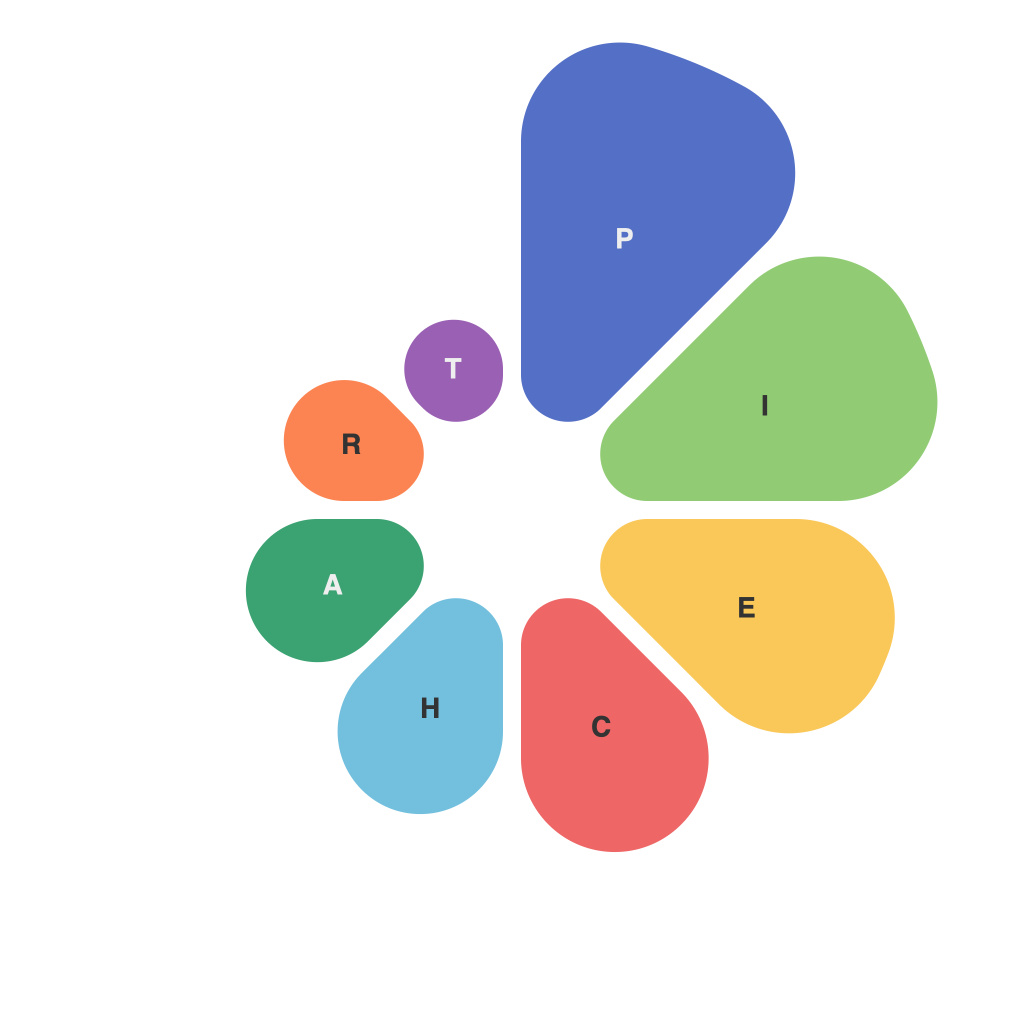
Imagine a world where complex data is made approachable, tangible, and—above all—beautiful. Where abstract statistics come to life, not just in static numbers, but in dynamic, vivid representations. Enter the realm of data visualization, and within this vast field, pie charts stand out as the charming, versatile narrators of data stories. In “Visualizing Data in Glazed Dimensions: Unveiling the Power of Pie Charts,” we’ll explore the wonders and limitations of pie charts, how they turn a slice of information into a window into the world of numbers.
pie charts are the sweet treats of data visualization, offering a slice-by-slice glance at the composition of a dataset. They are both enchanting in their simplicity and challenging in their execution. Like an expertly crafted pie that balances flakiness and sweetness, a well-crafted pie chart can be a harmonious delight, or one that yields a crumbly anticlimax.
The allure of pie charts is no mystery. They are a deceptively straightforward format that packs a lot of data into the space of a circle. We are deeply conditioned to understand visual compositions of circular nature; our eyes are naturally drawn to the symmetry and our brains adeptly process the segmented portions. The elegance of pie charts, in part, lies in their ability to break down intricate data into comprehensible pieces, each segment representing a proportion within the whole.
In “Visualizing Data in Glazed Dimensions,” we journey through the components of pie charts, starting with the basics:
### The Circle: The Whole Enchroma
The foundation of every pie chart is the circle, encompassing 100% of the data to be analyzed. It’s as simple as a round, uniform shape that invites our eyes to navigate from the outside in. A circle symbolizes equality, unity, and it’s also an efficient space for displaying parts relative to a whole without the spatial and alignment issues that can arise with other chart types.
### The Slices: The Taste of Data’s Flavor
The slices of a pie chart are cut to represent various data segments. These slices have no discernment; their size is determined solely by their proportion to the whole circle. When creating a pie chart, the goal is to ensure that the visual representation accurately reflects the real-life division of data.
### Central Angle: The Heart of Measurement
Central angles of each slice are pivotal in quantifying the data visually. Larger slices have larger angles, with each degree of the entire circle of 360° representing approximately 2.8% of the whole—making central angles a critical tool for gauging proportions.
### Arrangement: A Balance of Beauty and Clarity
One of the more delicate aspects of pie chart creation is arranging the slices. Depending on the data and context, ranging from an alphabetical arrangement to a hierarchy of significance, every arrangement brings an edge to the pie, making it either more accessible or more challenging to interpret.
### Transparency and Labels: The Toppings and Guidance
A good pie chart considers both visual design and user interaction. Color coding helps distinguish between slices, while transparency enables multiple layers to be layered effectively in a single view. Clear, concise labels or tooltips can also aid in understanding the individual slices at a glance.
Yet, despite their many attractions, pie charts face their share of criticism and limitations, particularly in “Visualizing Data in Glazed Dimensions”:
### Too Many Slices
The classic “information overload” issue applies to pie charts, just as it does to other forms of visual presentation. The more slices added to the chart, the harder it becomes for the viewer to discern between them and relate a slice’s size to its numerical proportion accurately.
### Lack of Context
Pie charts reveal proportions well, but often lack the ability to provide context. Consider a pie chart of a company’s budget allocation for different departments. While it shows distribution, it offers no information about how relative sizes might have changed over time or comparison to competitors.
### Misleading Impressions
Pie charts are susceptible to visual deception. The angle of the slices or the distance from the center can influence how human eyes perceive the sizes of the segments. In an attempt to deceive, a designer could intentionally misrepresent data points by adjusting these angles or distances.
### Better Alternatives?
In some cases, while pie charts may initially seem like the perfect representation, they might not be the best tool for the job. Bar charts, bubble charts, and even dot plots can offer a clearer picture, especially when the data contains many categories.
In conclusion, “Visualizing Data in Glazed Dimensions” is an ode to pie charts—those beguiling segments of knowledge wrapped in the circular form. While they have their drawbacks and should not be treated as a panacea for all data visualization needs, pie charts have their place when the goal is to show parts of a whole in a simple, striking fashion.
Remember, as with the perfect pie, a well-crafted pie chart is a thing of beauty in its dimensions, a delectable treat that satisfies the palate of the audience, be they data analysts, corporate decision-makers, or everyday observers of numbers in our world. Whether you bite a piece directly from the chart, or savor its sweet data through a well-arranged presentation, the power of pie charts lies in their ability to reveal information in glazed dimensions, simplifying complexity into the ultimate digestible form.

