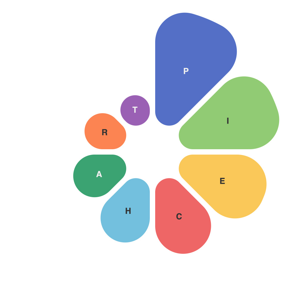
In the field of data representation and communication, visualizing data is an indispensable skill, and pie charts are one of the tools that are commonly used for this purpose. These circular graphs offer a simple and intuitive way to depict relationships between parts of a whole within a dataset. However, the power of pie charts is also accompanied by certain perplexities that can undermine their effectiveness. This article explores the significance of pie charts, their inherent problems, and the potential pitfalls in their usage.
As data visualization techniques evolve, pie charts have remained popular for their ease of understanding. They are particularly useful when displaying comparative proportions of different categories within a single dataset, such as demographic or consumer data. Their circular nature naturally draws the viewer’s eye to the center of the graph, making it a convenient choice when comparing a single category against others.
One of the key strengths of pie charts is their ability to depict the composition of a whole in a single view, which can facilitate quick comparisons. If the numbers are small and the number of slices is limited, pie charts can offer a clear and straightforward understanding of the relationships between data components.
Conversely, when pie charts are not used effectively, they can lead to miscommunication and misunderstandings. The human brain is not naturally attuned to understanding the areas of a circle, and perceiving subtle differences in angles and distances can be challenging. This can lead to misallocation of attention, where the viewer might focus more on the size of slices than the actual proportions.
Another notable challenge is the temptation to use pie charts when they may not be the most appropriate choice. For instance, comparing two or more pie charts side by side to make a comparison can be bewildering due to differences in scale. Moreover, using pie charts when data requires precise measurements can lead to misinterpretation. In such cases, where precise numerical values are necessary, a bar chart or a line graph might provide a clearer picture.
One of the perplexities involved in the use of pie charts is the issue of labeling. When multiple slices are involved, legends can become bulky or labels overlap, making the chart difficult to read. This is particularly problematic in the context of a presentation, where clarity is paramount. A well-labeled pie chart does not necessarily equate to a clear communication of the data; poor design can lead to confusion.
Color usage in pie charts is another delicate balance to struck. Different colors help distinguish various segments, but too many colors or an unsystematic color scheme can make the chart look cluttered and overwhelming. Additionally, color usage should adhere to accessibility guidelines to ensure that the data is comprehensible to all individuals, regardless of color vision deficiencies.
Even with their potential pitfalls, pie charts have their place in data visualization. They can provide an excellent overview of categorical data, especially when the goal is for users to make a quick assessment of relationships between parts of a whole. However, care must be taken to avoid the common mistakes that undermine the effectiveness of pie charts.
First, limit the number of slices to a handful to reduce cognitive load. Pie charts with too many segments are difficult to interpret as it becomes harder to distinguish the angles when there is very little difference between them. Furthermore, it’s wise to avoid using pie charts when exact measurements or precise comparisons are required.
Second, pay attention to the order of categories in the pie chart, ensuring that the largest slice is placed adjacent to the largest and the smallest to the smallest. This helps viewers make accurate proportion comparisons. Consider removing the legend if it’s cluttering the chart, leaving viewers to identify slices only from the central pie chart.
Third, always complement a pie chart with additional data visualization elements, like a bar chart, if viewers need more granularity. This provides a dual perspective that is more informative and doesn’t compromise readability.
Lastly, consider providing a textual summary along with the pie chart to clarify critical insights, especially if there are complex interactions or patterns in the data.
Visualizing data requires a balance of clarity, precision, and design sensibility. While pie charts can be a powerful tool in this arsenal, their effectiveness hinges on their thoughtful application. By being aware of the power and perplexities of pie charts, users can harness their potential and sidestep their pitfalls, ensuring effective data representation and clear communication.

