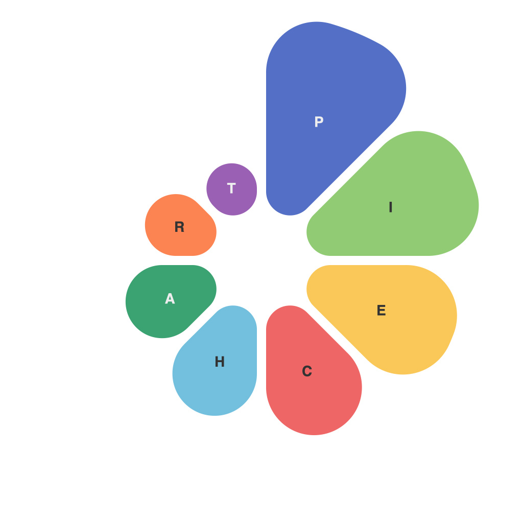
Visualizing data through pie charts is akin to crafting a delicate dessert—requiring precision, balance, and an aesthetic eye. These circular graphs, with their intricate slices, allow for a clear, straightforward way of interpreting and presenting data. This article is your delectable guide to understanding the art of creating compelling, informative pie charts.
## A Slice of Understanding: The Basics of Pie Charts
Pie charts are circular graphs divided into sections or slices. Each slice represents a fraction of the total data—providing a quick and intuitive look at proportions and percentages. The beauty of this chart lies in its simplicity and effectiveness.
A classic circle symbolizes the whole dataset, while each slice represents a part. The color or shading of each segment typically differs, making it easier to differentiate one category from another.
## The Ingredients for an Effective Pie Chart
Like any quality dish, pie charts demand the right ingredients:
### 1. Clean Data
Data is the foundation of an effective pie chart. Ensure your data is accurate, clean, and well-organized. Inaccurate or incomplete data can lead to misleading interpretations.
### 2. Clear Categories
Each slice should represent a distinct category. If there are too many categories, consider using donut charts or pie charts with a smaller circumference to avoid overcrowding.
### 3. Appropriate Sizing
The size of each slice should be proportionate to its value relative to the total dataset. Large slices stand out, signaling important aspects of your data, while small slices may blend into the background.
### 4. Balanced Design
Ensure that the pie chart remains balanced to avoid misinterpretation. If you notice that slices are overlapping or look out of sorts, it might be time to reconsider how you have categorized the data.
## Techniques to Elevate Your Pie Chart
As you embark on the journey to create a visually appealing and informative pie chart, here are some tips to help you on your way:
### 1. Color Coordination
Select colors that are easy on the eyes and distinct from one another. Tools like Adobe Color can help you choose the right color palette. Remember, colors should complement each other, not compete.
### 2. Labeling
Use clear and concise labels for each slice. Arrange labels outside or inside the chart, depending on your preference and the space constraints. Avoid using overly complex labels, as they might confuse readers.
### 3. Label the Legend Clearly
A well-defined legend makes it easier for viewers to identify different slices. Ensure that the legend reflects the color coding used in your pie chart.
### 4. Minimize Overlap
When labels and slices overlap, viewers may have difficulty discerning individual sections. Simplify your chart by limiting categories or using smaller fonts for your labels.
### 5. Donut for Depth
Consider using a donut chart if you want to emphasize the center of your data. A small circle in the center can represent a single category, giving readers a comprehensive view of the remaining data.
## Avoiding the Pitfalls
Even with your best intentions, some pitfalls can undermine the effectiveness of your pie chart:
### 1. Avoiding Too Many Categories
Too many categories can create an unbalanced and unreadable chart.
### 2. Be Mindful of Your Audience
Ensure your pie chart is designed with your target audience in mind. Avoid using jargon or colors that might not resonate with your viewers.
### 3. Not Using Labels
Omitting labels can lead to confusion. Always provide context to help users understand each segment.
Visualizing data through pie charts can be a delightful experience when executed with care and attention to detail. As you embark on your pie-chart-making journey, remember the importance of clean data, clear categories, and an aesthetically pleasing design. By balancing these elements, you’ll create a delicious dish of information that is both accessible and enjoyable for your audience. Bon appétit!

