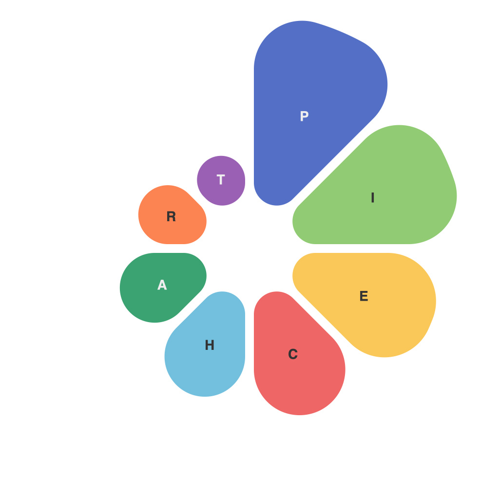
Data visualization stands as a cornerstone in the communication of complex information in today’s data-driven world. Among the various tools at our disposal, pie charts have emerged as fan favorites for their simplicity and直观性. This article delves into the realm of pie charts, examining their role in visualizing data, the challenges they face, and the best practices for their design.
## Insights into Pie Charts
Pie charts are circular statistical graphs divided into sectors, each sector representing a proportion of the whole. They are effective in illustrating proportionate parts of a single category or in comparing different segments of two related sets. At its best, a well-crafted pie chart can provide immediate clarity into a dataset’s composition.
Pie charts work particularly well:
– When the data consists of a small number of categories that each make up a significant proportion of the total.
– When the composition varies significantly between the categories.
– When the comparison of absolute frequencies is needed visually.
## Challenges of Using Pie Charts
Despite their popularity, pie charts present several challenges that can hinder data comprehension:
– **Quantitative Perception Challenges**: Humans are not very good at comparing the angles of two slices in a pie chart to infer their relative sizes. It’s often more intuitive to compare lengths or areas, which isn’t possible in a standard pie chart.
– **Overloaded Visual Clutter**: When there are multiple categories, especially if they vary significantly in size, a pie chart can become overwhelmed with too much information, making it harder to discern the composition at a glance.
– **Circular Misconceptions**: A pie chart’s circular shape can hint at a natural circular relationship between the data it represents, which isn’t always appropriate. For instance, a pie chart might imply that there is a relationship between categories over time that may not be accurate.
– **Lack of Interactivity**: Pie charts are generally static, which limits the interactivity and engagement that can be achieved with other types of visualizations, like interactive time series graphs.
## Design Best Practices for Pie Charts
In order to address some of the concerns mentioned above, there are best practices for designing effective pie charts:
– **Limit the Number of Slices**: Avoid overloading the pie with slices; keep it to no more than 7 or less for better readability. If there are many categories, consider a different visualization, such as a bar or stacked bar chart.
– **Use Starting Points Instead of Fractions**: To avoid ambiguity about the starting and ending points for each slice, use the whole angle from 12 o’clock to clearly indicate a slice’s starting point, creating an angular distance that more accurately corresponds to the slice’s proportion.
– **Ensure that Each Slice is Clearly Distinct**: Use color or texture to make each slice easily distinguishable. Avoid overly subtle variations in color or texture that can lead to misinterpretation.
– **Leverage Interactive Features**: Use interactive pie charts where possible to allow viewers to click through different slices to see more detailed data. Interactive elements can greatly improve engagement and comprehension.
– **Offer Contextual Information**: Whenever possible, accompany pie charts with textual annotations or supporting data. This can help clarify any points that the visual alone does not make obvious.
In conclusion, pie charts, with their circular shape and sectors, can offer valuable insights into data when used sparingly and with care. By employing the outlined best practices, designers can leverage the strength of pie charts to effectively communicate complex information to their audiences, mindful of the challenges inherent in their visual format. When pie charts are correctly visualized, they can be a valuable asset in data storytelling.

