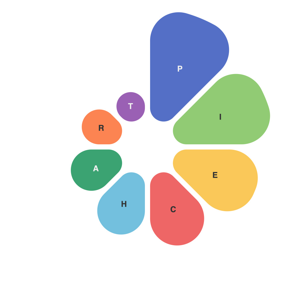
Within the vast landscape of data visualization, pie charts stand as a familiar beacon, a tool that has both shaped and been shaped by the evolution of information representation. They are perhaps the simplest and most classic of all charts, yet mastering their usage is far from straightforward. This article delves into how data is visualized through the lens of pie charts, offering insights into both the subtleties of their creation and the best practices to consider for maximally effective communication of data insights.
**The Art of Pie**
Pie charts are graphical representations of data, divided into slices to show proportions of an overall total. Each slice represents a percentage of the whole. Initially, they were used to illustrate data in ways that were both intuitive and engaging; they were particularly favored for depicting categorical data. However, their use can be deceptive and, when not used carefully, they can lead to misunderstandings or misinterpretations of data.
**Choosing the Right Context for Pie Charts**
Before you embark upon creating a pie chart, consider whether it the most appropriate visualization for your data. Here lies an essential truth of dataviz: not every dataset suits a pie chart. Ideal contexts for pie charts include situations where:
– There are relatively few slices (a rule of thumb is five or fewer)
– The individual components are clearly distinguishable; too many variations can lead to a cluttered chart
– The size of the different segments is quite different from one another
– The data being displayed naturally lends itself to circular division
**Insights from the Shape of Slices**
The way the slices are depicted can be enlightening. For instance, some pie chart designs highlight each slice with a border, helping viewers to easily compare different sizes. However, it is critical to avoid making the slices too thin, as this may cause distortion and make the chart unreadable.
**Color and Labeling: The Visual Language**
The visual language of pie charts is rich with the potential to convey messages more adeptly than with plain data. Color choice affects perception, so best practices include:
– Using distinct, contrasting colors to differentiate slices
– Limiting the color palette to avoid complexity and confusion
– Adding labels, but sparingly to prevent the chart from appearing cluttered
**Recognize the Cognitive Limitations**
Human cognitive limitations are a fundamental consideration in data visualization design. Our ability to accurately compare sizes of adjacent slices in a pie chart diminishes as the number of slices increases. The pie chart becomes more of an impressionistic representation than a precise quantifier.
For this reason, it’s wise to pair pie charts with additional data visualizations or tables that can more clearly convey the data’s finer points. For instance, a bar chart alongside the pie can allow for precision in numerical comparisons.
**Interactive Pie Charts: The Next Dimension**
Taking data visualization a step further, interactive pie charts offer an engaging way to interact with the data. Users can hover over slices to see numeric values or use controls to drill down into granular data.
**Pie Chart Best Practices in Summary**
– Limit pie chart slices to what is manageable for the human eye.
– Use color selectively to ensure clarity.
– Incorporate labels and data tables to complement the pie chart.
– Consider additional visualizations to provide more context.
– Be mindful of the audience and their expectations from the data presentation.
Visualizing data through the lens of pie charts is an art as much as a science, requiring an understanding of both data characteristics and human cognition. When crafted with these insights and best practices in mind, pie charts can be powerful tools in conveying complex information in an intuitive, engaging, and accurate manner.

