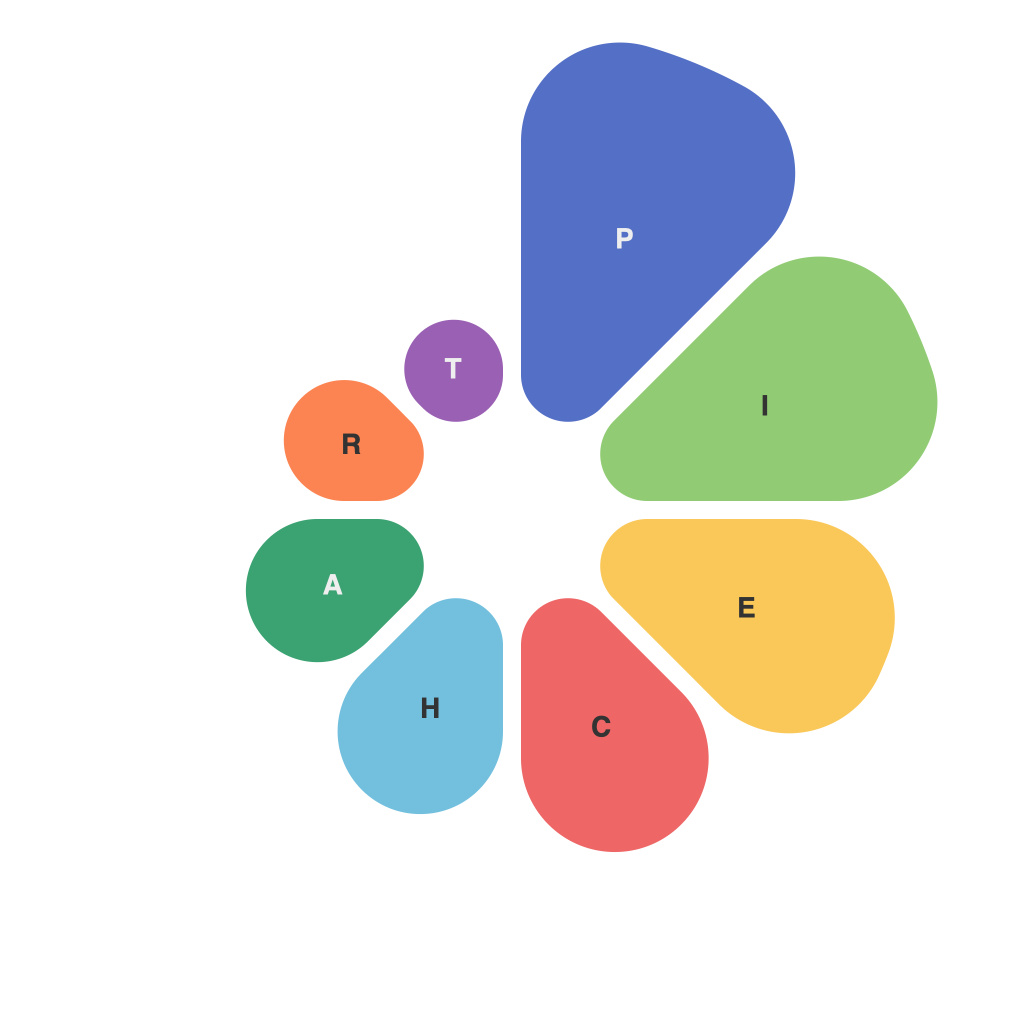
In today’s data-driven world, the ability to effectively communicate complex information through clear, engaging visuals is paramount. Among the various tools at our disposal, pie charts are often overlooked, sometimes seen as outdated or overly simplistic. However, when crafted meticulously, pie charts can be powerful, intuitive, and truly compelling tools for audience engagement. This article explores the essentials of visualizing data with clarity, focusing on how to develop effective pie charts that not only convey information accurately but also captivate the audience.
### Understanding the Purpose
Before jumping into pie chart creation, it’s crucial to understand the purpose of the visualization. Clarity in this context refers to both the clarity of information presented and the clarity of the understanding that your audience will derive from it. Ask yourself what key message you need to communicate. Is it to illustrate the composition of a whole or the proportion of various parts within a whole?
### Basic Structure
A well-structured pie chart begins with selecting the right data. Ensure that your dataset can be logically divided into slices that add up to 100%. Each slice should be represented proportionally to its value, with the largest slice being the most significant segment.
### Choosing the Right Colors
Color choices are crucial to pie chart effectiveness. A well-thought-out palette can bring your chart to life, helping differentiate between slices, but not so much that the audience gets lost. Use colors that are distinguishable but not entirely contrasting – this prevents sensory overload and keeps the reader focused on the chart itself.
### Ensuring Readability
A pie chart is only as effective as its readability. Keep the following points in mind for optimal results:
#### Use of Labels
Label each slice to identify the segment. Ensure that the font size is proportional to the slice’s size so that the smallest slices can still be easily read. Avoid overcrowding the chart with too many labels.
#### Avoid Clutter
Clutter kills visibility in a pie chart. Stick to one idea per chart. A pie chart shouldn’t be used to convey more than three to four categories, as trying to squeeze in more information can confuse the audience.
#### Maintain Consistency
Consistency in style, font, and labeling is key. Use a consistent color scheme and label format to foster understanding and prevent confusion.
### Enhancing the Visual
Even the best-structured pie chart can be improved through careful enhancement. Consider the following tips:
#### Adding a Legend
If the chart has more than four or five categories, a.legend can be an asset, especially if the chart is not to be displayed on the same page as the rest of your writing or presentation.
#### Annotating Slices
Adding annotations to indicate how large certain segments are not only aids understanding but also serves to highlight the most critical pieces of data. Use callouts that are clear and do not overpower the rest of the chart.
#### Use of Animation
For more engaging display purposes, carefully designed animation can help make the transition between slices clear. It can bring attention to key insights as the chart changes.
### Conclusion
Pie charts often bear the brunt of criticism for simplicity, but with careful crafting, they can serve as potent visual tools that resonate well with a wide range of audiences. By focusing on structure, color, readability, and enhancement, you can create pie charts that are both informative and captivating. With these guidelines, you will be well-equipped to visualize data with clarity, helping your audience not just to see the data, but also to engage with it, understand it, and make informed decisions based on it.

