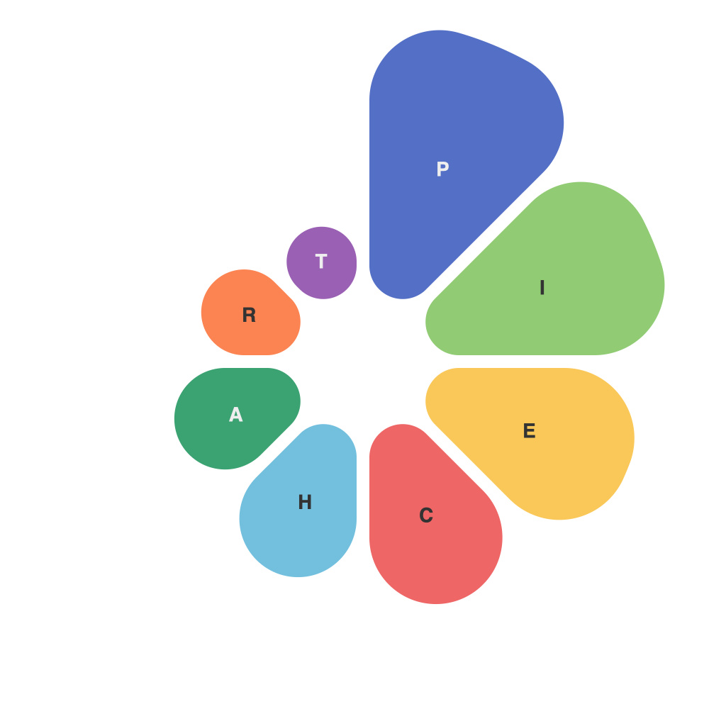
In the modern world of information overload, the ability to convey complex data through simple and effective visualization has become more crucial than ever. One such method that remains a staple in the visual storytelling toolkit is pie charts. Despite their simplicity, creating perfect pie charts is an art form that blends the technical precision of science with the intuitive creativity of art. This article delves into the intricate details that differentiate a good pie chart from an excellent one.
**Understanding Pie Charts**
A pie chart is a circular statistical graphic, where sections of the circle (slices) are used to represent the relative proportion of different data categories. It’s easily understood that a larger slice represents a category with a greater proportion or number compared to others. Pie charts are most effective when used to show parts of a whole or comparative proportions between different categories.
**The Do’s and Don’ts of Pie Charts**
Do: Start at the 12 o’clock position.
Starting the angle of the pie slice at the 12 o’clock position ensures that the chart is immediately recognizable as a slice of a pie. This standardization also helps the reader interpret the chart without confusion.
Don’t: Use more than 7 slices.
Psychology has shown that our brains can easily recognize similarities and differences with five to nine visual elements. Beyond this number, it becomes increasingly difficult to differentiate among slices, and the chart loses its effectiveness.
**Color and Aesthetics**
The right use of color can enhance the understanding and memorability of pie charts. Here are some key points:
Do: Choose a color scheme that contrasts with one another.
Each slice should have a color distinct from the others. This helps to differentiate each category at a glance.
Don’t: Use more than five to seven colors.
Too many hues can overwhelm the viewer and negate the clarity of the pie chart.
**Legibility and Font**
Font size and type can greatly influence the chart’s readability.
Do: Use a legible font size.
Ensure the font size is sufficient for the chart’s scale and is readable at any distance it’s displayed.
Don’t: Use decorative or script fonts.
These are difficult to read and can distract from the message of the chart. The focus should remain on the data and its presentation, not the font design.
**Effective Labeling**
Proper labeling is essential for the clarity of a pie chart.
Do: Use labels on the slices.
This enables the viewer to immediately understand which slice represents which category without having to refer back to the legend (which can compromise the flow of information).
Don’t: Only use a legend.
While a legend is an essential component, not including labels on the slices makes it harder for the viewer to absorb information quickly.
**Data Accuracy and Consistency**
The data presented in a pie chart must be accurate and consistent with the source material.
Do: Use accurate proportions.
Ensure that the size of each slice corresponds to its actual proportion in the dataset.
Don’t: Distort proportions for design purposes.
Adapting the sizes without changing the underlying data distorts the interpretation of the chart’s meaning.
**Using a Three-Dimensional or Stacked Chart Wisely**
Three-dimensional pie charts often appear more visually appealing but can confuse the viewer’s interpretation.
Do: Choose a three-dimensional pie chart sparingly.
Use it when there are few slices or when illustrating a point about depth is important.
Don’t: Rely solely on three-dimensional pie charts.
Two-dimensional pie charts are generally more straightforward and less visually cluttered.
**In Conclusion**
Creating perfect pie charts is more than just presenting data. It’s about designing with intent to enhance understanding and communication. The fine balance of science and art in pie charts requires attention to detail, adherence to best practices, and thoughtful execution. By paying homage to these principles, we can not only communicate information more effectively but also offer the viewer a visual aesthetic that complements the data’s story.

