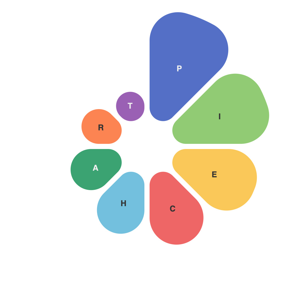
When it comes to presenting data, the choice of visualization can have a significant impact on how effectively your message is received. Among the variety of visualization tools at your disposal, pie charts have long been a popular choice. This is because they are intuitive, easy to understand, and can effectively illustrate proportions or percentages of a whole. However, crafting clear and compelling pie charts takes skill and finesse. The following comprehensive guide will take you through the essential principles of pie chart creation to help you produce visually striking, informative, and accurately reflective data presentations.
**Understanding Pie Charts**
Before we delve into how to create a pie chart, it’s important to understand what they represent. Pie charts are circular graphs where the whole circle represents a total amount, often used for illustrating data proportions such as market share, survey responses, or time allocation. The size of the pie sections—a.k.a. the “slices”—varies proportionally to the data they represent.
**Choosing the Right Data**
Pie charts are best suited for representing a few data points that are directly related to each other. They become challenging to interpret when too much data is crammed onto a single chart. When considering if pie charts are the right tool for your data, keep in mind the following guidelines:
– The data should be categorical.
– There are few categories.
– You want to emphasize the relationships between the categories, particularly the larger vs. the smaller.
**Designing the Pie Chart**
Once you’ve determined that a pie chart is the right tool for your data, the design phase begins. Here’s what you need to know:
**1. Chart Size and Platform**
Pie charts should be large enough to see the different slices clearly but not so large as to become unwieldy. Consider the context in which the chart will be viewed: a printed report will have different needs than an interactive web page.
**2. Standard Color Palette**
Use colors that can be easily distinguished from each other and are standard across your organization or for consistency within a series of presentations. Avoid desaturated or overly bright colors as they can make the chart difficult to read and comprehend.
**3. Clear Labels**
Each slice should have a clear, simple label that is easy to read. While it’s desirable to use the category names, it might not always fit — especially if there are a lot of categories. In such cases, use short, descriptive labels or even numbers or icons.
**4. legends for Complex Data Sets**
If your pie chart has too many slices, it might become cluttered and confusing. In such cases, use a legend to clarify the colors and their corresponding labels.
**5. Adding Text and Annotations**
Enhance your pie chart with relevant information that might not be immediately apparent. Add percentages to each slice, a title if needed, and annotations to highlight any critical insights from the data.
**Creating the Pie Chart**
When creating your pie chart, follow these steps:
**1. Data Preparation**
Organize your data in a logical format, often as a table or spreadsheet with categories as rows and measurement values as columns.
**2. Using Visualization Tools**
Depending on the tool you’re using, the process will differ slightly. However, typically, you’ll find an option for pie charts. Input your data and let the software handle the rest. In professional-grade software, you may have fine-grained control over design elements and can incorporate more sophisticated charting features.
**3. Formatting**
Adjust the size of the slices if needed, set the percentages to display as decimals or percentages, and align the labels to prevent overlap. Play with the angle of the slices if necessary to improve readability.
**4. Review and Adjust**
After creating your initial pie chart, review it for any potential confusion. Is it aligned so that the largest slice is facing you, as is the convention? Are all labels clear? Could you improve the layout for better understanding?
**Common Pitfalls to Avoid**
When creating pie charts, there are common pitfalls that can undermine their effectiveness:
– **Too Many Categories:** Each slice should be distinct to avoid confusion; too many categories can make the chart hard to interpret.
– **Too Many Colors:** Use a palette that offers contrast but is not overwhelming.
– **Order of Slices (Misleading Aesthetics):** Order slices from largest to smallest unless there’s a specific reason to do otherwise. Otherwise, it can trick the audience into perceiving data inaccurately.
Pie charts, when crafted with care, are a valuable tool in any data presenter’s arsenal. By following this guide, you can ensure that your pie charts are not only visually appealing but also informative and clear. Whether you are a corporate presenter or an academic researcher, mastering the art of creating compelling pie charts is an essential step in presenting data with impact.

