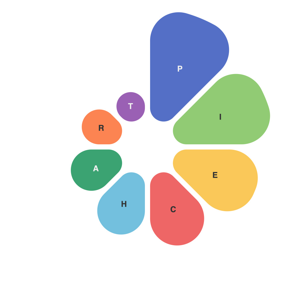
Visualizing data is an essential skill in modern data analysis and communication. Among the various types of charts available, pie charts have long been favored for their ability to represent part-to-whole relationships in an intuitive way. However, not all pie charts are effective. Creating an informative and clear presentation with pie charts requires careful design and consideration of your audience’s understanding. This guide explores the best practices for crafting pie charts that add value to your data storytelling.
### Understanding the Basics
Pie charts are circular graphs with slices that each represent a portion of the whole. They are best used when there are a limited number of categories, typically five or fewer, and when you want to compare the size of each category to the whole. Pie charts can be used to depict market share, population statistics, or any scenario where showing how much is in versus how much is out of a larger whole is necessary.
### Selecting the Appropriate Data
Before you begin, ensure that your data is appropriate for a pie chart. If you have too many categories or if the comparisons are not clear, a different chart type, like a bar chart or a donut chart, may be more suitable.
### Choosing Colors Wisely
Colors are one of the most important aspects of pie chart design. Select colors that are distinguishable from one another to ensure that your audience can easily differentiate between slices. Use color schemes that reflect your data’s themes or choose a palette that aligns with your brand colors. Avoid clashing colors that could lead to confusion.
### Label Slices Clearly
Labeling the slices is crucial for the chart’s readability. Make sure that the labels are clear and concise, and ideally, put the percentage alongside the label. When the pie chart includes a large number of slices, consider listing the labels outside the chart, as the inside space may not accommodate enough text.
### Ensure Labels are Readable
The text on your pie chart should be of a suitable size to read easily. Even the tiniest text may go unread once the chart becomes crowded. Strive for a readable font size without making the text look cumbersome or overlapping slices.
### Consider the Legend
If you have multiple datasets, using a legend may be necessary. Ensure that the legend matches the color scheme and is clearly positioned. Make sure that the legend entries are accurate representations of the slices within your chart.
### Minimize Label Clutter
Too many labels can clutter the pie chart, making it difficult to read. To mitigate this, remove unnecessary data or aggregate slices if they represent similar values. For example, a slice can be represented by a label with a notation like “Other (various)”
### Use Hole in the Middle (Donut Chart)
In cases where space is critical and labels outside of the pie are not enough, consider using a donut chart. It is similar to a pie chart with a hole in the middle to further separate labeled elements, which can help with text legibility and data interpretation.
### Arrange Elements Strategically
The order in which you place the categories can greatly affect interpretability. Sort the categories from largest to smallest by default, unless there’s a specific meaningful order you want to convey. Placing uncommon category slices towards the end of the chart can often reduce clutter.
### Use a Third Party Tool
Software applications like Microsoft Excel, Google Sheets, Tableau, and Adobe Illustrator offer robust tools for creating pie charts. These platforms often come with a built-in array of design features and libraries of pie chart templates. But they also provide the flexibility to tweak elements to your specific preferences.
### Avoid 3D Effects
While visually appealing, 3D effects in pie charts can distort the viewer’s perception and make it difficult to accurately assess the sizes of the slices. Avoid these effects unless they specifically add value to your presentation.
### Test thechart’s Legibility
Before finalizing your pie chart, test its legibility. Present the chart to a colleague or peer and ask them to interpret it. If they’re confused or need to refer to labels frequently, adjust your design accordingly.
### Concluding Thoughts
Pie charts are a vital tool for visual data storytelling. With careful consideration of the appropriate use cases, design, and audience, pie charts can effectively illustrate part-to-whole relationships and add insight to your presentations. By leveraging this guide’s recommendations, you can create informative and clear pie charts that aid in effective data communication. Remember, the goal of a pie chart is not just to display the data but to help the audience understand it.

