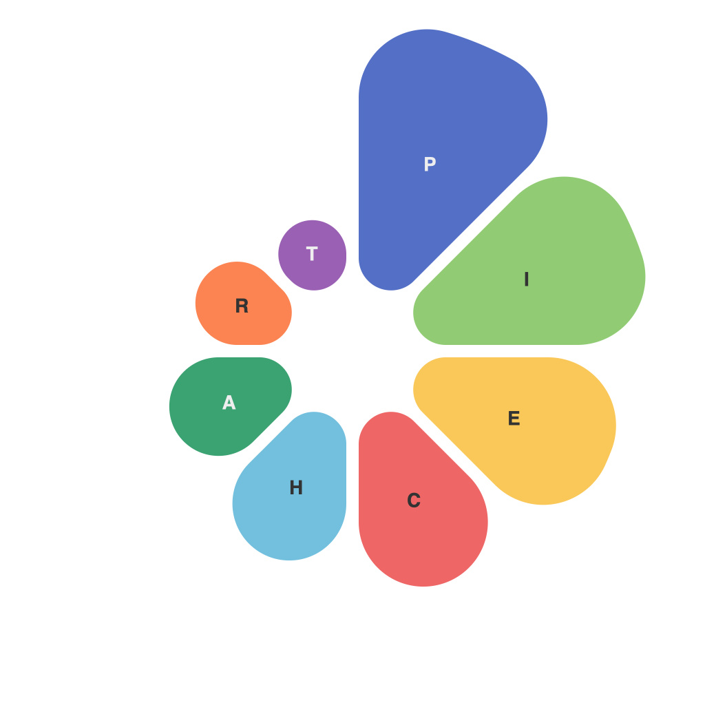
In our data-driven world, the ability to effectively visualize information has become pivotal for both professionals and enthusiasts. Pie charts, as a popular data visualization tool, have always held their place in the arsenal of effective communicators, whether it’s for conveying financial ratios, segment sales, or breaking down survey results. This article takes you through the art of creating visually appealing and informative pie charts, explores creative themes, delves into best practices, and showcases infographics that have set the gold standard in pie chart design.
—
**Pie Chart: A Foundation for Clear Communication**
At its core, a pie chart represents a part of a whole, and when done right, they provide a clear and concise view of a dataset. Crafting a pie chart involves not just the data arrangement but also the theme it embodies and how it is presented—aesthetically and strategically.
**Creative Themes: Shaping the Identity of Your Pie Chart**
The theme you choose for your pie chart can significantly influence how the audience interprets the data. Here are a few creative approaches:
1. **Color Schemes:** Using relevant and contrasting colors can help draw attention to certain segments. For instance, in a demographic pie chart, distinct hues can represent different age groups.
2. **Iconography:** Adding icons to each segment can aid in identifying them immediately—for example, using a shopping cart icon in a retail pie chart.
3. **Contextual Themes:** Themed pie charts can make your data analysis more relatable. For example, employ a football-themed pie chart for football viewership data.
**Best Practices for Crafting Effective Pie Charts**
To ensure your pie chart serves as an effective communication tool, adhere to these principles:
1. **Limited Segments:** Keep the number of segments below 6-7, as too many slices can clutter the chart and make it difficult to interpret.
2. **Logical Order:** Arrange segments logically to facilitate understanding. It can help to follow a rule of progression—either alphabetically, starting with the largest, or categorically based on importance.
3. **Label Placement:** Labels should be clear but not interfere with the pie’s readability. It often helps to use a label on top of each segment, but be careful of overlap.
4. **Use of Labels:** Avoid long labels and use abbreviations if necessary, but only do so consistently.
5. **Data Labels:** Include data labels to enhance the viewer’s understanding, allowing them to easily verify the percentages shown.
**Infographics Showcase: The Pinnacle of Pie Chart Excellence**
An infographics showcase demonstrates the power of a well-executed pie chart:
1. **Netflix’s Content Trends:** A visually striking pie chart showcasing the variety of content on Netflix, with slices uniquely colored and shaped to indicate various genres and content types.
2. **BBC World Service Language Usage:** A pie chart illustrating the percentage of broadcasts in different languages, cleverly themed to mirror the globe, with each segment a different continent and language flag.
3. **Apple’s Product Lines by Revenue:** An informative pie chart that includes a subtle gradient to communicate the relative size of revenue segments across Apple’s product lines.
**Conclusion**
Pie charts are more than just a collection of digits on a circle; they are tools that translate complex information into digestible graphics that can resonate with a wide audience. Whether you’re creating one for a business report, an educational presentation, or simply to explore data, it’s imperative to design with thoughtfulness, adhering to best practices while adding your unique creative touch. As data visualizations evolve, the right pie chart can set your analytics apart, making it stand as more than just data—it becomes insight.

