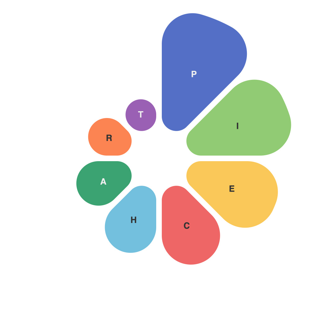
Visualizing data with pie charts can be a powerful tool for conveying complex information succinctly. However, designing an effective pie chart requires careful planning and execution. This article illustrates strategies and best practices for crafting pie charts that enhance clarity, engagement, and interpretation among your audience.
**Understanding the Purpose**
Before plunging into the design of a pie chart, it is crucial to understand the purpose of the chart. Ask yourself, what story does the data tell? What insights do you want to communicate to your audience? The answers to these questions will guide your chart design decisions.
**Choosing the Right Data**
Pie charts are best used for illustrating the portion-to-whole relationship in data. They are not appropriate when there are more than a few categories, as overlapping slices can make the chart confusing. Choose a dataset that can be effectively represented by different slices, and avoid pie charts when data comparison is the primary goal.
**Limiting the Number of Slices**
The rule of thumb is to keep the number of slices to seven or fewer. This guideline is based on research demonstrating that people can easily differentiate up to five distinct shades or colors. With more slices, the pie chart becomes cluttered and difficult to interpret.
**Using Clear Categories**
Ensure that the categories represented in your pie chart are mutually exclusive and collectively exhaustive. You don’t want to leave your audience wondering about the pie slice that is ‘other.’
**Labeling Clearly**
To make the pie chart user-friendly, label each slice clearly. Use clear, concise text annotations to specify what each slice represents. Make sure the font is legible against the background of the chart.
**Color Selection**
Colors are an essential part of a pie chart. Use a color palette that is both aesthetically pleasing and intuitive. Consider using shades or tints of one base color for related slices to create a sense of hierarchy. Avoid clashing colors that might make the chart tough to interpret.
**Consider the Hierarchy**
Highlight the most critical information by placing it towards the top of the pie, if possible. Make the largest slices more pronounced or even use a larger chart size if you want to emphasize certain pieces of data.
**Use Transparency and Shadows Wisely**
Adding transparency (also known as alpha) to pie slices can help differentiate them, especially when dealing with a chart with many slices. Shadows can add depth and aid in perception, but use them sparingly and only when necessary.
**Incorporate Interactivity**
Interactive pie charts can enhance the user experience. By allowing users to click on different slices to display more detailed information, the chart becomes a more engaging tool.
**Consider Context**
Context is key in data visualization. Use the pie chart as one element of a broader presentation that provides additional information, such as tables or textual explanations, to give your audience a full picture.
**Avoid 3D Pie Charts**
Resist the temptation to use 3D pie charts as they can distort perception and make comparison more challenging. 2D pie charts provide a better visual experience and improved data interpretation.
**Regular Audits and Refinements**
After presenting your pie chart, ask for feedback. Did your audience get the message you intended? Adjust the chart accordingly. Iterative revision is a key part of data visualization improvement.
By following these strategies and adhering to best practices, you can create pie charts that are not only visually appealing but also convey the intended message with clarity and precision. Remember, visualization is not just about the how, but also about the what and why of the data you are presenting.

