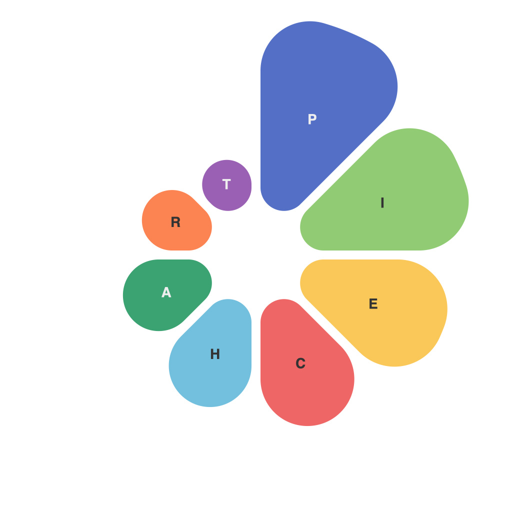
In an era characterized by an overload of data, the ability to visualize information effectively is more crucial than ever. Among the various tools available for such purposes, the pie chart stands out as a classic and powerful means of representing percentages within a given context. However, not all pie charts are created equal. Crafting clear and concise pie charts is both an art and a science, requiring a keen understanding of design principles and user experience best practices.
**The Essence of Pie Charts**
At its core, a pie chart is a circular statistical graphic that is divided into sections to represent numerical proportions. Each slice of the pie represents a segment of the whole, making it one of the simplest and most intuitive ways to compare parts of a whole.
**Precision in Measurement**
To visualize data with precision, the accuracy of the pie chart’s numerical values is paramount. Incorrect or miscalculated figures can easily misrepresent the entire data set. To address this, begin by collecting and verifying your data sources. Double-check percentages and ensure they add up to 100. The pie chart is not just a decorative element but a tool with a specific function: to communicate data accurately.
**Choosing the Right Data**
Not all data is suited to be visualized in a pie chart. For instance, pie charts work best when you have three or more categories to compare. However, if there is a strong focus on a single dominant segment compared to others, or if the absolute sizes of the segments vary significantly, a different chart type might tell a more effective story.
**Designing for Clarity**
A well-crafted pie chart should not just be precise but also visually appealing. Here are some design tips to ensure clarity:
– **Color Palette**: Use distinct colors that can be easily distinguished. Avoid color schemes that include similar shades; these can lead to confusing comparisons between segments.
– **Legend**: Include a clear and concise legend that defines each color correctly. Make sure that the colors are recognizable independently, without relying on the legend.
– **Labels**: Make sure that all segments are clearly labeled with both the name of the category and its corresponding percentage. This allows viewers to quickly identify each piece and compare them side by side.
– **Label Position**: Align labels on an angle for legibility and aesthetics, but avoid placing them over the border where they might be cut off. This could require careful calculation to ensure the label placement is just right.
– **Sizes**: Ensure that the sizes of the segments reflect the percentages accurately; avoid overly simplistic or exaggerated sizes that could distort the chart.
**Simplicity is Key**
Pie charts can easily become cluttered and overwhelming. To maintain clarity:
– **Limited Data Series**: Avoid using too many segments. The rule of thumb is to have no more than seven slices; otherwise, consider an alternative chart type, like a donut chart.
– **Avoid Over-Detailing**: Don’t fill in the pie chart slices with intricate designs or patterns; keep it simple to avoid visuals that might distract from the message.
– **Focus on the Key Takeaways**: If there’s one or two segments that are most important, highlight them to draw the viewer’s attention to the key data points.
By keeping these principles in mind, you can craft pie charts that are not only precise in their measurements but also clear and concise in their visualization. Such charts serve as a valuable tool for conveying complex data in an intuitive and straightforward manner, making them an indispensable asset for anyone aiming to communicate information effectively.

