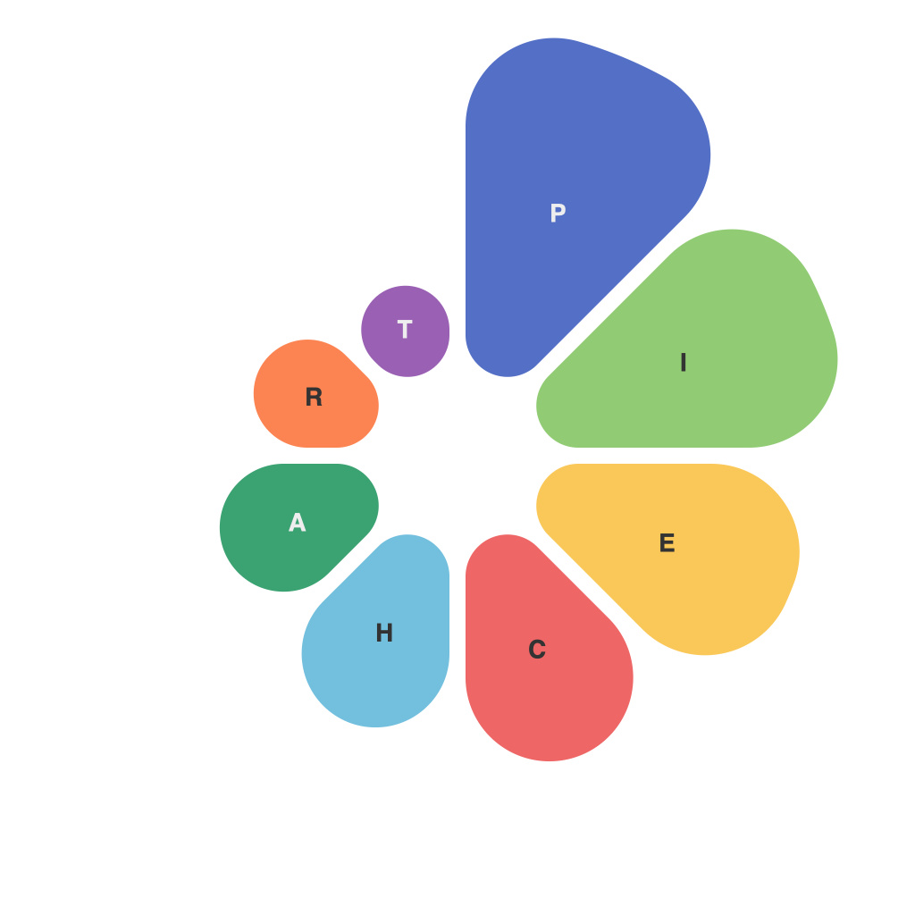
In an age where data rules the roost and information is currency, the ability to effectively visualize statistics is an invaluable skill. Among the many tools at our disposal are pie charts, which, despite their seemingly simple nature, carry a power hidden within their concentric circles. This article delves into the artful use and interpretation of pie charts, offering insights into how we can harness their visual charm to convey complex statistics in a digestible format.
The Story Begins with Strips
At the heart of every pie chart lies the humble bar chart, a visual staple since the 18th century. The pie chart, with its pie-cutting roots, is essentially a circular variant of this concept. By rearranging strips into sections, pie charts encapsulate data into a pleasingly circular format, often more approachable than the traditional linear arrangement.
Choosing Wisely: Design Do’s and Don’ts
The right design can make or break the impact of a pie chart. It’s essential to select a chart that not only communicates the intended message but also enhances the viewer’s understanding. Here’s a brief guide on dos and don’ts:
Do:
1. Use a clean and uncluttered design that allows for easy interpretation.
2. Define slices clearly with distinct colors or labels.
3. Balance the size of slices to the data they represent—avoid overly large or tiny sections.
4. Provide a legend for ease of reference.
Don’t:
1. Overload the chart with too much information or text.
2. Ignore the order of magnitude when it comes to slice size.
3. Add 3D effects—pie charts should remain flat to avoid exaggeration and misinterpretation.
4. Use the same color for all slices; it makes the chart less visually interesting and informative.
The Psychology of Color
Color, the unsung hero of pie charts, can evoke emotion and guide the viewers’ interpretations. Red, for instance, often signifies danger or importance, while blue may evoke trust. But it’s not about choosing your favorite colors; it’s about conveying information effectively.
Color Scheme as a Guidepost
Creating a color scheme for pie charts is akin to painting a landscape. The hues should blend harmoniously and highlight significant slices, without overwhelming the viewer.
– Use color consistently across your data set for ease of comparison.
– Balance the number of colors used to avoid visual chaos.
– Test the color scheme to ensure contrast and legibility.
Reading Between the Lines: Interpreting Pie Charts
Pie charts provide numerous benefits to interpreters, but they are also subject to misinterpretation if not used wisely:
1. Avoid overgeneralizations: A small slice might denote a small percentage of the whole, but that percentage could be crucial in a specific context.
2. Beware of the illusion of space: Larger slices in a pie chart often seem to occupy more space in the viewer’s mind, leading to potentially misleading interpretations.
3. Check the context and the source of the data: Pie charts can sometimes be used to misrepresent truths or to bolster a specific agenda.
Piecing Together the Future
The artful use and interpretation of pie charts extend beyond the visual representation of data—they are a window into the data’s soul. With the right approach—balanced design, thoughtful selection of colors, and careful interpretation—the pie chart can not only convey statistics but also tell a story, making complex information relatable and accessible.
As the world becomes more data-driven, pie charts and their visual counterparts will continue to play a vital role in helping us navigate the seas of information. So next time you’re presented with a pie chart, take a moment to admire its artistic creation and consider the story it has to tell. After all, the art of data visualization lies in our ability to understand and interpret the story behind the numbers.

