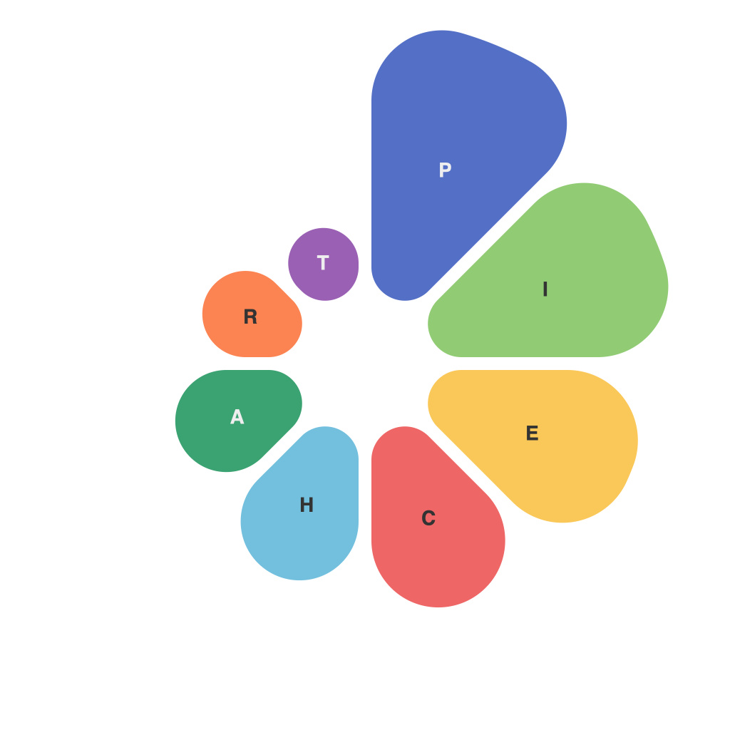
Visualizing visions through data is a crucial component in the field of analytics and communication. Among the various tools available for presenting data, pie charts stand out as one of the most intuitive and commonly used formats. Yet, as simple as they appear, pie charts can carry complex narratives and rich historical contexts—navigating the art and nuance behind these circular graphs requires a keen eye and a nuanced understanding of information visualization.
The Evolution of Pie Charts
Pie charts have been in use since the early 19th century, first popularized by William Playfair. Through the centuries, they have evolved in design and purpose, influencing how we perceive and analyze data. From demographic data to market share information, pie charts have found their place in various corners of the data-driven world. However, not all pie charts tell the same story, and their art lies in the design, context, and the way they are presented.
Pie Charts and Perception
One of the central challenges in pie chart design is how they affect human perception. Pie charts are circular—this design suggests a form of symmetry, balance, and completeness that often influences our thought processes. Humans are pattern-seeking creatures; we naturally find the whole more significant than its parts, and this is where pie charts can sway us.
In a perfect world, pie charts would be perfectly symmetrical, but since this is often not the case, we must consider their accuracy carefully. Even a small difference in the perceived size of segments can lead to misinterpretation of data. Therefore, one must be careful about the precision and clarity of the numbers when designing and presenting pie charts.
Color and Composition in Pie Charts
Visual elements, such as color, play a critical role in enhancing the effectiveness of pie charts. The way colors are chosen and applied helps distinguish between sections, aiding in better comprehension. However, it’s essential to balance aesthetics with readability. Using too many colors can make a chart overwhelming, whereas a well-curated color palette can ensure both impact and clarity.
Another crucial nuance involves the composition of the pie chart itself. Careful placement of labels, sensible use of gridlines, and selecting a suitable size for the chart are essential. Sometimes, smaller pie charts fit well in presentations or reports, as they are easier to digest in confined spaces. On the other hand, larger charts allow for better detail and can be more effective when the story is complex or requires in-depth analysis.
Pie Charts and Data Clarity
While pie charts are an effective tool for presenting static data comparisons, their effectiveness diminishes when used to illustrate trends over time or when the data set is vast. In such cases, additional information or different types of visuals such as bar graphs, stacked line charts, or heat maps might be more suitable. It is beneficial to understand the strengths and weaknesses of pie charts and to select an appropriate visualization medium based on the data and the desired message.
In the realm of data visualization, pie charts serve as a canvas for artists, storytellers, and analysts to communicate complex ideas in a digestible format. Still, this art form requires an informed approach that acknowledges the subtle nuances of pie chart design and perception.
Pie charts are not just about numbers; they are about crafting a narrative that bridges the gap between data and understanding. Through thoughtful design, careful selection of colors, and strategic placement, pie charts can help uncover hidden insights, stimulate discussion, and lead to more informed decision-making. Navigating the art and nuance of pie charts in data presentation is an essential step in turning raw data into compelling and meaningful stories.

