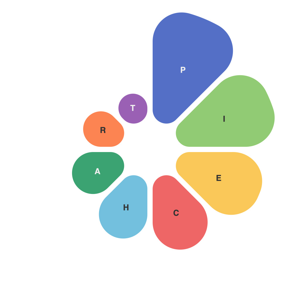
In the realm of data representation, the pie chart has long been a favorite of statisticians, policymakers, and even casual observers alike. This circular diagram slices the whole into a series of segments, each representing a portion of a larger whole or sum. While they are undeniably simple and intuitive, pie charts can also be quite deceptive if used without a clear understanding of their limitations and the principles of effective visualization.
**The Beauty in Simplicity**
The principle behind pie charts is their simplicity. Their环形 design intuitively suggests the size of the total pie and allows for an immediate comparison between the sizes of individual slices. One of the most striking aspects of these charts is the way they can make the relative proportions of categories easily interpretable. But like many tools that are easy to use, pie charts can be misused, leading to potential misinterpretation of data.
**The Challenges of Representation**
There are several pitfalls when pie charts are used to represent data:
1. **Cognitive Load**: When the number of slices is high, pie charts can become difficult to interpret. Too many slices make it challenging for the human eye to distinguish between them. The eye has to travel around the entire pie to gauge the size of each slice, an inherently inefficient process.
2. **Misleading Proportions**: The human brain is not very good at comparing different-sized shapes. Pie charts that use 3D effects, shadows, or varying opacity can lead viewers to think that one sector is larger than it actually is.
3. **Lack of Precision**: Pie charts use angles to represent proportions, which can lead to misunderstandings when data is particularly close. Even the smallest difference in the proportion of the pie has a significant effect on its angular size.
4. **Circular Distortion**: Any pie chart that is not properly scaled will distort the area of each slice. This means that two elements with extremely different proportions might look very similar in slices of a pie chart.
**The Art of Effective Pie Chart Design**
Despite these potential drawbacks, pie charts can be a powerful tool if used effectively. Here are some guidelines for creating interpretable pie charts:
1. **Limit the Number of Slices**: Limit your pie charts to no more than eight slices. If you need to represent more categories, consider a bar chart or a multi-series pie chart.
2. **Use Clear Labels**: Make sure each slice has a clearly readable label that identifies what it represents.
3. **Consider the Order of Slices**: Place the largest slice first so that the viewer’s eye can scan from the largest to the smallest, highlighting the largest component first.
4. **Prefer 2D Over 3D**: Avoid 3D effects, as these can distort the appearance of the pie slices and make it more difficult to interpret the exact percentages.
5. **Minimize the Use of Color**: Be sparing with color use to reduce the risk of color-based misinterpretation and help viewers focus on the comparative sizes of the slices.
6. **Provide Contextual Data**: Always display accompanying numerical data alongside the chart to provide a second layer of precision and context.
In the end, pie charts can communicate data effectively when used correctly, combining the art of graphical presentation with the science of data visualization best practices. Careful consideration of these principles can lead to the creation of pie charts that not only present data in a visually appealing way but also accurately reflect the true relationships between the components of the total.

