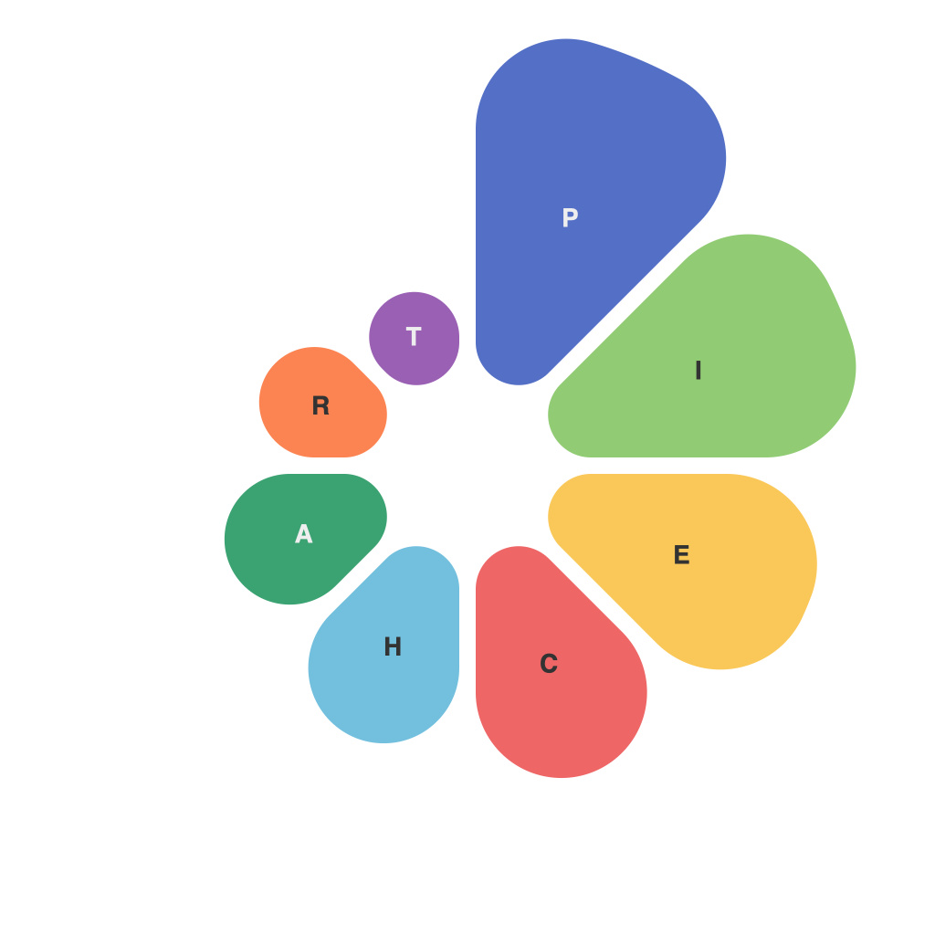
In the realm of data representation, pie charts have long been a staple for visualizing proportions and percentages. Despite being a visual language that can be both loved and loathed, pie charts offer a simple yet powerful way to communicate complex data. The magic and methodology behind their design are both elegant and challenging. They require careful consideration of color, layout, labeling, and design principles to convey information with both accuracy and aesthetic appeal. Let’s delve into the intricacies involved in creating masterful pie charts.
### The Magic of Pie Charts
The allure of the pie chart lies in its simplicity. With a single circle, one can distill the essence of a dataset into a readable format that is generally easily interpreted by the human eye. The magic of pie charts is in their ability to turn an abstract concept into a tangible, visual idea. When well designed, they can help make even the most arcane statistics feel tangible and accessible.
However, visualizing data is not about making it easy; it is about making it clear. A pie chart, like all graphical displays, must be crafted with intention to ensure it communicates a story or point effectively.
### The Methodology Behind Designing Pie Charts
Creating a pie chart that truly informs, rather than confuse, involves a series of careful steps:
#### Selecting the Right Data
Before the first slice is even cut, you must decide which type of data best lends itself to a pie chart. Pie charts are most effective when illustrating the percentage or proportion of whole. For example, a survey of political party affiliations might be a great candidate for a pie chart, while the annual performance of a corporate office team might not be.
#### Deciding on the Size
The diameter of the pie chart should be chosen with respect to the amount of space available and the importance of the visualization. A larger chart can handle more detail, but it also risks losing the viewer’s attention. Conversely, a small chart may be too cluttered to convey a clear message.
#### Choosing Colors
Color is a powerful tool in data visualization, and pie charts are no exception. The selection of colors should be both visually pleasing and functional. Consider the following tips:
– Use a limited color palette for clarity and consistency.
– Reserve one color for a dominant portion of the pie and choose complementary shades for the remaining portions.
– Employ color schemes that have been proven to be effective and are easily distinguished—avoid using blues and purples as they can be perceived as monochromatic when close together.
#### Laying Out the Segments
To prevent the slices of the pie from appearing in jumbled confusion, some organization is required. Segments should be positioned to create a logical path from beginning to end. Additionally:
– Arrange segments in order of size from largest to smallest.
– Ensure there is enough separation between segments to make them discernible—this can be easier said than done in densely populated charts.
#### Adding Labels
The information should be clear without requiring too much mental effort from the viewer. Effective labeling techniques include:
– Using clear, concise text.
– Ensuring that labels are proportional to the size of the slice.
– Considering the need for axis numbers and percentage signs, especially when dealing with non-self-evident slices.
#### Designing with the User in Mind
All the visual elements must work in concert. Consider the following aspects when designing the visual:
– Label the complete pie or a reference line to indicate the complete whole and the relative size of each partition.
– Avoid using unnecessary decorations to keep the chart sleek and unobtrusive.
– Use design principles such as symmetry and gradient effects only when they add to the clarity of the chart.
### The Challenges
Building a pie chart that accomplishes all of the above can be challenging due to the nature of the visual form itself. Here are some common pitfalls:
– Misleading omissions or including too many partitions can make the pie chart overwhelming and unreadable.
– People often misjudge the area of slices rather than the angles and angles are not reliable for making comparisons.
– It is difficult to read off exact values from the chart, which can be a dealbreaker in some contexts.
### Conclusion
While not the only tool for visualizing volumes of data, the pie chart remains a powerful and sometimes irreplaceable element in the visual data teller’s toolkit. Masterful pie chart design requires thorough planning and attention to detail around data selection, color, layout, and labeling. Through understanding the methodological aspects of creating a pie chart, designers and communicators can craft tools that turn volumes of data into clear, informative, and persuasive narratives. Whether you are a data scientist, analyst, or simply someone who wants to understand the data better, knowing how to design a pie chart can make the complex simple and the abstract come to life.

