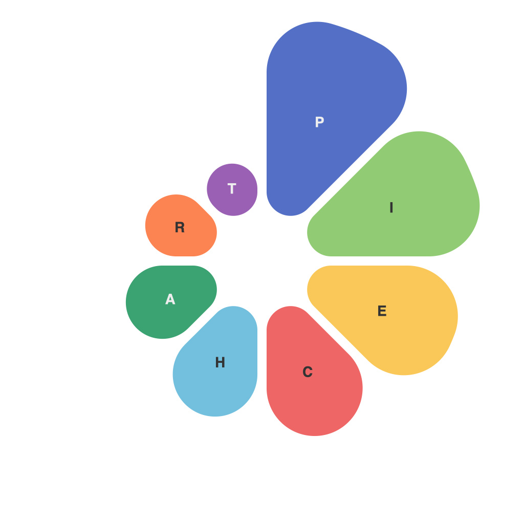
Unlocking the Power of Data Visualization: Mastering the Art of Pie Charts
Pie charts hold a distinctive place in the vast landscape of data visualization. Their circular and seemingly simple formation belies the profound impact they have on understanding complex data. The artistry and precision of pie charts, when harnessed correctly, can significantly enhance the clarity and impact of data, making it accessible and relatable to a broad audience. This article, devoted to mastering the realm of pie charts, aims to illuminate their significance, delve into their applications, and demystify the creation of effective pie charts.
### Significance of Pie Charts
Pie charts, first recognized by William Playfair in the late 1700s, embody the essence of sharing part-to-whole relationships effectively. Their purpose lies in illustrating proportions where each slice represents the relative size of that segment to the total dataset. This visual representation simplifies comparisons between different categories within a single data set, offering a snapshot of distribution that might be difficult to grasp from raw numbers.
### Applications of Pie Charts
Pie charts find extensive use across numerous sectors for a variety of purposes. For investors and financial analysts, they are instrumental in displaying the distribution of financial assets, such as stocks, bonds, and cash equivalents. For researchers, pie charts can depict categorical data related to demographics, market segments, or product usage patterns. The healthcare sector, too, benefits by using pie charts to illustrate vaccination uptake, patient disorders prevalence, or treatment modality choices.
### Crafting Effective Pie Charts
#### 1. **Choosing the Right Data**
Before creating a pie chart, ensure that the data being presented is suitable for this format. Pie charts excel in scenarios where it’s essential to compare parts of a whole, focusing on proportions and not the exact values.
#### 2. **Limiting the Number of Slices**
For maximum clarity, limit the number of data slices to no more than five. Any more can make the chart cluttered and hard to interpret. Consider clustering smaller categories into an “Other” slice for cleaner visuals.
#### 3. **Sorting Slices**
Arrange the slices in descending order of size. This visual grouping allows the viewer to quickly grasp the dominant proportions and their relative differences. For instance, placing the largest slice at the top or in a clockwise order can enhance readability.
#### 4. **Legends and Labels**
Provide a clear and concise legend that matches each slice to its corresponding category. If the chart is straightforward and only contains a few slices, consider labeling each directly for better precision and accessibility. However, in cases with numerous subtleties, a legend is more appropriate.
#### 5. **Color Contrasts and Aesthetics**
Use contrasting colors to separate slices effectively, ensuring that each segment stands out. High contrast colors enhance readability. However, avoid overly bright or clashing colors, which might strain the viewer’s eye or distract from the data.
#### 6. **Avoiding 3D Effects**
3D pie charts are aesthetically appealing but can distort the perception of sizes and angles, leading to misinterpretation. Their use is generally discouraged in favor of 2D versions that maintain the integrity of data representation.
### Conclusion
Pie charts, with their visual prowess and simplicity, remain an indispensable tool in the data visualization arsenal. By understanding the significance of these charts, their proper applications, and the art of crafting them effectively, one can harness their power to illuminate, simplify, and effectively communicate data insights. As you embark on your journey in mastering the art of pie charts, remember: clarity, simplicity, and the accurate representation of data are paramount. Through careful design and consideration, you can unlock the full potential of this traditional yet powerful data visualization technique.

