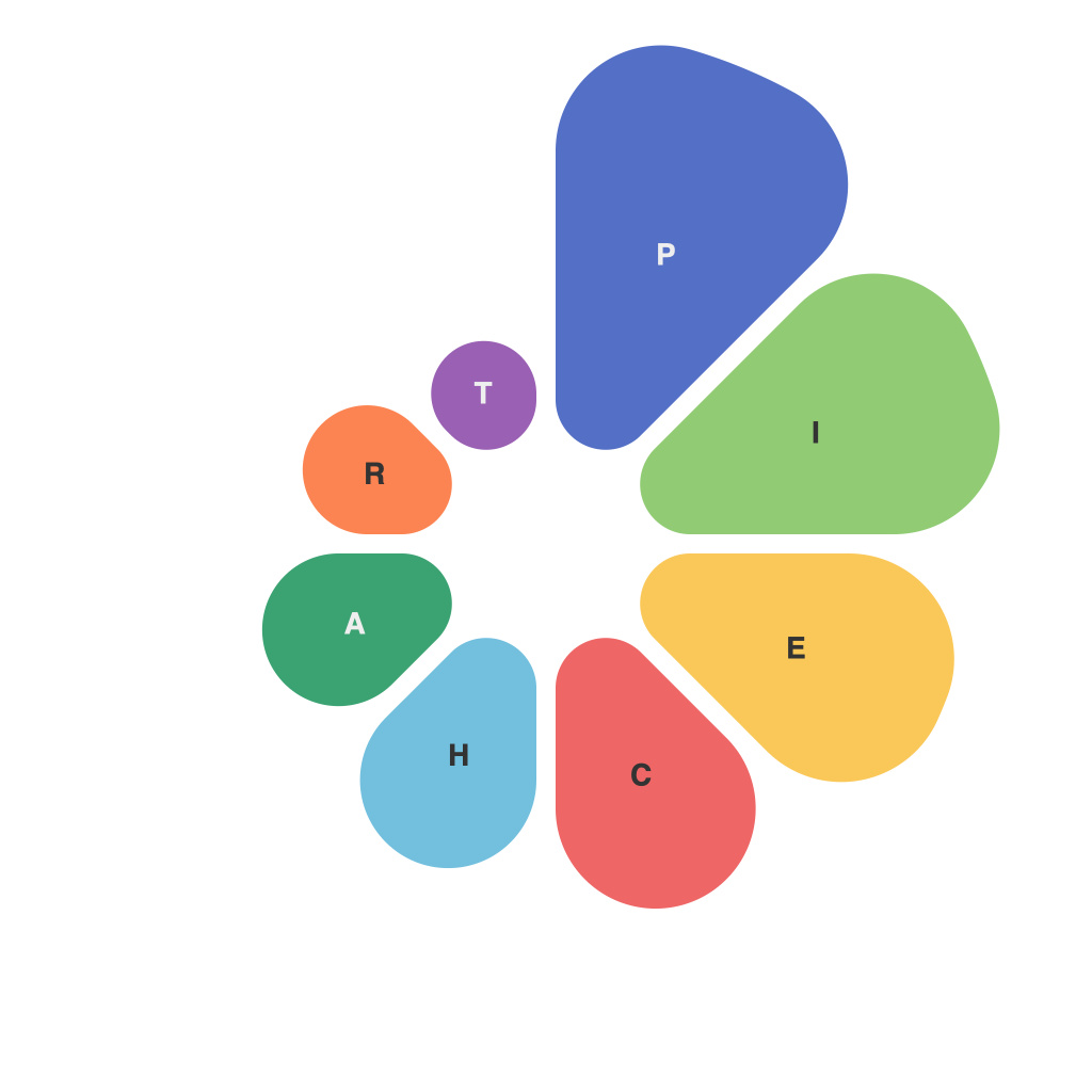
In today’s data-driven world, the ability to effectively communicate and tell a story through data visualizations is a highly sought-after skill. One of the most versatile and powerful tools in the arsenal of data visualization is the pie chart, commonly known as the ‘pie chart’ or ‘pie graph.’ It’s a circular statistical graphic that is divided into slices to illustrate numerical proportions of a whole. Whether you are analyzing market shares, comparing parts of a demographic, or distributing project tasks, a well-crafted pie chart can convey your message with clarity and impact. To help you harness the full potential of this data visualization staple, we present the PieChartMaster’s ultimate guide to data visual mastery.
## Understanding the Basics
Before diving into the intricacies of creating a perfect pie chart, it’s crucial to grasp its foundational concept. A pie chart represents whole data with a circle, and each sector or segment within the circle represents a portion of the whole. The angle of each slice is proportional to the quantity it represents. Here are a few key principles to remember when dealing with pie charts:
1. **Simple and Self-Explanatory**: A good pie chart should be instantly understandable. Avoid overly complex data sets; Pie charts are best when used for simple, two-dimensional data representation.
2. **Equal Slices for Equal Values**: Every segment should have a distinct shape. If slices are similar or identical in size, they can be difficult to differentiate, distorting the viewer’s interpretation.
3. **A Complete Circle**: The data within the pie chart should add up to the whole; leave out any unnecessary data points to keep viewers focused.
4. **Labeling**: Clearly label each section so the audience can easily identify the data it represents.
## Choosing the Right Data for Pie Charts
Not all data is suitable for a pie chart. To make this decision, consider the following:
1. **Comparative Data**: Pie charts are particularly effective when comparing different parts of a whole across different categories.
2. **Limited Number of Categories**: Keep your pie charts simple by focusing on no more than five to seven categories. Any more, and they become too crowded and confusing.
3. **When Proportions Are Important**: Pie charts highlight proportions and can be more effective than bar or line graphs in showcasing the relative magnitude of different sections.
## Designing a Pie Chart: Fundamentals
Designing an effective pie chart involves more than just piling up data. Here are some best practices:
### Color Palette
1. **Consistency Across Slices**: Use distinct colors that don’t repeat so that viewers can quickly identify each section.
2. **Minimalist Color Palette**: Too many colors can be distracting. A clean, simple palette is typically more effective.
### Labeling and Typography
1. **Readable Font & Size**: Choose a font that is easily readable across all slices and ensure the size is legible even if someone is viewing the chart from a distance.
2. **Clear Labels**: Label each section in such a way that it is clear which part of the pie represents what.
### Layout
1. **Start from the 12 O’Clock Position**: Begin your slices from the top (12 o’clock position) for readability and consistency.
2. **Avoid Starting at Odd Angles**: This helps to prevent slices with unexpected angles that could throw viewers off.
## Advanced Techniques
Once you are confident with the foundational principles and design, the PieChartMaster offers a few advanced techniques:
### Incorporating a Legend
When you have numerous slices, adding a legend can help viewers quickly reference the data represented.
### Exploding Pie Charts
Exploding pie charts can highlight a particular section for emphasis, though they should be used sparingly due to potential audience interpretation issues.
### Using Interactive Charts
Take advantage of modern data visualization tools that allow for interactivity. Users can hover over slices to see exact figures or click to expand the chart into a more detailed view.
### 3D Pie Charts
While 3D pie charts can make charts look visually striking, they are typically not recommended because they can distort the perception of the data and are harder to visually interpret.
## Common Pie Chart Errors to Avoid
1. **Too Many Slices**: Combining too many slices can make it difficult to discern individual segments, reducing the chart’s effectiveness.
2. **Circularity**: If the circle is not drawn to scale, the data may be perceived incorrectly. Always draw a perfectly round circle.
3. **Distorted Perception**: The human eye perceives certain colors as being closer and larger than others, so be aware of color theory when designing your charts.
In conclusion, the art of crafting a pie chart is both a science and a creative endeavor. Whether you are a seasoned professional or a beginner, the PieChartMaster’s guide provides a wealth of knowledge that will help you create compelling, insightful, and visually engaging data representations. Embrace the principles outlined here, and you’ll turn your data into an actionable narrative that speaks volumes at a glance.

