### Charting Success: An In-depth Guide to Mastering Pie Charts for Effective Data Visualization
Pie charts have long been a popular tool in the field of data visualization. Often hailed for their simplicity and straightforward depiction of data, they are particularly useful for representing proportions or percentages in a clear visual format. However, to truly harness their power and effectively employ them in various contexts, it’s essential to understand their structure, potential limitations, and best practices for implementation. In this guide, we’ll delve into the intricacies of pie charts, exploring how to construct and interpret them correctly, and then delve into best practices for leveraging their effectiveness in data storytelling.
### Understanding Pie Charts
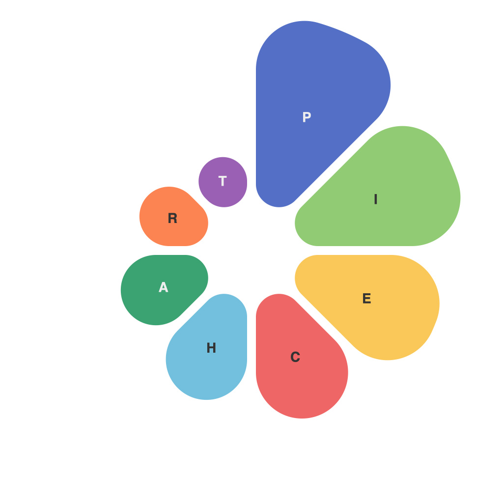
**Constructing a Pie Chart**: A pie chart represents data as slices of a circle, with each slice’s area proportional to the category’s value. The circle, symbolizing the whole, is divided into sectors that represent different components. This visualization is particularly useful when you need to compare parts of a whole, where each part must clearly be identifiable and distinguishable from others, often by the use of different colors or labels.
### Key Considerations for Pie Charts
#### 1. Use of Circular and Radial Layouts
Pie charts are inherently circular and radial, which means they are designed to represent data segments that form a whole. This layout naturally guides the viewer to compare sizes of segments against the whole, making it effective for comparisons that involve a single variable where the total sum is meaningful.
#### 2. Limitations and Limitations
**Complexity**: Pie charts are most effective with three to five categories. More slices can become difficult to distinguish and interpret, potentially overwhelming the viewer. When faced with more categories, consider alternatives such as stacked bar charts or line graphs.
**Comparison**: Direct comparison between multiple pie charts in a single view can be challenging, especially when slices are small. This makes the medium less suitable for comparisons across multiple datasets unless the slices are consistently sized.
### Best Practices for Utilizing Pie Charts
**Choosing the Right Data**: Utilize pie charts for datasets where the sum of all parts equals 100%, and where the viewer needs to understand the proportion of each part relative to the whole. They are particularly fitting for datasets where each category represents a unique and significant component of the total.
**Simplicity and Clarity**: Use a simple color scheme. Different colors should be used for different segments to enhance readability and make the chart more visually appealing. Avoid using too many colors as this can lead to confusion.
**Labeling**: Always label each slice of the pie with clear, concise, and consistent labels. Ideally, these labels should include the category name and the associated value (if small values are close). If labels are too crowded, consider using data labels or hovering tooltips in digital formats.
**Interactive Pie Charts**: In digital presentations, interactivity can significantly enhance user engagement. Features like tooltips for additional information, interactive segments, and sorting capabilities can make exploration of data more engaging and insightful.
### Conclusion
Pie charts form a critical tool in the data visualization arsenal, offering a visually appealing format to display proportions and percentages. Their effectiveness hinges on their proper use, taking into account the complexity of the data, the need for clear visual distinction, and the potential for straightforward comparison. By adhering to best practices, including keeping the number of categories manageable, ensuring clarity through labels and color schemes, and leveraging interactive features in digital platforms, the power of pie charts can vastly increase the clarity and impact of data, leading to more effective and engaging data storytelling.

