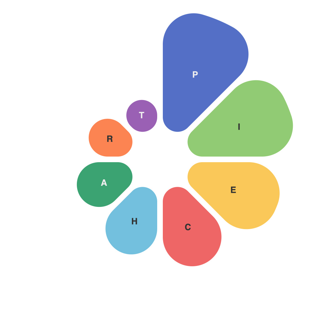
In the myriad landscapes of data visualization, pie charts often take a backseat to their grander, more dynamic counterparts: bar graphs, line graphs, and scatter plots, each vying for the attention they believe their formats can bring to the forefront of an analysis. However, beneath the surface, the pie chart has been quietly weaving its magic—a tapestry of information simplicity that often gets overlooked. A well-crafted pie chart is an art form—a display of data with grace, one that can reveal insights, patterns, and comparisons with both clarity and elegance. Let us delve into the elegant power, or rather, the silent strength, of pie charts in information visualization.
**The Simplicity of Structure**
A pie chart is, in form, simple. It is essentially a circle, divided into wedges, each representing a proportion of data relative to the whole. The visual simplicity belies the chart’s depth; pie charts can effectively represent large datasets and complex information by presenting it in an easily digestible format.
**The Visual Cue**
The core allure of pie charts is their ability to provide a snapshot of data trends. The human brain is equipped with an intuitive understanding of visual comparisons; hence, pie charts serve as a powerful tool for rapid comprehension. When proportions are easily discernible, readers can begin to derive insights right away without wading through numbers or convoluted calculations.
**Colors and Labels: A Match Made in Visual Heaven**
The application of colors and clear labelling on pie charts can enhance their clarity to a remarkable degree. Utilizing a color palette that contrasts well with the shades of the chart allows for easier visual distinction between slices. Adding labels or legends can further clarify what each slice represents, ensuring that the audience can interpret the chart accurately without confusion.
**Sizing Up the Segments**
It goes without saying that the size of each slice should accurately represent the data it stands for. Pie charts, when done correctly, can make it glaringly apparent how each category sizes up against the rest. In turn, these insights may lead to strategies for improvement or allocation of resources based on which slices are large or small.
**Avoiding Pie Charts Pitfalls: The Fine Print**
Yet, pie charts have become a whipping boy for data visualization snobs due to their misapplication. Here are a few guidelines to ensure that the powers of the pie chart are not misplaced:
1. **Limit the Number of Slices:** Too many slices can make the chart difficult to read. Keep it lean.
2. **Avoid 3D Charts:** The added depth can distort the visual proportions.
3. **Check for Misleading Labels:** Make certain that the data being represented is true to the label.
4. **No Data is Better than False Data:** It’s better to leave gaps in a pie chart than to fill it with information that doesn’t actually exist.
**The Power of Provenance**
Perhaps what makes pie charts so compelling is their agelessness. They have been used for well over a century, standing the test of time as a reliable visualization tool within data analytics. They’ve been implemented across industries from finance to marketing, politics to retail, and have consistently proven their worth when it comes to presenting numerical data that requires easy interpretation.
In conclusion, pie charts are more than just a visual aid. They have the power to communicate data with a grace that is both intuitive and compelling. When crafted with care, they can tell a story without words, highlighting trends and patterns that may not be apparent in tables or line graphs. Data with grace means making the analytical process elegant and accessible, and pie charts have long been a staple in achieving just that.

