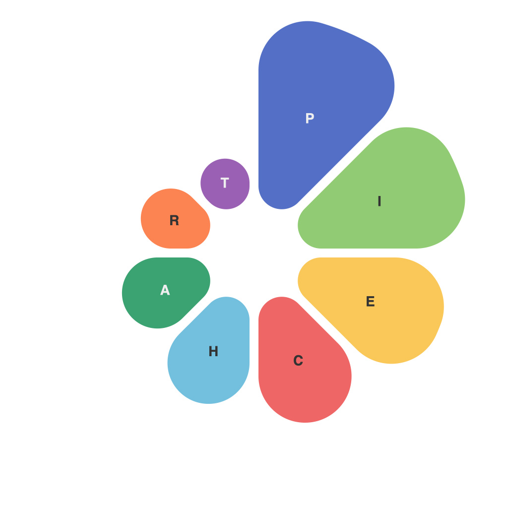
The Digital Era has revolutionized the way we communicate complex information through the medium of data. With the help of various tools and techniques, we can transform raw data into visually compelling narratives that resonate with our audience. Among the variety of data visualization methods, PieCharts have emerged as a formidable tool, offering straightforward insights into relative proportions. Enter PieChartMaster, your definitive guide to mastering the art of PieChart excellence. This article serves as a thorough manual to achieve the perfect PieChart, equipping you with the skills to convey your message effectively through this circular wonder.
**Understanding the Basics**
First, let’s demystify the basics. The PieChart is an intriguing visual element derived from a circle divided into segments that correspond to percentages. Every pie slice represents a portion of the whole and can depict relative sizes or values within a dataset. When used correctly, the PieChart can provide a stark visual reminder of the importance of certain segments relative to the whole.
**Selecting the Right Data for PieCharts**
PieCharts are not versatile by nature—there are specific scenarios where they are a perfect fit. Here are a few pointers to help you select the right data:
– **Limited number of categories**: PieCharts perform best with a small subset of categories (typically 5-7). Attempting to include too much data can complicate the visualization and dilute the message.
– **Use when emphasizing the whole**: When the overall distribution of parts is the main point, the PieChart becomes the hero of your data presentation.
– **Avoid overlapping slices**: It might seem like multiple pieces can fit more information, but it actually confuses and misleads the viewer. Stick to single pie slices for each category.
– **Choose relevant categories**: Categories should represent components that are easily understood and can stand alone in the pie chart.
**Design Considerations**
Creating a visually appealing and clear PieChart involves more than just choosing the right data. Here are vital design considerations:
– **Color Scheme**: Utilize colors that have low contrast and are distinguishable from one another for ease of interpretation.
– **Consistency**: A consistent color palette throughout your presentation ensures a professional look and aids in quick recognition of each category.
– **Labeling**: Label each segment clearly, ensuring it stands out from the rest so viewers can quickly identify the data.
– **Legends and titles**: A legend is crucial when there are more than three or four slices of pie. However, a title can also help convey the chart’s significance at a glance.
**Common Mistakes to Avoid**
PieCharts can be susceptible to various pitfalls if one is not careful. Here’s what to watch out for:
– **Avoiding 3D PieCharts**: The extra dimension often leads to visual distortion, making it difficult to assess the actual sizes of segments accurately.
– **Don’t use too many colors**: Overuse of colors can overwhelm the viewer and lead to misinterpretation of the data.
– **Be cautious with proportions**: It can be challenging for the human eye to discern small differences in pie slices, especially when there’s a significant gap in relative sizes.
– **Consider replacing with a BarChart**: If the relative size of pie slices is crucial, consider using a BarChart, which often makes it easier to compare sizes.
**Final Thoughts**
In conclusion, crafting the perfect PieChart requires a careful selection of data, thoughtful design, and awareness of common pitfalls. With PieChartMaster’s guide, you’re equipped to present your data with precision and visual appeal. The PieChart is an invaluable weapon in your data visualization toolbelt. Harness its power, engage your audience, and make your message resonate through the art of presentations. Remember, the perfect PieChart does not only reveal data but tells a visual story that sticks with your audience for a lifetime.

