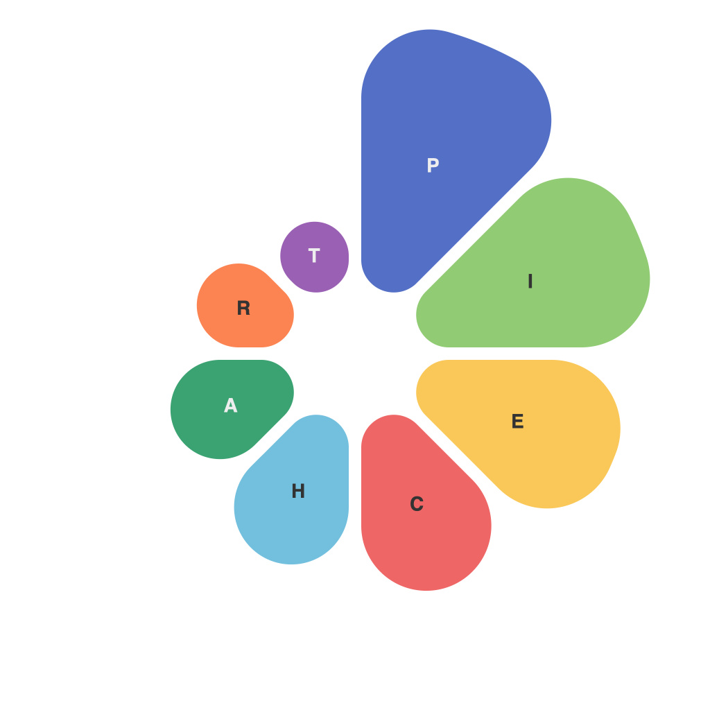
In recent times, the demand for effectively presenting data has grown exponentially. With an abundance of data available at our fingertips, creating representations that accurately convey the information in a digestible manner has become more important than ever. Among the various chart types, pie charts have emerged as a fundamental choice for showcasing proportions and percentages distinctly. In this comprehensive guide, we will delve into the principles of creating impressive pie charts that are not only visually alluring but also accurately represent the underlying data.
### Step 1: Understanding Pie Charts
Pie charts, also known as circle charts, are a special type of graph used to represent categorical data. Each category is represented by a portion of the circle, with the size of the sector indicating the relative size of the category compared to the whole. This makes pie charts an excellent tool for demonstrating parts-to-whole relationships.
### Step 2: Choosing the Right Data
To start creating an effective pie chart, you need to ensure your data is suitable. The data should clearly demonstrate a “parts-to-whole” relationship, making pie charts ideal for showing percentages or proportions. For example, data on market share, budget allocations, or demographic breakdowns can be represented well with pie charts.
### Step 3: Data Aggregation
Before drawing a pie chart, aggregate your data into categories that make logical groupings to facilitate comparison and understanding. This step simplifies the chart and prevents it from appearing cluttered, making it easier for the viewer to interpret the information.
### Step 4: Selecting Color Schemes
Color choice is integral to the aesthetics of your pie chart and can significantly impact its readability and emotional impact. Use a distinct color palette that emphasizes categories without overwhelming the viewer. It’s crucial to maintain consistency in colors used for similar categories across different charts, which improves visual recognition for audiences.
### Step 5: Labeling Clearly
Proper labeling ensures that your pie chart is informative and comprehensible. Label each sector with its percentage and category name, and consider using a legend if a sector’s label would be too cluttered or if there are many categories that may be hard to decipher visually. Avoid using technical jargon and simplify descriptions to cater to a wide audience.
### Step 6: Consideration for Screen Size
When creating pie charts for digital use, consider the screen size and resolution. A high number of pie slices can become confusing on smaller screens. You might choose to aggregate categories or use a hover-over function to display detailed information about each slice, which can be hidden on smaller devices for a cleaner interface.
### Step 7: Animation and Interactivity
To engage viewers, consider adding animations and interactivity to your pie charts. Animate transitions between slices as users click through categories or zoom into details. This not only makes the presentation more dynamic but also helps in retaining user interest and enhancing information delivery.
### Step 8: Aesthetics and Clarity
Crafting a visually appealing pie chart doesn’t solely hinge on color and animation but also on maintaining clarity. Ensure your chart isn’t overly decorated; focus on clarity and simplicity, ensuring the data is the focal point. This can be achieved through a minimalist design, appropriate use of white space, and avoiding unnecessary design elements.
### Conclusion
Mastering the creation of informative and aesthetically pleasing pie charts is a skill that enhances your ability to communicate data effectively. By adhering to these steps, you not only improve the visual appeal of your charts but also increase their practical utility, ensuring that your audience can easily digest and act upon the information presented. Remember, the key to an outstanding pie chart lies in the balance of form and function, ensuring that it is not only beautiful but also serves its purpose.

