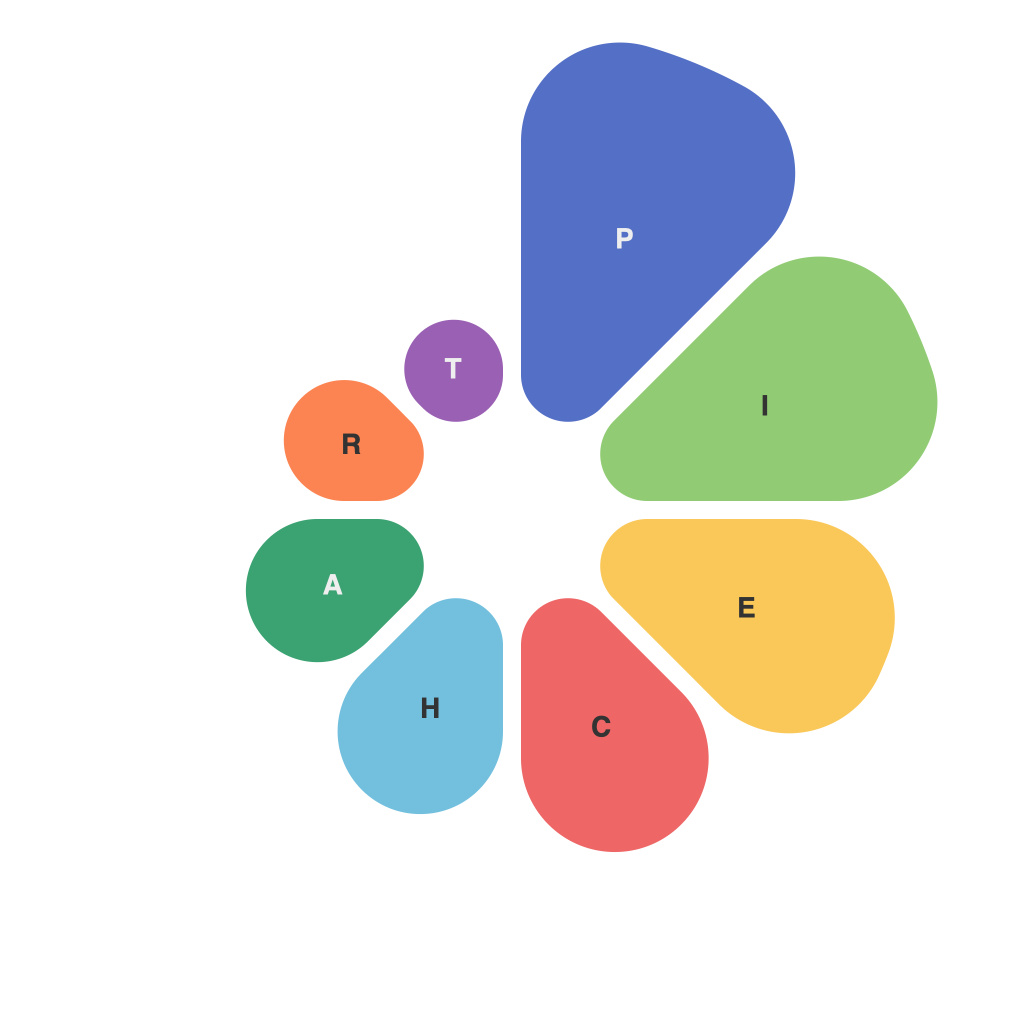
Unleashing Visual Insights: Mastering the Art of Pie Charts in Data Visualization
Pie charts stand as a quintessential tool in the data visualization arsenal. They can transform raw numerical data into easily digestible, visually appealing representations, making complex patterns and insights accessible to a wide audience. In this article, we’ll explore the anatomy of pie charts, their strengths, and limitations—providing insights that will help you navigate through the art of pie chart construction, interpretation, and beyond.
### The Anatomy of Information in Pie Charts
Pie charts are designed to display parts of a whole, where each slice, or “section,” represents a specific category’s proportion to the total. With their circular layout, they lend a natural and easy-to-analyze way to compare the size of each part in relation to the whole. This visual tool is particularly effective when you seek to emphasize the individual contributions of components to a larger whole.
### Strengths of Pie Charts
**Ease of Understanding:** Pie charts offer a straightforward method to visualize data. The human eye is typically adept at comparing the sizes of visual elements, making pie charts an intuitive and effective tool for audiences seeking to quickly grasp percentage data.
**Comparison of Proportions:** They are best suited for comparing the relative sizes of categories, especially when those categories need to represent part of a total that doesn’t grow beyond a certain percentage (usually 100%).
### Limitations of Pie Charts
**Limited Detail:** Pie charts can struggle with clarity when the differences between category sizes are minute. It can be hard for viewers to discern small differences in slice sizes, which might be crucial for accurate data representation.
**Crowding Issues:** As more slices are added, pie charts can become cluttered, leading to decreased readability and understanding. This can be particularly problematic when attempting to display a large number of categories or when categories have very similar values.
### Crafting Your Pie Charts for Maximum Impact
**Keep It Simple, Stupid (KISS):** Limit the number of slices to four or less. More slices can lead to confusion and overcrowding, making your chart harder to interpret.
**Use Consistent Width or Color Contrast:** Ensure that slices are either of consistent width or use clear color contrasts to aid in visual distinctions without adding unnecessary detail.
**Label Wisely:** While labels can sometimes be omitted for slices that seem intuitively identifiable, always include percentages or values, especially for slices that might not have clear visual differences.
**Highlight Key Data:** Utilize data labels, legends, and hovering tooltips for additional insights, allowing viewers to focus on specific categories without cluttering your primary visualization.
### Moving Beyond Pie Charts
**Alternative Visualizations:** When data complexity increases or specific insights are hard to convey through pie charts, consider alternatives like doughnut charts, stacked pie charts, or other forms of data visualization such as bar charts, line graphs, or heat maps.
### Conclusion
Pie charts remain a potent tool in the data visualization toolkit, particularly when seeking to present the makeup of a whole in a digestible, intuitive manner. However, their effectiveness hinges on smart design choices and understanding their strengths and limitations. As you harness the power of pie charts, consider these insights to ensure that your visualizations are not only beautifully presented but also packed with meaningful, actionable insights.

