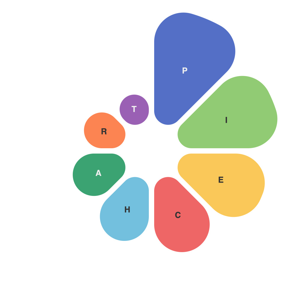
Unlocking Visual Insights: A Comprehensive Guide to Mastering Pie Charts is designed to navigate the intricacies of pie charts, a widely adopted graphical depiction used across numerous sectors for data visualization. Pie charts are a form of circular statistical graphic that divides data into sectors or slices, representing the proportion of each element relative to the whole. With its straightforward design and intuitive nature, pie charts can provide a snapshot of overall categories against the whole, making them an attractive choice for communication in many contexts. Here, we delve into the nuances of pie charts, offering strategies for effective use and critical tips for designers and data professionals alike.
### Understanding the Basics
Before diving in, it’s pivotal to understand the fundamental components of a pie chart. Each slice represents a category’s contribution to the total, the size of which is determined by the value of the data point it represents. The chart’s center is universally positioned to facilitate viewer perception, often with the option to adjust labels inside, outside, or alongside the chart to improve readability.
### Selecting the Right Metrics
### 1. **Appropriate Data Distribution:** Use pie charts when you want to compare parts to the whole. Ensure the data has a natural denominator, ideally less than 12 elements, which ensures clarity and easy differentiation of slices.
### 2. **Comparative Analysis:** Pie charts are not the best for comparing multiple datasets or displaying small differences between categories. Consider alternative visualizations like bar charts for comparative insights.
### Designing for Effectiveness
### 1. **Slice Size and Color:** Utilize color for differentiating slices based on categories. Ensure the color contrast allows for accessibility. The visual impact of slice size should not be overwhelming, emphasizing the need for uniform background size.
### 2. **Labeling:** Accurate and succinct labeling is crucial for clarity. Utilize both colors and labels if necessary, ensuring that labels are clearly readable and do not overcrowd the chart, even when printed.
### 3. **Legend Usage:** If labels are not practical or space constraints are present, a legend can be employed. Ensure it follows a logical order and is easily interpretable.
### 4. **Emphasize Key Metrics**: For critical information, consider using larger or contrasting colors for emphasized slices, ensuring they stand out without distorting the whole.
### Advanced Considerations
### 1. **Avoid Overcomplicating:** Keep the chart simple and avoid unnecessary elements that might distract from the data. This includes minimizing too many colors or adding unnecessary decorations.
### 2. **Responsive Design:** Ensure that your pie charts are readable and effective in various viewing sizes, especially for online contexts where resizing is common.
### 3. **Accessibility:** Consider the needs of all stakeholders, including those with color blindness. Use color combinations that can be differentiated by color and texture or by shape, depending on the context.
### Conclusion
Mastering the art of using pie charts effectively empowers data professionals to communicate their insights clearly and compellingly. By keeping the principles outlined in this guide in mind, such as selecting appropriate metrics, designing for clarity and impact, and considering the advanced aspects of chart crafting, individuals with a strong grasp of pie chart usage will be well-equipped to unlock visual insights that resonate with their audience, enhancing communication and understanding across various sectors and applications.

